-
Notifications
You must be signed in to change notification settings - Fork 1
Drop Down
Patrick Ruhsert edited this page Mar 13, 2017
·
3 revisions
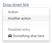
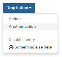
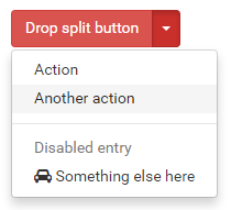
The Drop Down component shows a drop down menu (one level) on either a label, a button or a split button.
Label example:

Button example:

Split Button example:

Table of contents
The component has the following properties:
| Property | Type | Default | Description |
|---|---|---|---|
| enabled | Boolean | true | Whether the component is enabled or not |
| isButton | Boolean | true | Whether a label or a button is shown |
| isSplitButton | Boolean | true | When isButton is true, controls whether to display as split button or not |
| menuItems | MenuItem[] | null | An array of MenuItem objects used to create the menu from |
| styleClass | String | null | Optional style class(es) for the component. For buttons, typically one of the bootstrap button classes ("btn-default", "btn-primary", "btn-success", "btn-info", "btn-warning", "btn-danger") |
| visible | Boolean | true | The visible property of the component, default true. |
MenuItem is a component specific javascript type representing a single menu item with the following properties:
| Property | Type | Default | Description |
|---|---|---|---|
| itemId | String | null | An ID used to identify the item |
| text | String | null | The text to show |
| userData | Object | null | An optional object that can be used to store any data associated with that menu item |
| iconName | String | null | An optional icon added to the menu item. Any glyhicon or font awesome icon can be used (e.g. "glyphicon glyphicon-search" or "fa fa-car"). |
| enabled | Boolean | true | Whether the item is enabled or not |
| onAction | Function | null | When set, this method is fired when this menu item is selected. When not set, the component's onMenuItemSelected method is fired instead. Can be used to give single items their own method to be called. |
| isDivider | Boolean | false | When true, the item will be drawn as a divider line. |
| Method | Params | Return | Description |
|---|---|---|---|
| addMenuItem | menuItem:MenuItem | Adds the given menu item to the end of the list of menu items | |
| removeMenuItem | itemId | Removes the menu item with the given ID from the component. | |
| setMenuItems | menuItems:MenuItem[] | Sets all menu items of the component. |
Adds the given menu item to the end of the list of menu items
Params
| Type | Name | Description | Required |
|---|---|---|---|
| MenuItem | menuItem | The menuItem to add | Required |
Returns void
Removes the menu item with the given ID from the component.
Params
| Type | Name | Description | Required |
|---|---|---|---|
| String | itemId | The ID of the menu item to remove | Required |
Returns void
Sets all menu items of the component.
Params
| Type | Name | Description | Required |
|---|---|---|---|
| MenuItem[] | menuItems | The items of the menu to show | Required |
Returns void
| Event | Params | Return | Description |
|---|---|---|---|
| onAction | event:JSEvent | Fired when the button of a split button is clicked (has no effect on plain button or label, because these show the menu when clicked) | |
| onMenuItemSelected | event:JSEvent, menuItem:MenuItem | Fired when an item is selected from the menu and that item has not been given an onAction method itself |