-
Notifications
You must be signed in to change notification settings - Fork 1.6k
New issue
Have a question about this project? Sign up for a free GitHub account to open an issue and contact its maintainers and the community.
By clicking “Sign up for GitHub”, you agree to our terms of service and privacy statement. We’ll occasionally send you account related emails.
Already on GitHub? Sign in to your account
FrontEnd : CSS : Transition and transformation (D) - Part 2 (only contains Transitions) #2606
Merged
code-reaper08
merged 26 commits into
girlscript:Frontend_Web_Development_HTML_CSS_JS
from
RC2208:trans1
Sep 30, 2021
Merged
Changes from all commits
Commits
Show all changes
26 commits
Select commit
Hold shift + click to select a range
fb7d743
Create Transition And Transformation.md
RC2208 fa92fb7
Delete Transition And Transformation.md
RC2208 b72faad
Create README.md
RC2208 78e138f
Update README.md
RC2208 d86fad0
Update README.md
RC2208 f9f6d4f
Update README.md
RC2208 95722e8
Create Transitions.md
RC2208 560f489
Create Transforms.md
RC2208 7fffe82
Update Transforms.md
RC2208 5a6c581
Update README.md
RC2208 1ff463a
Update README.md
RC2208 08618df
Update Transitions.md
RC2208 4982006
Update Transitions.md
RC2208 142340a
Update Transitions.md
RC2208 70c4553
Update Transitions.md
RC2208 e23ea53
Update Transitions.md
RC2208 ce70d78
Update Transforms.md
RC2208 e6f3d26
Update Transforms.md
RC2208 92f8ad2
Update README.md
RC2208 9ecd9e8
Delete Transitions.md
RC2208 465ca1a
Merge branch 'girlscript:Frontend_Web_Development_HTML_CSS_JS' into F…
RC2208 1e9e1b1
Merge branch 'girlscript:Frontend_Web_Development_HTML_CSS_JS' into F…
RC2208 ca5aff2
Create Transitions.md
RC2208 e6e1441
Delete README.md
RC2208 04845e9
Delete Transforms.md
RC2208 23bee8e
Update Transitions.md
RC2208 File filter
Filter by extension
Conversations
Failed to load comments.
Loading
Jump to
Jump to file
Failed to load files.
Loading
Diff view
Diff view
There are no files selected for viewing
115 changes: 115 additions & 0 deletions
115
Web_Development/FrontEnd/CSS_Transition_And_Transformation/Transitions.md
This file contains bidirectional Unicode text that may be interpreted or compiled differently than what appears below. To review, open the file in an editor that reveals hidden Unicode characters.
Learn more about bidirectional Unicode characters
| Original file line number | Diff line number | Diff line change |
|---|---|---|
| @@ -0,0 +1,115 @@ | ||
| # CSS Transitions: | ||
|  | ||
|
|
||
| ## What is a Transition? And whats the difference between an Animation and a Transition?<br> | ||
| CSS transitions allows one to change values of a property smoothly, over a given time duration. All transitions need a trigger to start Eg. A mouse hover or click. Whereas Animations start as soon as the web page is loaded and can run for an infinite amount of time. | ||
|
|
||
| ## Transition Methods <br> | ||
|
|
||
| Following are the methods in css transitions: | ||
| * transition | ||
| * transition-delay | ||
| * transition-duration | ||
| * transition-property | ||
| * transition-timing-function | ||
|
|
||
| To create a transition effect, you need to specify two things: | ||
| * the property you want to add the effect to | ||
| * the duration/timing of the effect | ||
|
|
||
| ```css | ||
| div { | ||
| width: 50px; | ||
| height: 50px; | ||
| background: blue; | ||
| transition: width 3s; | ||
| } | ||
| ``` | ||
|
|
||
| ```css | ||
| div:hover { | ||
| width: 300px; | ||
| } | ||
| ``` | ||
|
|
||
|
|
||
| ## Change Multiple Property Values <br> | ||
| The transition property is specified as one or more single-property transitions, separated by commas. | ||
|
|
||
| ```css | ||
| div { | ||
| transition: width 2s, height 4s; | ||
| } | ||
| ``` | ||
|
|
||
| ## Selecting all properties <br> | ||
| transition-property takes a special value: `all`. When all is specified, all CSS transition properties will start move. | ||
|
|
||
| ```css | ||
| div{ | ||
| transition: all 2s; | ||
| } | ||
| ``` | ||
|
|
||
|
|
||
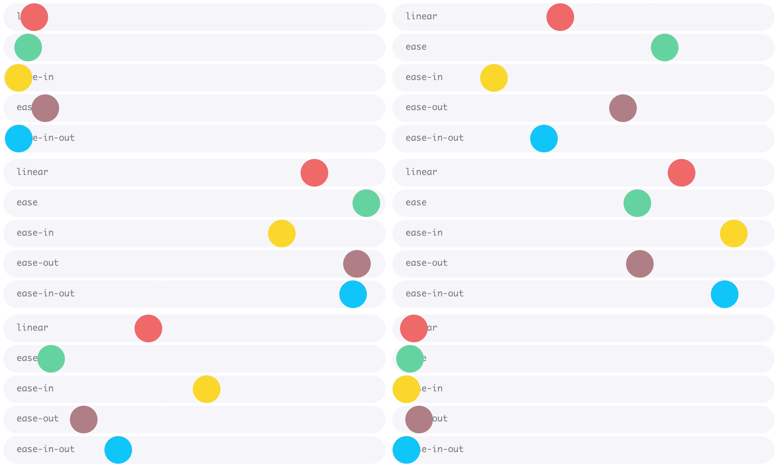
| ## Transition Timing function<br> | ||
| The transition-timing-function property specifies the speed curve of the transition effect. | ||
| This property can have the following values: | ||
|
|
||
| * ease -Transition effect with a slow start, then fast, and then ends slowly (default) | ||
| * linear - Transition effect with same speed from start to end | ||
| * ease-in - Transition effect with slow start | ||
| * ease-out - Transition effect with slow end | ||
| * ease-in-out - Transition effect with slow start and end | ||
| * cubic-bezier(n,n,n,n) - lets you define your own values in a cubic-bezier function. | ||
|
|
||
|
|
||
|  | ||
|
|
||
| Code For different transition prpoerties: <br> | ||
| ```css | ||
| div { | ||
| width: 50px; | ||
| height: 50px; | ||
| background: yellow; | ||
| transition: width 2s; | ||
| } | ||
|
|
||
| #div1 {transition-timing-function: linear;} | ||
| #div2 {transition-timing-function: ease;} | ||
| #div3 {transition-timing-function: ease-in;} | ||
| #div4 {transition-timing-function: ease-out;} | ||
| #div5 {transition-timing-function: ease-in-out;} | ||
|
|
||
| div:hover { | ||
|
There was a problem hiding this comment. Choose a reason for hiding this commentThe reason will be displayed to describe this comment to others. Learn more. Codeblocks here |
||
| width: 200px; | ||
| } | ||
| ``` | ||
|
|
||
| ## Transition Delay <br> | ||
| This property specifies a delay (mostly in seconds) for the transition effect to take place. | ||
|
|
||
| ```css | ||
| div { | ||
| transition-delay: 3s; | ||
| } /*Delays transition by 3 sec*/ | ||
| ``` | ||
|
|
||
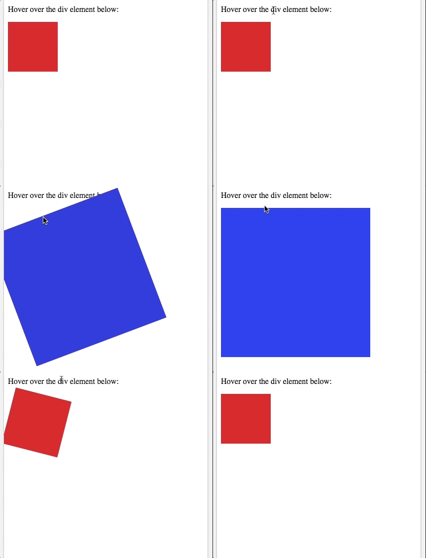
| ## Using Transitions in transform | ||
| ```css | ||
| div { | ||
| width: 50px; | ||
| height: 50px; | ||
| background: red; | ||
| transition: width 2s, height 2s, transform 2s; | ||
| } | ||
|
|
||
| div:hover { | ||
| width: 200px; | ||
| height: 200px; | ||
| transform: rotate(180deg); | ||
| background-color:blue; | ||
| } | ||
| ``` | ||
|
|
||
|  | ||
Add this suggestion to a batch that can be applied as a single commit.
This suggestion is invalid because no changes were made to the code.
Suggestions cannot be applied while the pull request is closed.
Suggestions cannot be applied while viewing a subset of changes.
Only one suggestion per line can be applied in a batch.
Add this suggestion to a batch that can be applied as a single commit.
Applying suggestions on deleted lines is not supported.
You must change the existing code in this line in order to create a valid suggestion.
Outdated suggestions cannot be applied.
This suggestion has been applied or marked resolved.
Suggestions cannot be applied from pending reviews.
Suggestions cannot be applied on multi-line comments.
Suggestions cannot be applied while the pull request is queued to merge.
Suggestion cannot be applied right now. Please check back later.
There was a problem hiding this comment.
Choose a reason for hiding this comment
The reason will be displayed to describe this comment to others. Learn more.
Codeblocks here too