-
Notifications
You must be signed in to change notification settings - Fork 1
ResponsiveImageViewHelper
This ViewHelper renders an img-Tag with data-srcset attribute. This attribute contains paths to processed images for different widths. The ViewHelper also respects values for height and focuspoint. The initial src attribute contains an empty 1x1px image. Make sure to add javascript functionality to replace the value of the src attribute by the appropriate value of the data-srcset attribute!
This ViewHelper extends the Fluid ImageViewHelper. So most of the arguments are the same.
The special argument here is sizes. Here you can influence the way how the images are generated. You can imagine three possible use cases:
Images are taken as they are with their ratio and all of its content being always visible. For this use case you have to define only the width property within the sizes argument. You can define as many widths as you want for the different container widths within which the images are shown. A maximum of seven may be appropriate. Best practice is to define these values via Typoscript.
lib.fluidContent {
    settings {
        image {
            responsiveSettings {
                width {
                    0 = 350
                    1 = 480
                    2 = 769
                    3 = 992
                    4 = 1200
                    5 = 1500
                    6 = 1920
                    7 = 2560
                }
            }
        }
    }
}

Sometimes images need a fixed ratio of width to height to meet the design requirements.
For this use case you specify an additional property within the sizes array: ratio. The ratio property is a floating point number representing the desired aspect ratio, e.g. 1.5 for the ratio 3:2.
plugin.tx_xmskdbasismodul.settings {
    xmTools.responsiveImage.sizes {
        listexhibition {
            ## Dauerausstellungen
            permanent {
                width {
                    0 = 260
                    1 = 320
                    2 = 380
                    3 = 420
                    4 = 485
                }
                ratio = 0.7626
                mode = c
            }
            ## Sonderausstellungen
            special < .permanent
            special.ratio = 1.5252
        }
    }
}
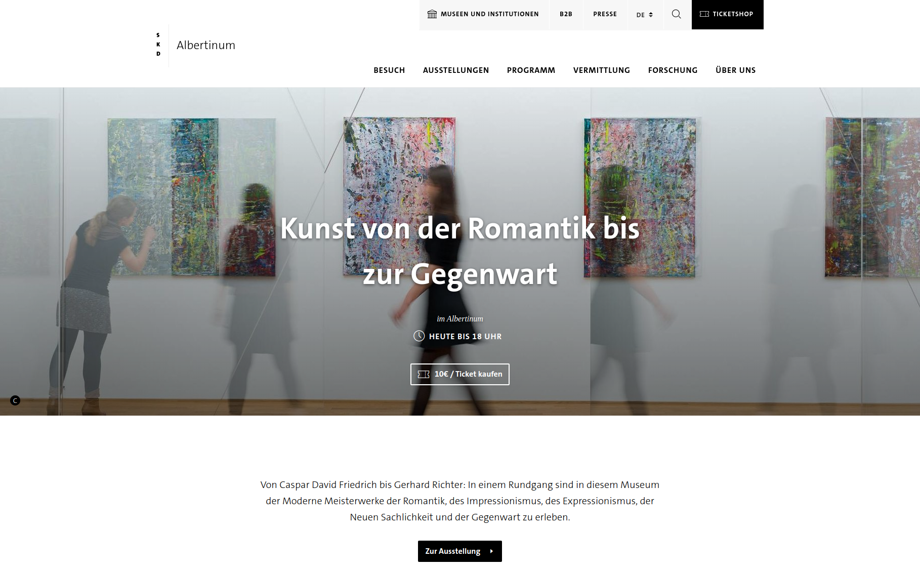
Desktop:

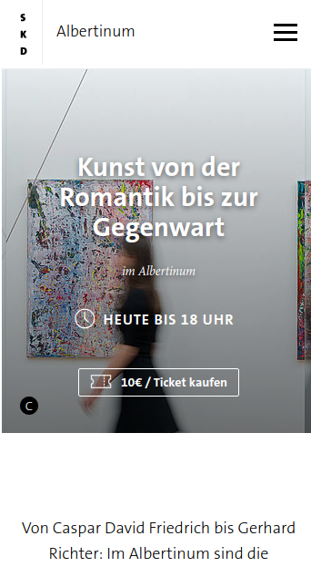
Mobile:

Imagine an image that covers the whole viewport width on desktop and the width is much bigger than the height, e.g. 3:1. On mobile devices this image would be very small with the "normal" responsive image behaviour. In this case it may be better to show only a part of the original image. So in smaller viewports you want to show a fixed image height but cut off areas left and right of the image.
For this you can specify the height property of the sizes array. You can specify either one fixed height for all of the given widths or one height value for each of the width values (corresponding heights). The values for the heights can either be integers (pixel height) or the keyword "auto" which will preserve the aspect ratio of the original image and calculate the new height accordingly.
The mode property has to be set to "c", meaning the image has to be cropped to match the desired width and height.
The other possible value for mode would be "m", which means the original ratio of the image will be preserved. In this case the image will be resized to fit in a frame representing the specified width and height. That's obviously not what you want in this use case.
What gains importance here is the focus point. If you have installed EXT:focuspoint you can determine a point of the image that should always be visible and the image will be cropped accordingly.
plugin.tx_xmskdbasismodul.settings {
    xmTools.responsiveImage.sizes {
        museumheadimage {
            width {
                0 = 350
                1 = 480
                2 = 769
                3 = 992
                4 = 1200
                5 = 1500
                6 = 1920
                7 = 2560
            }
            height {
                0 = 400
                1 = 400
                2 = 400
                3 = 400
                4 = 500
                5 = auto
                6 = auto
                7 = auto
            }
            mode = c
        }
    }
}
It can happen that certain files (.gif, .png, ...) should not be considered by the Viewhelper. Therefore the TypoScript configuration of the extension can be extended by the attribute 'dontRegenerateFileFormats'. In this attribute all file formats can be specified as comma separated list, which should not be considered.
Processed Images cannot be animated. If GIFs are processed, critical properties will be lost and an animation is no longer possible. To allow animated GIFs, they have to be added to the list of 'dontRegenerateFileFormats'. Keep in mind, that this will most likely break the layout in the frontend and adjustments must be made to the CSS.
plugin.tx_xmtools {
    settings {
        viewHelpers {
            responsiveImage {
                dontRegenerateFileFormats = gif,_IMAGE-TYPES_
            }
        }
    }
}
{namespace xmTools = Xima\XmTools\ViewHelpers}
<xmTools:responsiveImage src="'NULL'"
        width="'NULL'"
        height="'NULL'"
        minWidth="'NULL'"
        minHeight="'NULL'"
        maxWidth="'NULL'"
        maxHeight="'NULL'"
        treatIdAsReference="'FALSE'"
        image="'NULL'"
        sizes="{settings.image.responsiveSettings}"
        crop = "'NULL'",
        absolute = "'FALSE'" />
by XIMA MEDIA GmbH