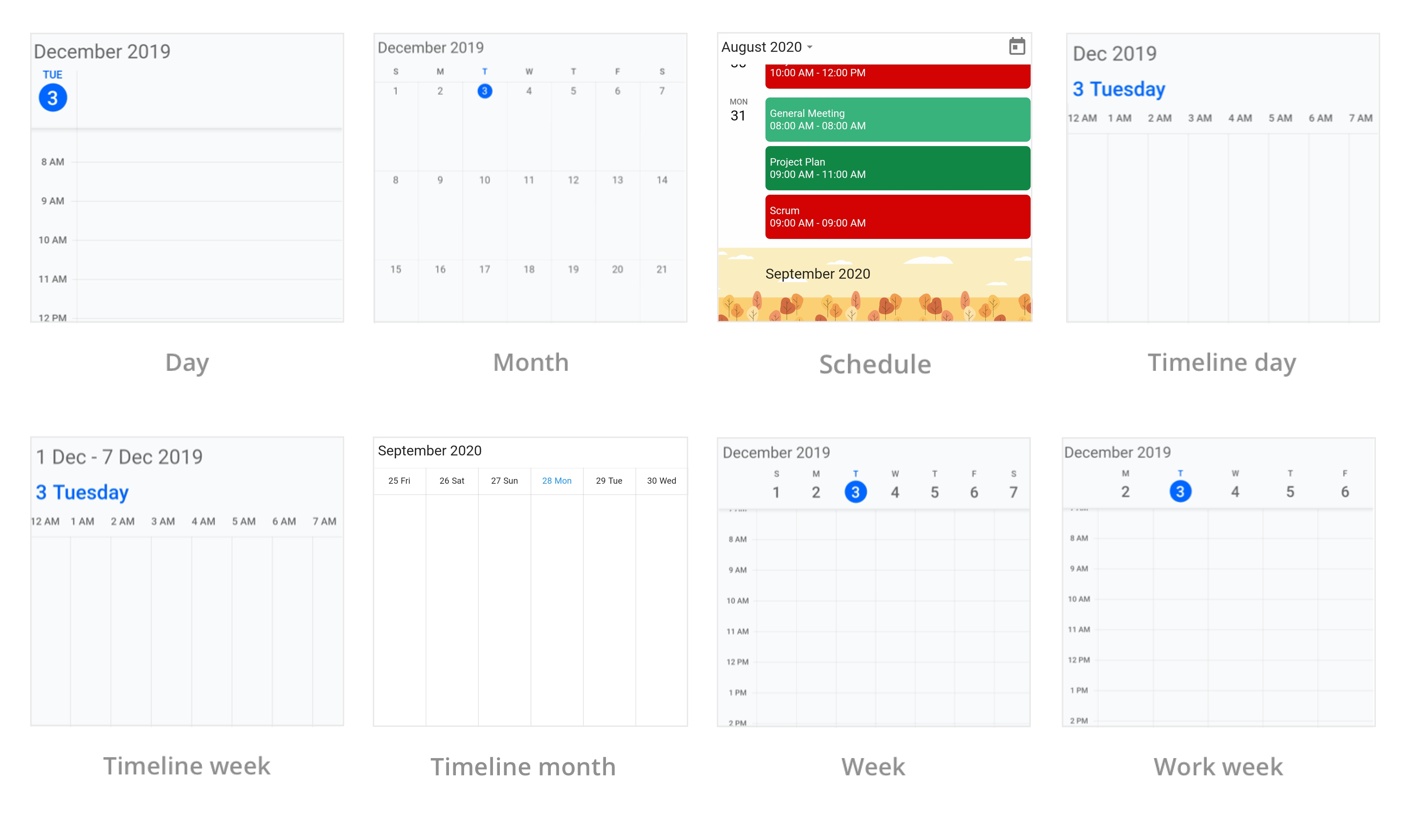
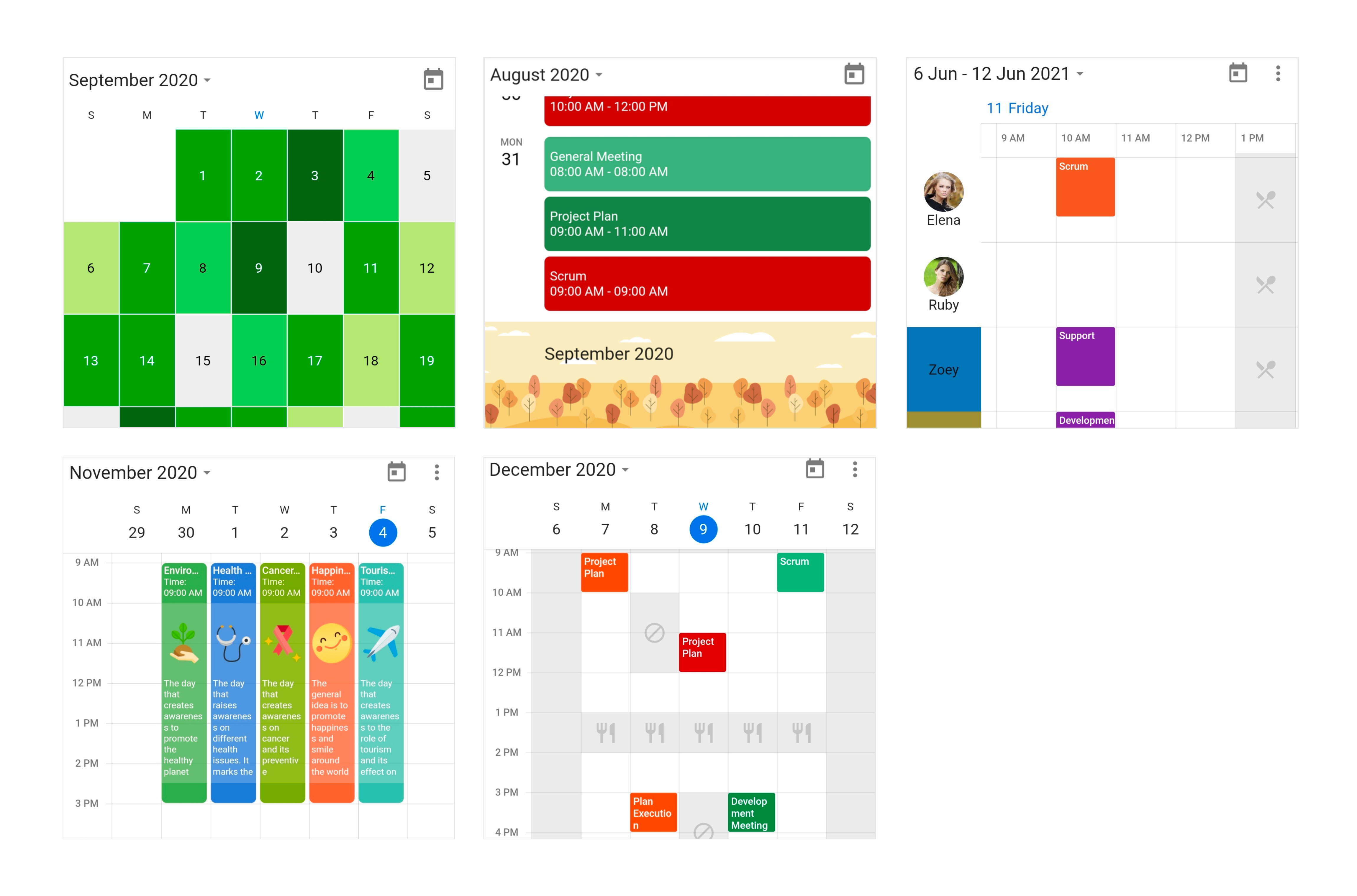
The Flutter Calendar widget has built-in configurable views such as day, week, workweek, month, schedule, timeline day, timeline week, timeline workweek and timeline month that provide basic functionalities for scheduling and representing appointments/events efficiently.
Disclaimer: This is a commercial package. To use this package, you need to have either a Syncfusion commercial license or Free Syncfusion Community license. For more details, please check the LICENSE file.
- Calendar features
- Coming soon
- Get the demo application
- Useful links
- Installation
- Getting started
- Support and feedback
- About Syncfusion
- Multiple calendar views - A wide range of built-in view modes are available: day, week, workweek, month, schedule, timeline day, timeline week, timeline workweek. The control allows you to conveniently customize every view with unique, view-specific options.
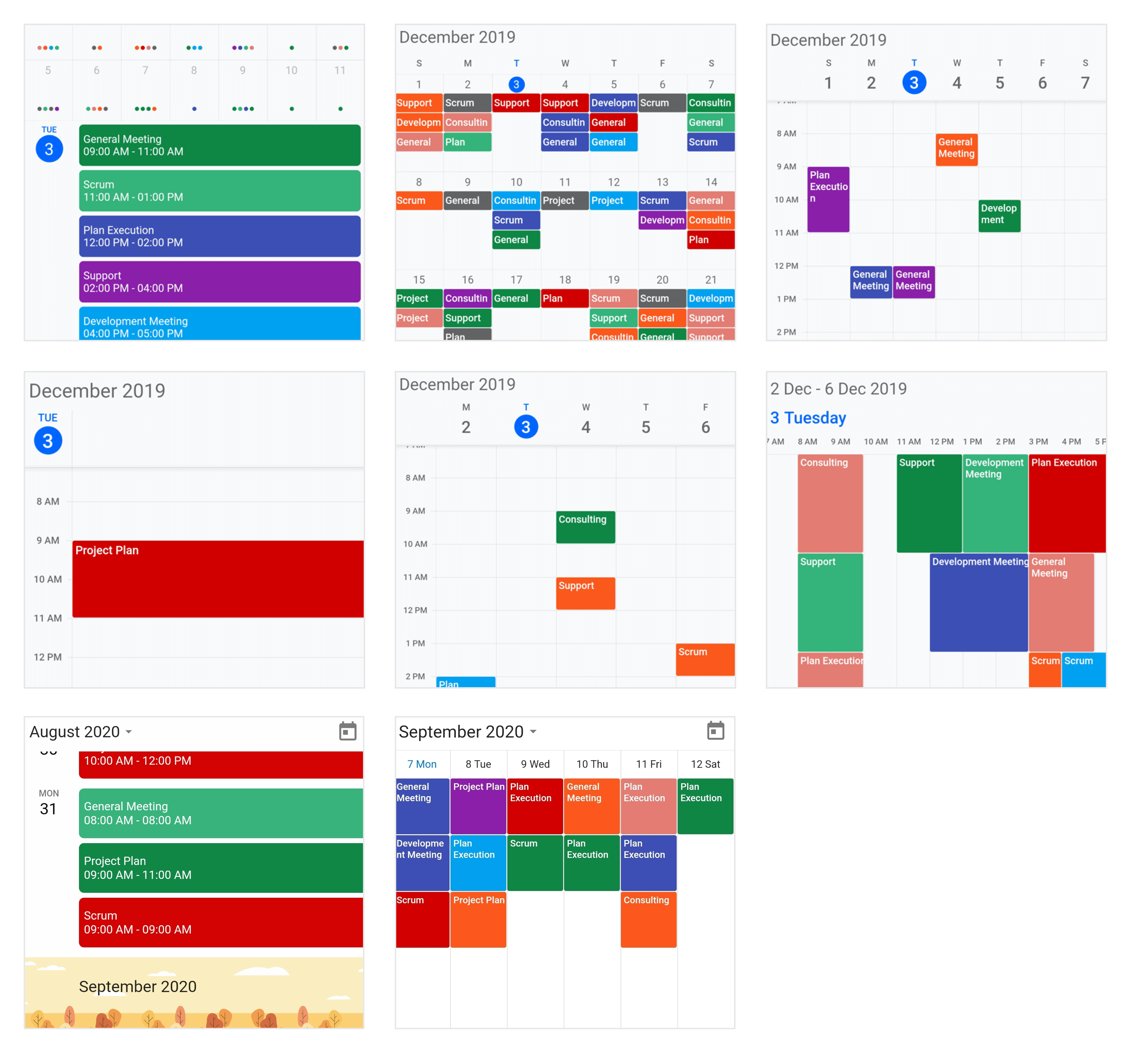
- Appointments - Appointments contain information on events scheduled at specific times. In addition to default appointments, users can use their own collections to connect a business entity to an appointment by mapping their fields, such as start time, end time, subject, notes, and recurrence.
- Recurring appointments - Easily configure recurring events to be repeated on a daily, weekly, monthly, or yearly basis with optimized recurrence options. You can also skip or change the occurrence of a recurring appointment.
- Time zone - Regardless of the time zone in your device, Calendar supports setting any required time zone for the control itself, as well as individual events.
- Resource view - Display resources as a discrete view integrated with the calendar, to display appointments of each resource in a timeline view to enhance viewability. You can customize everything from the display name, resource panel size, background color and image of the resource view.
- Schedule view - Show a list of scheduled appointments grouped by week, between set minimum and maximum dates, with the schedule view. You can customize everything from the date and time formats to the styling of each header.
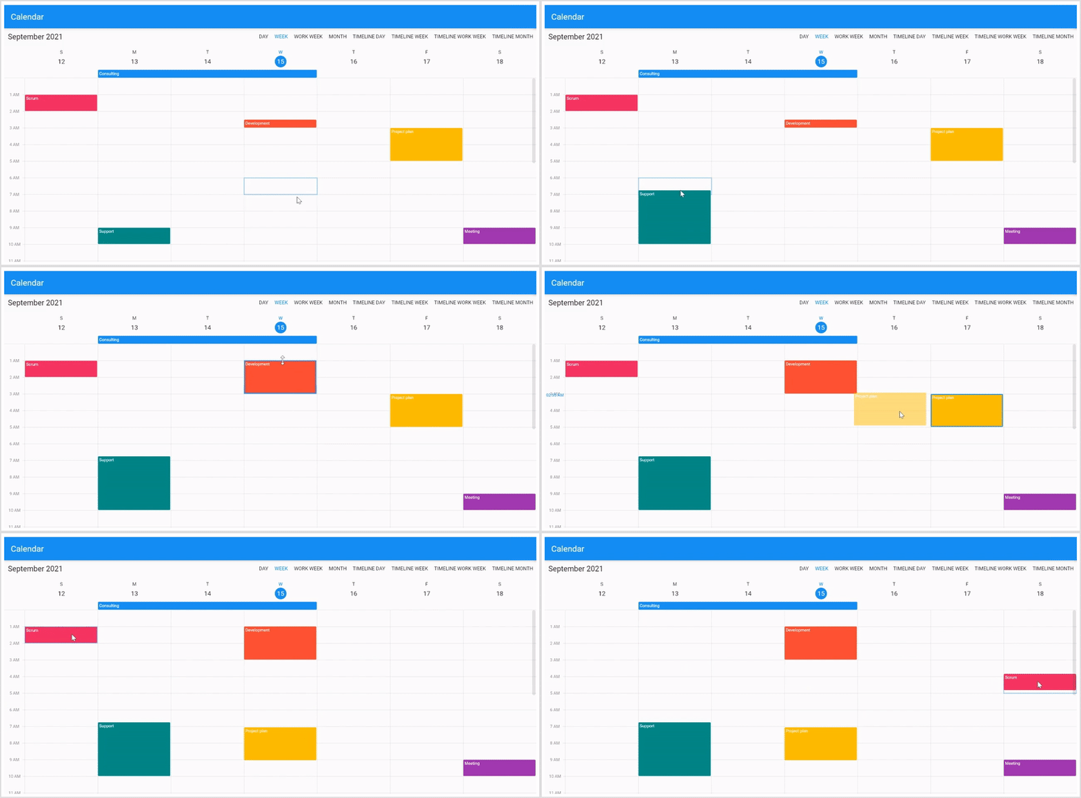
- Resize, drag and drop - Resize and drag-and-drop support have been added for rescheduling appointments in the event calendar.
-
Load more - Load appointments on-demand whenever users switch from one view to another or when scrolling to the start or end position of the schedule view.
-
Calendar details - Returns calendar details based on the given offset passed through an argument by using the getCalendarDetailsAtOffset method.
-
Special time regions - Disable interactions and selections for specific time ranges. This is useful when you want to block user interaction during holidays or another special events and to highlight those time slots.
- Flexible working days - Customize the work days in a workweek so that the remaining days will be hidden from view.
-
Number of days in view - Customize the number of days in view in the flutter event calendar.
-
First day of the week - Customize the first day of the week as needed. The default is Sunday.
- Blackout dates - Disable any date in a month and timeline month view of a calendar to make it inactive. Easily prevent the selection of weekends and holidays by disabling them.
- Customize leading and trailing dates - Hide the days of the next month and previous month in calendar to enhance the appearance.
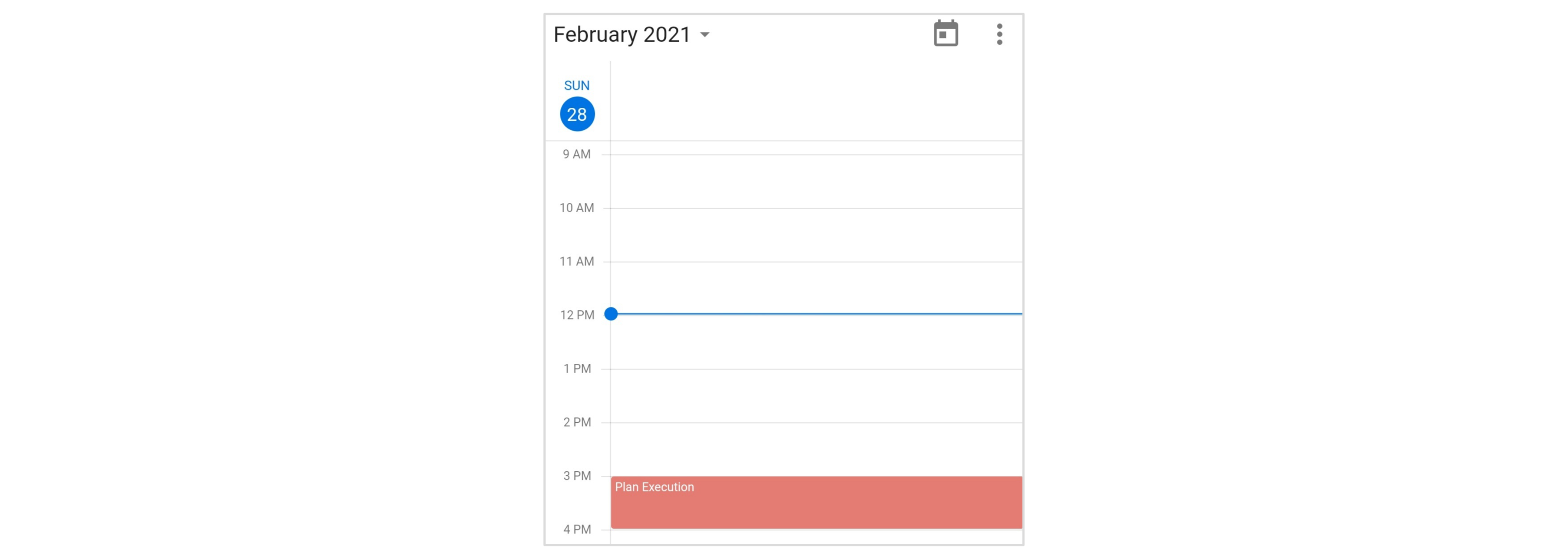
- Current time indicator - The current time indicator displays in the current time slot of the Calendar.
-
Custom start and end hours - Display the event calendar timeslot views with specific time durations by hiding the unwanted hours.
-
Month agenda view - Display appointments in a list as shown in the following month view by clicking on a day.
- Week numbers - Display the week numbers of the year in the month, week, and work week views of the Calendar.
- Quick view navigation - Navigate among calendar views easily using the header date picker views button in the calendar header and clicking month cell and view headers.
- Builders - Allows you to design and set your own custom view to the month cells, month header of schedule view, resource header of timeline views, special time regions, and appointments view of the calendar.
- Appearance customization or Theming - Provide a uniform and consistent look to the Calendar’s appearance and format. Theming support to provide a consistent look to the calendar.
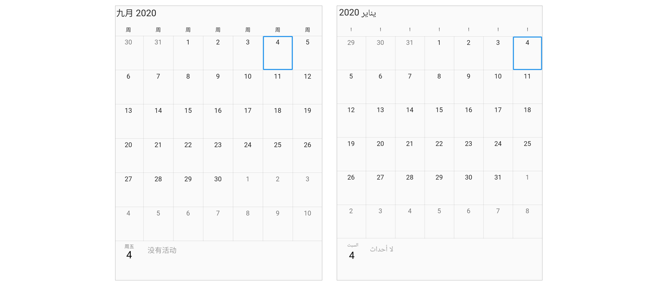
- Localization and Globalization - Display the current date and time by following the globalized date and time formats, and localize all available static texts in calendar.
-
Accessibility - The Calendar can easily be accessed by screen readers.
-
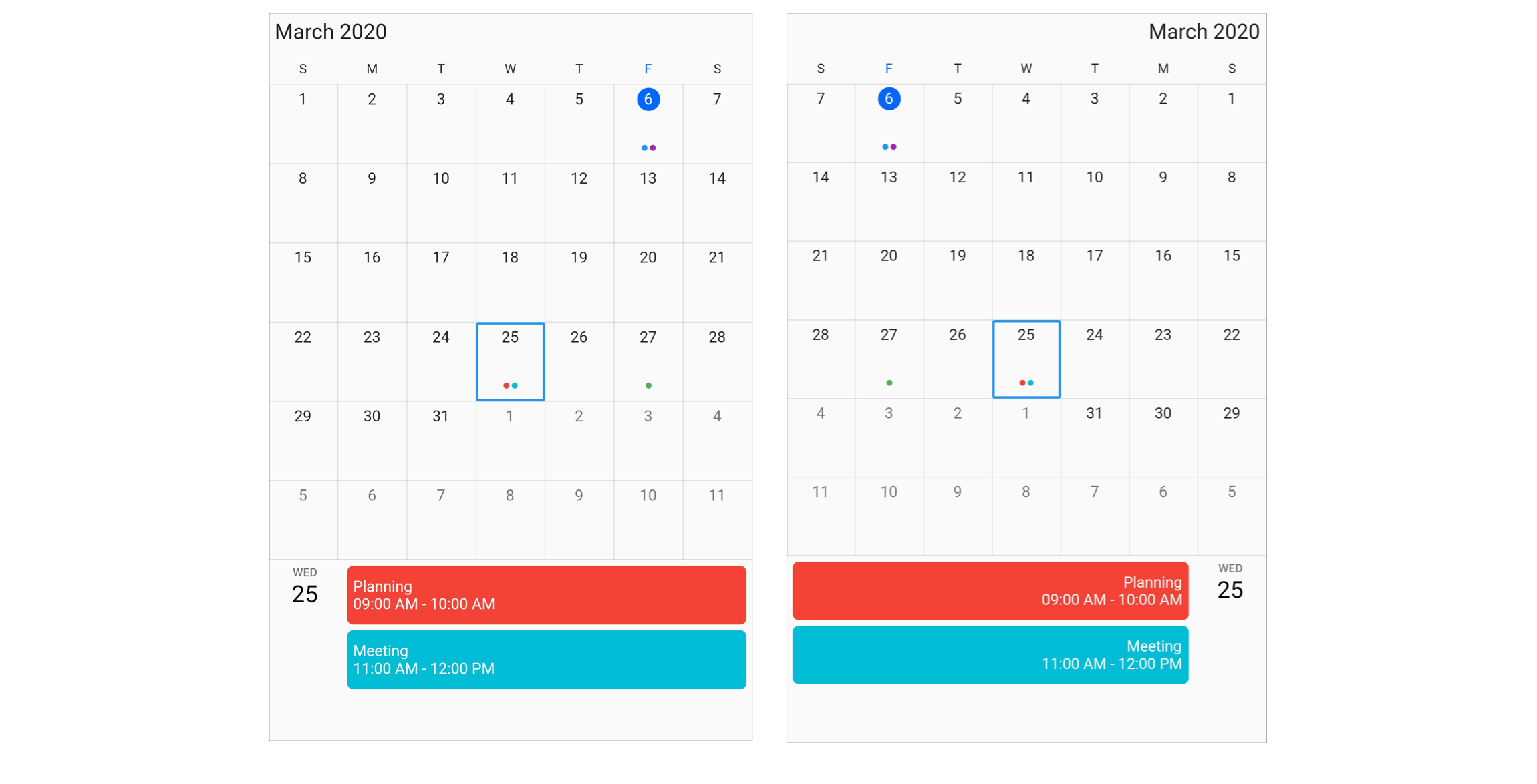
Right to Left(RTL) - Right-to-left direction support for users working in RTL languages like Hebrew and Arabic.
-
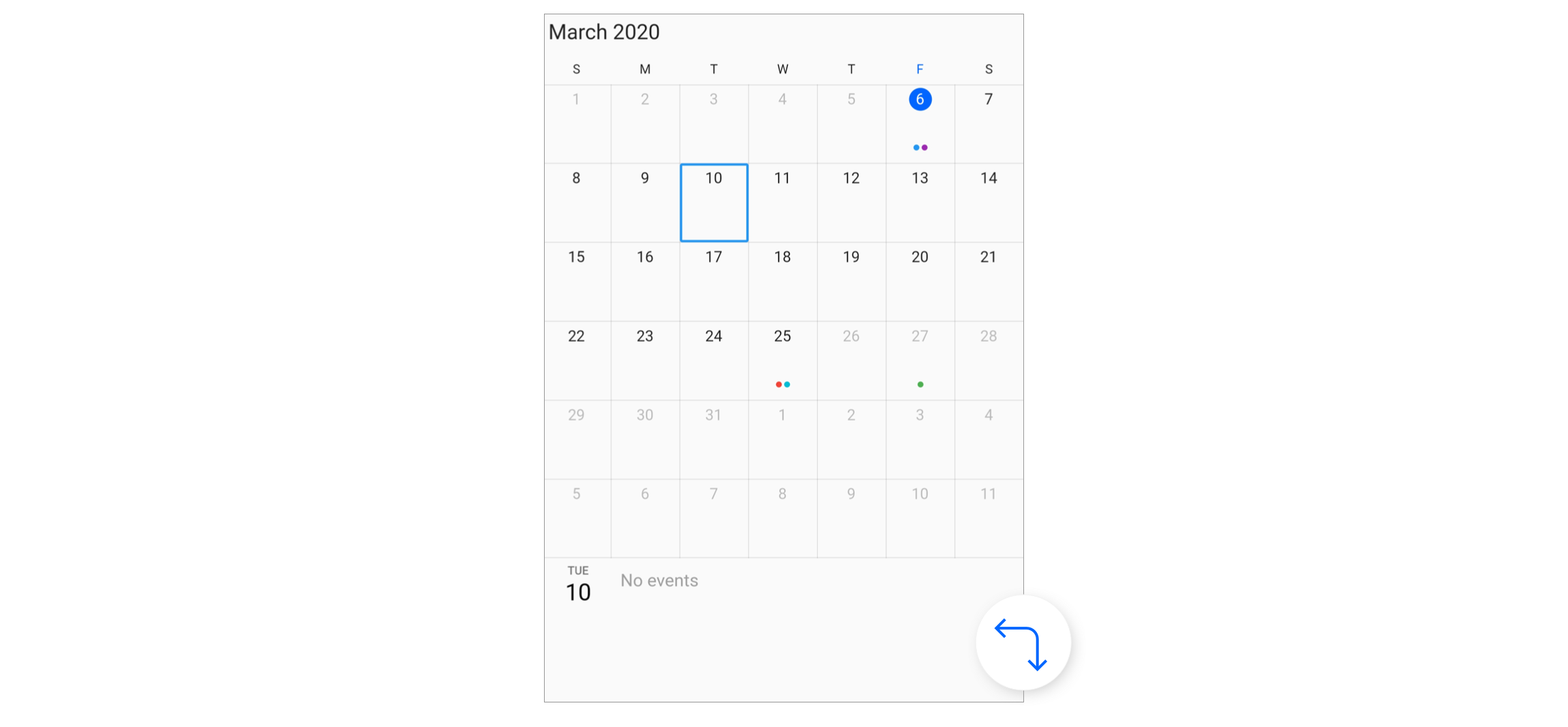
Navigation - Programmatic navigation to the previous/next views by using the calendar controller. Also, support provided to enable or disable view navigation using swipe interaction.
-
Minimum and maximum dates - Restrict the date navigation for end users by using the minimum and maximum dates.
- Web layout - Web layout improved for better experience, and now the mouse hovering effect has been applied to all the calendar elements.
- Reminder
Explore the full capabilities of our Flutter widgets on your device by installing our sample browser applications from the below app stores, and view samples code in GitHub.
Take a look at the following to learn more about the Syncfusion Flutter Calendar.
Install the latest version from pub.
Import the following package.
import 'package:syncfusion_flutter_calendar/calendar.dart';Add the Calendar widget as a child of any widget. Here, the calendar widget is added as a child of the scaffold widget.
@override
Widget build(BuildContext context) {
  return Scaffold(
      body: Container(
    child: SfCalendar(),
  ));
}The SfCalendar widget provides seven different types of views to display dates. It can be assigned to the widget constructor by using view property. By default, the widget is assigned day View. The current date will be displayed initially for all the Calendar views.
@override
Widget build(BuildContext context) {
  return Scaffold(
      body: SfCalendar(
    view: CalendarView.month,
  ));
}The default values for startHour and endHour are 0 and 24 to show all the time slots in time slot views. You can to set the startHour and endHour properties of timeSlotViewSettings to show only the required time duration for end users. You can set startHour and endHour in time duration to show the required time duration in minutes.
You can also customize the nonworking days of a week by using the nonWorkingDays property of timeSlotViewSettings to show only the required days for the end users.
@override
Widget build(BuildContext context) {
  return Scaffold(
      body: SfCalendar(
    view: CalendarView.workWeek,
    timeSlotViewSettings: TimeSlotViewSettings(
        startHour: 9,
        endHour: 16,
        nonWorkingDays: <int>[DateTime.friday, DateTime.saturday]),
  ));
}The Calendar widget will be rendered with Sunday as the first day of the week, but you can customize it to any day by using the firstDayOfWeek property.
@override
Widget build(BuildContext context) {
  return Scaffold(
      body: SfCalendar(
    view: CalendarView.week,
    firstDayOfWeek: 1,
  ));
}The Calendar month view displays a divided agenda view that is used to show the selected date’s appointments below the month. You can show the agenda view by setting showAgenda property to true in monthViewSettings.
@override
Widget build(BuildContext context) {
  return Scaffold(
      body: SfCalendar(
    view: CalendarView.month,
    monthViewSettings: MonthViewSettings(showAgenda: true),
  ));
}The Calendar widget has a built-in capability to handle appointment arrangement internally based on the appointment collections. You need to assign the created collection to the dataSource property.
You can also map custom appointment data to our calendar.
@override
  Widget build(BuildContext context) {
    return Scaffold(
        body: SfCalendar(
          view: CalendarView.month,
          dataSource: MeetingDataSource(_getDataSource()),
          monthViewSettings: MonthViewSettings(
              appointmentDisplayMode: MonthAppointmentDisplayMode.appointment),
        ));
  }

  List<Meeting> _getDataSource() {
    final List<Meeting> meetings = <Meeting>[];
    final DateTime today = DateTime.now();
    final DateTime startTime =
    DateTime(today.year, today.month, today.day, 9, 0, 0);
    final DateTime endTime = startTime.add(const Duration(hours: 2));
    meetings.add(
        Meeting('Conference', startTime, endTime, const Color(0xFF0F8644), false));
    return meetings;
  }
}

class MeetingDataSource extends CalendarDataSource {
  MeetingDataSource(List<Meeting> source){
    appointments = source;
  }

  @override
  DateTime getStartTime(int index) {
    return appointments![index].from;
  }

  @override
  DateTime getEndTime(int index) {
    return appointments![index].to;
  }

  @override
  String getSubject(int index) {
    return appointments![index].eventName;
  }

  @override
  Color getColor(int index) {
    return appointments![index].background;
  }

  @override
  bool isAllDay(int index) {
    return appointments![index].isAllDay;
  }
}

class Meeting {
  Meeting(this.eventName, this.from, this.to, this.background, this.isAllDay);

  String eventName;
  DateTime from;
  DateTime to;
  Color background;
  bool isAllDay;
}- For any other queries, reach our Syncfusion support team or post the queries through the Community forums and submit a feature request or a bug through our Feedback portal.
- To renew the subscription, click renew or contact our sales team at [email protected] | Toll Free: 1-888-9 DOTNET.
Founded in 2001 and headquartered in Research Triangle Park, N.C., Syncfusion has more than 20,000 customers and more than 1 million users, including large financial institutions, Fortune 500 companies, and global IT consultancies.
Today we provide 1,000+ controls and frameworks for web (ASP.NET Core, ASP.NET MVC, ASP.NET WebForms, JavaScript, Angular, React, Vue, Flutter, and Blazor), mobile (Xamarin, .NET MAUI, Flutter, UWP, and JavaScript), and desktop development (Flutter, WinForms, WPF, UWP, .NET MAUI, and WinUI). We provide ready-to deploy enterprise software for dashboards, reports, data integration, and big data processing. Many customers have saved millions in licensing fees by deploying our software.

