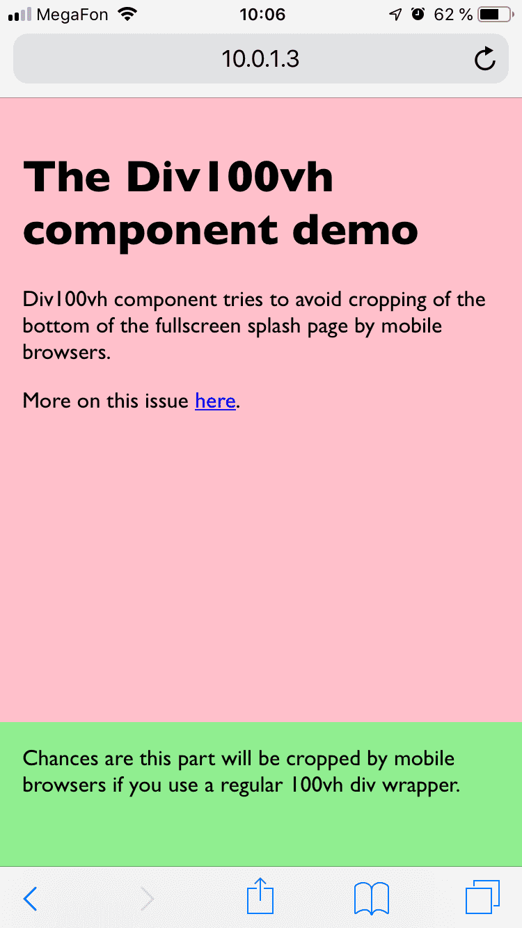
This is a workaround for iOS Safari and other mobile browsers.
At the top of the page, mobile browsers cover bottom of 100vh page with "browser chrome" (that's the name for browser navigation/context buttons, don't confuse with the browser from Google), effectively cropping it. If you have something important at the bottom of your splash screen, chances are it will not be visible/available until user scrolls.
More on this issue here.
<div style={{height: '100vh'}}> |
<Div100vh> |
|---|---|
 |
 |
Browse https://react-div-100vh.netlify.com on your phone!
- Install it:
npm install --save react-div-100vhoryarn add react-div-100vh - Import the component and wrap your stuff with
<Div100vh>as you would with a normal<div style={{height: '100vh'}}>, but this time mobile browsers should display the whole page on load:
import Div100vh from 'react-div-100vh'

const MyFullscreenComponent = () => (
  <Div100vh>
    <marquee>Your stuff goes here</marquee>
  </Div100vh>
)If you want to set min-height (or any other property) instead, you can use made up rvh ("real viewport height") units in values of an object passed to style prop. Div100vh will find any style declarations with this unit and calculate the value as a percentage of window.innerHeight:
  <Div100vh style={{minHeight: '50rvh'}}>
    <marquee>This is inside a div that takes at least 50% of viewport height.</marquee>
  </Div100vh>
If you don't specify style prop, it works as if you specified {height: '100rvh'};
<Div100vh> is equivalent to <Div100vh style={{height: '100rvh'}}>.
If you do pass anything to the style prop, no implicit style is applied. You can do something like:
<Div100vh
  style={{maxHeight: '70rvh', color: 'blue'}}
  onClick={() => console.log('hi')}
>
  <p>my content here</p>
</Div100vh>Use the dontResize prop if you dont want your <Div100vh> to resize. This is helpful if you want to have the same height when ui like mobile keyboards open.
<Div100vh dontResize={true} >
  <p>my content here</p>
</Div100vh>
The rest of the props are passed unchanged to the underlying div that Div100vh renders.
Please note that most likely you will want to set body {margin: 0} css, unless you use some css reset that does it for you.