-
Notifications
You must be signed in to change notification settings - Fork 1
android material design
#You're early! This is a work-in-progress document. You can read it though while I finish it up!
A list of Android Material Design Components and how apps can use them.
- What is Material Design?
- Material Design Components
- Dialog
- Picker
- Nav Drawer
- Right Drawer
- Bottom Sheet
- Floating Action Button (FAB)
- Sub Menu
- Menu
- Lists
- Card
- Raised Button
- Snackbar
- App Bar
- Toolbar
- Refresh Indicator
- Search Bar / Quick Entry
- Switch
- References
Material design is a comprehensive design language and guidelines developed by Google that makes use of elements from print design, responsive transitions, and depth effects.
- Description: A dialogs is small window that communicates additional information to the user and requires the user to take action (e.g., accept or cancel). Android features a number of different dialogs that are subclasses of the base class android.app.Dialog: AlertDialog, AppCompatDialog, CharacterPickerDialog, MediaRouteChooserDialog, Presentation, AlertDialog, MediaRouteControllerDialog, and ProgressDialog.
- AlertDialog: A dialog that shows a title, up to three buttons, a list of selectable items, or a custom layout.
- Using v7 appcompat library.
- Example: Alert Dialog using (android.support.v7.app.AlertDialog).
```java
import android.support.v4.app.DialogFragment import android.support.v7.app.AlertDialog;
public class MyAlertDialogFragment extends DialogFragment { @Override public Dialog onCreateDialog(Bundle savedInstanceState) { // 1. Instantiate an AlertDialog.Builder with its constructor AlertDialog.Builder builder = new AlertDialog.Builder(getActivity()); // 2. Chain setter methods to set various regions and characteristics builder.setMessage(R.string.dialog_message) .setPositiveButton(R.string.ok_text, new DialogInterface.OnClickListener() { public void onClick(DialogInterface dialog, int id) { // Do the OK action here } }) .setNegativeButton(R.string.cancel, new DialogInterface.OnClickListener() { public void onClick(DialogInterface dialog, int id) { // User cancelled the dialog } }); // 3. Create the AlertDialog object and return it return builder.create(); } } ... ... // 4. show the dialog DialogFragment myAlertDialog = new MyAlertDialogFragment(); myAlertDialog.show(getSupportFragmentManager(), "alert-tag");
```
+ Third-party libraries
  + [material-dialogs](https://github.com/afollestad/material-dialogs)

```java
import com.afollestad.materialdialogs.MaterialDialog;
import android.support.v4.app.DialogFragment;

public class RateUsDialog extends DialogFragment {
...
@Override
public Dialog onCreateDialog(Bundle savedInstanceState) {
    return new MaterialDialog.Builder(getActivity())
               .title(R.string.rateUsTitle)
               .positive(R.string.dismiss)
               .build();
    }
}
```
- External Links
- Description: A picker is essentially a dialog that allows the user to select a value from a pre-determined set of values. There are two types of Pickers: Date pickers and Time pickers:
- DatePickerDialog: A dialog that shows a UI that allows the user to select a date.
- TimePickerDialog: A dialog that shows a UI that allows the user to select a time.
public static class MyTimePickerFragment extends DialogFragment
                          implements TimePickerDialog.OnTimeSetListener {
  @Override
  public Dialog onCreateDialog(Bundle savedInstanceState) {
      // 1. Use the current time as the default values for the picker
      final Calendar c = Calendar.getInstance();
      int hour = c.get(Calendar.HOUR_OF_DAY);
      int minute = c.get(Calendar.MINUTE);

      // 2. Create a new instance of TimePickerDialog and return it
      return new TimePickerDialog(getActivity(), this, hour, minute,
              DateFormat.is24HourFormat(getActivity()));
  }

  public void onTimeSet(TimePicker view, int hourOfDay, int minute) {
      // 3. Do something with the time chosen by the user
  }
...
// 4. Show the dialog
DialogFragment myTimePicker = new MyTimePickerFragment();
myTimePicker.show(getSupportFragmentManager(), "time-picker-tag");
}- External Links
-
Using the Android Design Support Library.
<android.support.design.widget.NavigationView
  android:id="@+id/nav_view"
  android:layout_height="match_parent"
  android:layout_width="wrap_content"
  android:layout_gravity="start"
  android:fitsSystemWindows="true"
  app:headerLayout="@layout/nav_header"
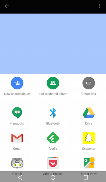
app:menu="@menu/drawer_view"/>- Description: A bottom sheet is a sheet of paper that the user can slide up from the bottom of the screen to reveal more information. There are two types of bottom sheets: Modal and Persistent. Modal Bottom Sheet is an alternative to Dialogs and usually sets at a higher elevation than the app content to show content with additional links. Persistent Bottom Sheet presents additional app content and usually rests at the same elevation as the app content.

Modal Bottom Sheet.

Persistent Bottom Sheet.
- Code Examples: Bottoms sheets can be implemented using the Design Support Library or a third-party library.
- Using the Design Support Library
- Modal Bottom Sheet: Use the
android.support.design.widget.BottomSheetDialogFragmentclass. - Persistent Bottom Sheet. Use the
android.support.design.widget.BottomSheetBehavior
- Modal Bottom Sheet: Use the
For a sample app using the design support library, see BottomSheetSample
- Using 3rd party libraries:
-
<com.flipboard.bottomsheet.BottomSheetLayout>
   ...
</com.flipboard.bottomsheet.BottomSheetLayout>
-
import com.cocosw.bottomsheet.BottomSheet;

new BottomSheet.Builder(this).title("title")
               .sheet(R.menu.list)
               .listener(new DialogInterface.OnClickListener() {
                @Override
                public void onClick(DialogInterface dialog, int which) {
                    switch (which) {
                        case R.id.help:
                            q.toast("Help me!");
                            break;
                    }
                }
            }).show();
-

The FAB can be created using an ImageButton view and giving it a special background image (Oval shape) and setting its elevation to a desired depth.
- OPTION 1: Creating FAB from scratch with custom drawable.
<ImageButton
 android:layout_width="56dp"
 android:layout_height="56dp"
 android:layout_margin="20dp"
 android:background="@drawable/oval_ripple_shape"
 android:src="@drawable/fab_plus"
 android:elevation="6dp"
 android:stateListAnimator="@anim/fab_raise"/>
drawable/oval_ripple_shape.xml
<shape xmlns:android="http://schemas.android.com/apk/res/android"
 android:shape="oval">
 <solid android:color="?attr/colorAccent"/>
</shape>
OR
<ripple xmlns:android="http://schemas.android.com/apk/res/android"
     android:color="?android:colorControlHighlight"
     android:shape="oval">
<item>
 <shape android:shape="oval">
   <solid android:color="?android:colorAccent"/>
 </shape>
</item>
</ripple>- OPTION 2: Using The Design Support Library.
<android.support.design.widget.FloatingActionButton
... />- OPTION 3: Using third party libraries.
 <com.melnykov.fab.FloatingActionButton
.... /><com.getbase.floatingactionbutton.FloatingActionButton
..../>http GET 'http://localhost:3000/q?queryText=MATCH app WHERE \
<android.support.design.widget.FloatingActionButton/> \
<date-published>(*)</date-published> \
RETURN app, l$1 as releasedOn'Scrolling interaction effect can change an element's width, height, and elevation. It can be used to show how an element can raise up to allow another surface to pass below it during scrolling. Several material design scrolling techniques are illustrated in the material design guidelines. For example, using an appBar that collapses to a standard height and sticks to the top of the screen as the user scrolls. We can build this effect using the CoordinatorLayout, which coordinates behavior (e.g., scrolling) across its child views.
<android.support.design.widget.CoordinatorLayout>
  <android.support.design.widget.AppBarLayout>
    <android.support.design.widget.CollapsingToolbarLayout
        app:layout_scrollFlags="scroll|exitUntilCollapsed">
        <android.support.v7.widget.Toolbar/>
    </android.support.design.widget.CollapsingToolbarLayout>
  </android.support.design.widget.AppBarLayout>
  <android.support.v7.widget.RecyclerView
    android:layout_behavior="@string/app_scrolling_view_behavior"/>
</android.support.design.widget.CoordinatorLayout>
- Description: RecyclerView is a more advanced version of ListView and can be used to implement a scrollable list of items. For usage example, see lists with material design style.
- Screenshot:
In layout XML file:
<android.support.v7.widget.RecyclerView
   .../>
In code:
class name: android.support.v7.widget.RecyclerView
method name: setLayoutManager, setAdapter
A CardView with shadows and rounded corners and contains a child TextView:
<android.support.v7.widget.CardView
    xmlns:card_view="http://schemas.android.com/apk/res-auto"
    card_view:cardElevation="4dp"
    card_view:cardCornerRadius="3dp">
    <TextView
         android:id="@+id/info_text"
         android:layout_width="match_parent"
         android:layout_height="match_parent" />
</android.support.v7.widget.CardView>
- Description: A snackbar is similar to Toast in that they provide feedback but they have actions to allow users to interact. The official guidelines recommends using at most one action or no action.
class: android.support.design.widget.Snackbar methods: make, setAction, show
import android.support.design.widget.Snackbar;
Snackbar.make(parentView, R.string.snackbar_text, Snackbar.LENGTH_LONG)
.setAction("UNDO", myOnClickListener)
.show();- Description: The app bar is formerly known as the action bar. It's a special kind of the more general widget called Toolbar. An app bar may contain on the left side (in LtR langauges) a navigation icon (hamburger icon) to open a navigation drawer or an up arrow for navigating upward through the hierarchy, a title that reflects the current page, filter icon. On the right side, it may contain action icons or a menu icon.
- Description: Toolbar is a more general form of the app bar. It may contain a navigation icon, branded logo image, title and subtitle, action items, and an action item. Toolbar provides developer with a much more control over the look and functionality.
   <android.support.v7.widget.Toolbar
        android:id="@+id/toolbar"
        android:layout_width="match_parent"
        android:layout_height="wrap_content"
        app:popupTheme="@style/ThemeOverlay.AppCompat.Light"
app:layout_collapseMode="pin" /> @Override
public void onCreate(Bundle savedInstanceState) {
final Toolbar toolbar = (Toolbar) findViewById(R.id.toolbar);
setSupportActionBar(toolbar);
}- Description: Show a refresh indicator when the users manually uses a vertical swipe gesture to refresh the content (e.g., pulling down).
- Screenshot:
-
Code Examples:
You can implement the pull-down-to-refresh UI pattern by making the
SwipeRefreshLayoutthe parent ofListView,RecyclerView, orGridView.
<android.support.v4.widget.SwipeRefreshLayout>
   <ListView />
</android.support.v4.widget.SwipeRefreshLayout>