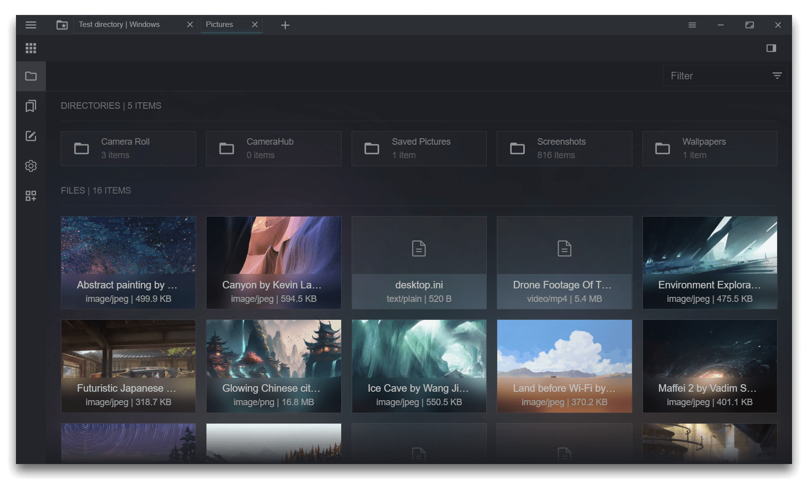
Advanced virtual scrolling module for Vue 3.
Originally created for the parent project: Sigma File Manager v2.
- Supports complex list view.
- Supports complex grid view.
- Programmatic control.
- Grid view generates automatically based on the specified min column width, and adapts to the viewport / window size.
- Supports arbitrary dynamic item height, row and column gaps.
- Allows to build complex virtual scrollers programmatically with spacers, dividers and item groups of different sizes.
- Supports custom scrollbars.
- Emits many useful events, including scroll statuses like
is-scrolling,bottom-reached, etc. - Scrollbar doesn't jitter when scrolling because the item height is known in advance.
| Your logo here |
| Platform | Address |
|---|---|
| Patreon (monthly, with rewards)
By joining, you will get all rewards of the related parent project: Sigma File Manager |

|
| Buymeacoffee |

|
| BTC |
bc1qv5ujcuwjsk505qjhd3sptcf3xpvjktqjxj0wrc
|
| USDT (Tron TRC-20) |
TN3hFLmjY2eXR149yKMq1qZQotmZbTGV4a
|
npm install sigma-scrollkit
The module renders a list of virtual rows (virtual entries) in both the list and grid views. The difference is that in list view the column count is always 1.
interface VirtualEntryItem {
  [key: string]: unknown;
}

export interface VirtualEntry {
  id: number | string;
  height: number;
  rowGap: number;
  columnGap: number;
  items: VirtualEntryItem[];
  [key: string]: unknown;
}

interface Props {
  virtualEntries: VirtualEntry[];
  scrollerId: string;
  layoutType: "list" | "grid";
  minColumnWidth?: number;
  bufferItemCount?: number;
  calcExtraInfo?: boolean;
  topOffsetTrigger?: number;
  bottomOffsetTrigger?: number;
}<script setup>
import {VirtualScroller, VirtualScrollerRow} from 'sigma-scrollkit'
import type {VirtualEntry} from 'sigma-scrollkit/types/shared';
// ...
</script>
<template>
<VirtualScroller
ref="virtualGridRef"
layout-type="grid"
:scroller-id="0"
:virtual-entries="formattedDirEntries"
:min-column-width="minColumnWidth"
@viewport-mounted="onViewportMounted"
@top-reached="onTopReached"
@bottom-reached="onBottomReached"
@is-scrollable="onIsScrollable"
>
<template #viewport="{ renderedItems, scrolling, maxColumns }">
<VirtualScrollerRow
v-for="virtualEntry in renderedItems"
:key="virtualEntry.id"
:virtual-entry="virtualEntry"
:max-columns="maxColumns"
>
<Component
:is="componentReference[virtualEntry.component]"
v-for="(item, index) in virtualEntry.items"
:key="index"
:height="virtualEntry.height"
:hover-enabled="!scrolling"
:dir-entry="item"
layout-type="grid"
v-bind="'props' in item && item.props"
:style="`height: ${virtualEntry.height}px`"
/>
</VirtualScrollerRow>
</template>
</VirtualScroller>
</template>The module exports 2 components:
VirtualScroller- main container component, calculates all the logic and renders virtual list / grid.VirtualScrollerRow- component needed to wrap each row in the virtual container.
- Required:
true - Type:
VirtualEntry[]
- Required:
true - Type:
string
- Required:
true - Type:
'list' | 'grid'
- Required:
false - Type:
number
- Required:
false - Type:
number
- Required:
false - Type:
boolean - Description: if
true, extra data properties will be calculated and emited in thescrollevent:scrollSpeed: current scroll speed
- Type:
{viewport: Ref<HTMLElement | null>; selector: string}
- Type:
ScrollEmitValue
- Type:
boolean
- Type:
boolean
- Type:
boolean
- Type:
boolean
- Required:
true - Type:
VirtualEntry
- Required:
true - Type:
number
