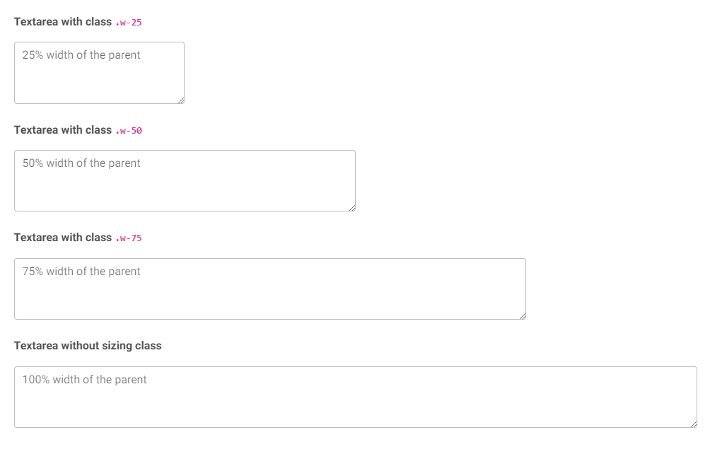
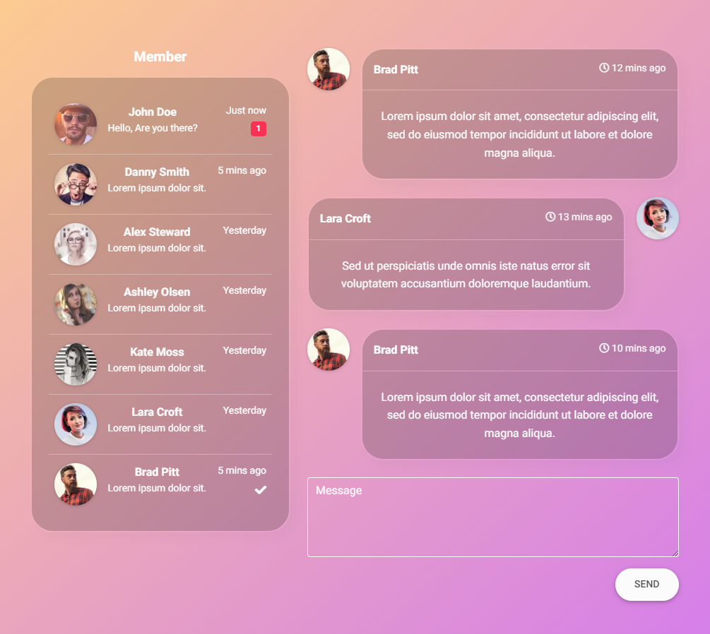
Responsive textarea built with Bootstrap 5. How to change size, height, width and style. Examples of comments, contact form, checkout and chat.
Check out Bootstrap Textarea Documentation for detailed instructions & even more examples.
<div class="form-outline">
  <textarea class="form-control" id="textAreaExample1" rows="4"></textarea>
  <label class="form-label" for="textAreaExample">Message</label>
</div>A Bootstrap Textarea is an input dedicated to a large volume of text. It may be used in a variety of components like forms, comment sections, chats and forums.
Textarea can hold an unlimited number of characters, and the text renders in a fixed-width font.
The name attribute is needed to reference the form data after the form is submitted (if you omit the name attribute, no data from the text area will be submitted).
The id attribute is needed to associate the text area with a label.
-
Download MDB 5 - free UI KIT
-
Choose your favourite customized component and click on the image
-
Copy & paste the code into your MDB project
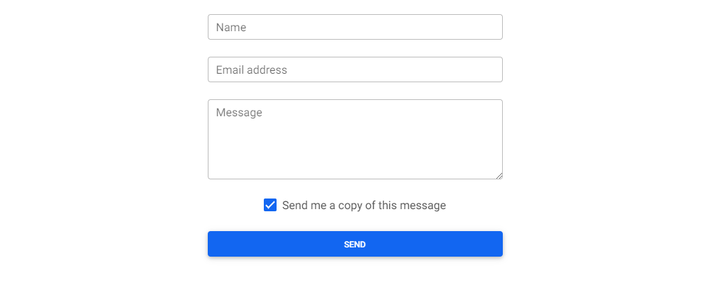
Bootstrap Textarea Contact form:
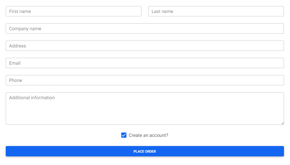
Bootstrap Textarea Checkout form:
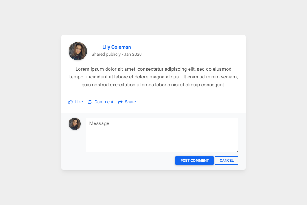
Bootstrap Textarea Simple comment card:
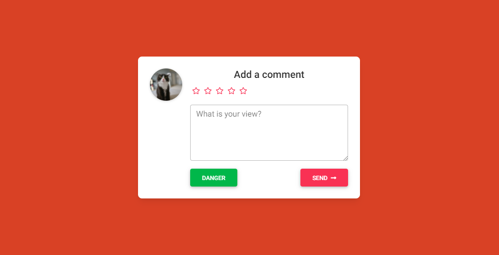
Bootstrap Textarea Add a comment:
- Bootstrap Address Form
- Bootstrap Avatar
- Bootstrap Back To Top Button
- Bootstrap Carousel Slider with Thumbnails
- Bootstrap Chat
- Bootstrap Code Blocks
- Bootstrap Comments
- Bootstrap Comparison Table
- Bootstrap Credit Card Form
- Bootstrap Drawer
- Bootstrap Nested Dropdown
- Bootstrap FAQ component / section
- Bootstrap Gallery
- Bootstrap Hamburger Menu
- Bootstrap Invoice
- Bootstrap Jumbotron
- Bootstrap Login Form
- Bootstrap Maps
- Bootstrap Media Object
- Bootstrap Mega Menu
- Bootstrap Multiselect
- Bootstrap News Feed
- Bootstrap Offcanvas
- Bootstrap Order Details
- Bootstrap Page Transitions
- Bootstrap Payment Forms
- Bootstrap Product Cards
- Bootstrap Profiles
- Bootstrap Quotes
- Bootstrap Registration Form
- Bootstrap Expanding Search Bar
- Bootstrap Shopping Carts
- Bootstrap Side Navbar
- Bootstrap Sidebar
- Bootstrap Social Media Icons & Buttons
- Bootstrap Square Buttons
- Bootstrap Survey Form
- Bootstrap Testimonial Slider
- Bootstrap Testimonials
- Bootstrap Textarea
- Bootstrap Timeline
- Bootstrap To Do List
- Bootstrap Video Carousel / Gallery
- Bootstrap Weather


