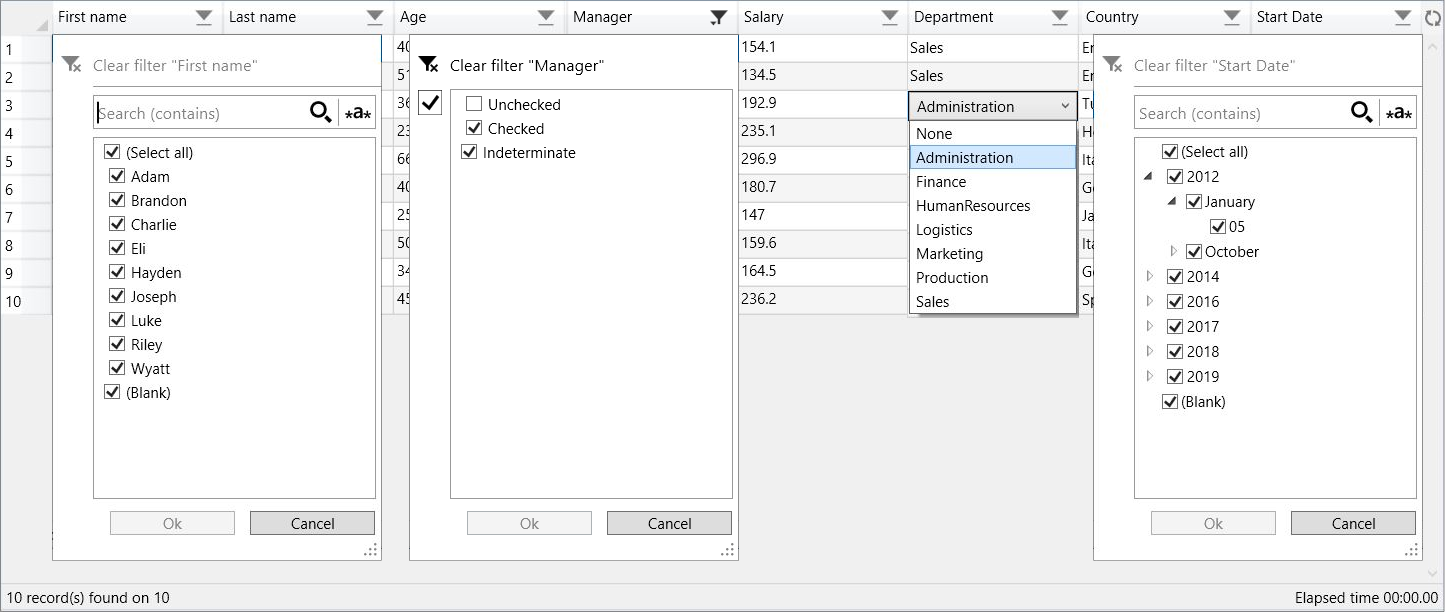
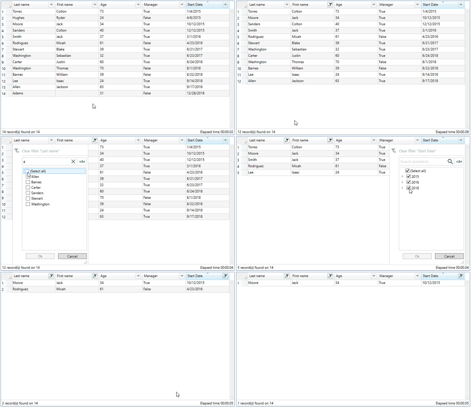
A DataGrid control that inherits from the base DataGrid control class and override some methods to implement filters
for each column like Excel, in automatic or custom generation.
Support for nested objects and filter persistence.
Translation of labels and formatting of dates in the following languages: Czech, Chinese(traditional and simplified), Dutch, English, French, German, Hebrew, Hungarian, Italian, Japanese, Polish, Portuguese, Russian, Spanish, Turkish, Ukrainian.
The translations are from google translate, if you find any errors or want to add other languages, please let me know.
The Nuget package is available here.
To understand how the filter works, you can consult the article posted on CodeProject.
-
There are two ways to install :
-
NuGet command : Install-Package FilterDataGrid
-
Or manually add FilterDataGrid.dll as reference in your project
-
Add Namespace :
xmlns:control="http://filterdatagrid.control.com/2021"
or
xmlns:control="clr-namespace:FilterDataGrid;assembly=FilterDataGrid"
-
Control
  <control:FilterDataGrid
  FilterLanguage="English" DateFormatString="d" ShowStatusBar="True" ShowElapsedTime="False"
  ExcludeFields="lastname,age,manager" ...
-
Properties
-
DateFormatString : date display format, default : "d"
warning: Before version 1.2.5.2, you must set the "Time" part of the DateTime fields to zero, otherwise the filter doesn't work. see the documentation
-
ExcludeColumns 🆕 : name of fields to exclude from displayed columns, separated by commas, only works in AutoGenerateColumns mode
-
ExcludeFields : name of fields separated by commas to exclude from the filter, only works in AutoGenerateColumns mode
-
FilterLanguage : translation into available language, default : English
-
PersistentFilter : enable/disable filter persistence , default : false
-
ShowElapsedTime : displays the elapsed time of filtering in status bar, default : false
-
ShowRowsCount : display the number of rows, default : false
If the value passed to RowHeaderWidth is greater than the calculation of the width of the column, this is the one that is used.
-
ShowStatusBar : displays the status bar, default : false
-
FilterPopupBackground : set a custom background color for the filter popup, default : Background color of host window.
If FilterPopupBackground is not set, the background color of the main window is used.
-
-
Custom TextColumn / CheckBoxColumn
If you add custom columns, you must set AutoGenerateColumns="False"
<control:FilterDataGrid.Columns>
    <control:DataGridTextColumn     IsColumnFiltered="True" ... />
    <control:DataGridCheckBoxColumn IsColumnFiltered="True" ... />
-
Custom TemplateColumn
⚠️ FieldName property of DataGridTemplateColumn is required<control:FilterDataGrid.Columns> <control:DataGridTemplateColumn IsColumnFiltered="True" FieldName="LastName" ... />
-
Custom ComboBoxColumn 🆕
⚠️ SelectedItemBinding or SelectedValueBinding property is required.
The SelectedValuePath property is not required in case ItemsSource is an enumeration.
In the case where the field is a nested object, enter the entire path of this field, e.g: Country.NameDemo application contains several types of combo-box implementation, for greater clarity
some are commented but completely operational.<control:FilterDataGrid.Columns> <control:DataGridComboBoxColumn IsColumnFiltered="True" DisplayMemberPath="<name of the field to display the value (from the datagrid list)>" ItemsSource="{Binding <external list or enum>}" SelectedValueBinding="{Binding <unique identifier (from the datagrid list)>}" SelectedValuePath="<unique identifier of external list>" ... />
You can define a global style which overrides the default style of "FilterDataGrid"
⚠️ The ComponentResourceKey is obsolete from version 1.2.7BasedOn="{StaticResource {ComponentResourceKey TypeInTargetAssembly=control:FilterDataGrid, ResourceId=FilterDataGridStyle}}"
 <Application.Resources>
  <Style
            x:Key="FilterDatagridStyle" TargetType="{x:Type control:FilterDataGrid}">
            <Setter Property="Margin" Value="10" />
            <Setter Property="RowHeaderWidth" Value="40" />
            ...
  </Style>
 </Application.Resources>

  <!-- usage -->
<control:FilterDataGrid Style="{StaticResource FilterDatagridStyle}" ...Enabling the PersistentFilter property saves a json file in the application folder that contains the status of active filters, any modification of the filters is immediately saved until the closing of the application, it is this state of the filters which will be loaded during the new launch of the application.
The name of the json file is inferred from the name you give to your FilterDataGrid control.
<control:FilterDataGrid x:Name="MyFilterDatagrid"If it is not provided, the type name of the source collection is used, for example for a generic list of type Employees, Employees will be used
// collection used as ItemsSource
List<Employees>
Two methods (LoadPreset/SavePreset) are exposed to be able to manually manage loading and saving from the host application.
These methods are independent of the PersistentFilter property whatever its state.
// Load Preset
MyFilterDatagrid.LoadPreset();

// Save Preset
MyFilterDatagrid.SavePreset();
Be aware that the filters must remain consistent with your source collection, for example if you filter on a "True" Boolean field and when the application is launched your collection no longer contains the "True" value for this field, the filter application may cause unexpected results.
This is especially true for demo applications that use random data generation.
Intel Core i7, 2.93 GHz, 16 GB, Windows 10, 64 bits.
Tested on the "Last name" column of the demo application using a random distinct name generator, between 5 and 8 letters in length.
The elapsed time decreases based on the number of columns and filtered items.
| Number of rows | Opening of the PopUp | Applying the filter | Total (PopUp + Filter) |
|---|---|---|---|
| 10 000 | < 1 second | < 1 second | < 1 second |
| 100 000 | < 1 second | < 1 second | < 1 second |
| 500 000 | ± 1.5 second | ± 1 second | ± 2.5 seconds |
| 1 000 000 | ± 3 seconds | ± 1.5 seconds | ± 4.5 seconds |


