-
Notifications
You must be signed in to change notification settings - Fork 4.3k
New issue
Have a question about this project? Sign up for a free GitHub account to open an issue and contact its maintainers and the community.
By clicking “Sign up for GitHub”, you agree to our terms of service and privacy statement. We’ll occasionally send you account related emails.
Already on GitHub? Sign in to your account
Align Dropdown and DropdownMenu styles #18631
Conversation
| @@ -0,0 +1,3 @@ | |||
| .components-dropdown { | |||
| display: inline-block; | |||
There was a problem hiding this comment.
Choose a reason for hiding this comment
The reason will be displayed to describe this comment to others. Learn more.
Thanks for fixing this! Changing the display of the div makes sense. Can confirm it's working in Storybook 👍
There was a problem hiding this comment.
Choose a reason for hiding this comment
The reason will be displayed to describe this comment to others. Learn more.
@youknowriad Tested in Docker + Storybook, and it's working as expected. Awesome job 🚀 .
I decided to leave the toolbar hover style fix for a separate...
I agree 👍
|
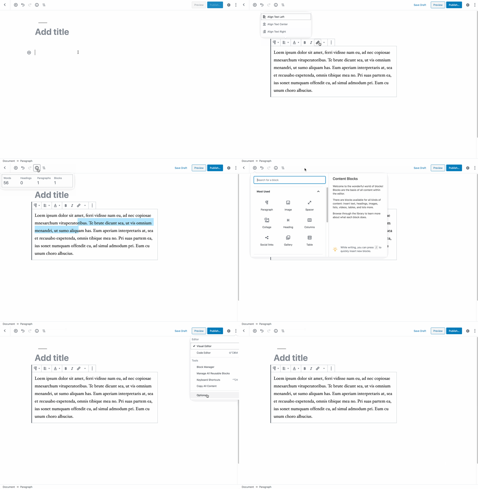
When trying to work on the toolbar buttons style alignments, I noticed that it basically comes down to remove styles from the The hover style is not consistent but bigger than it was before. It could be considered a very small visual regression but I think consistency wins here and if we were to restore the smaller hover style, we should restore it for all components consistently. |
|
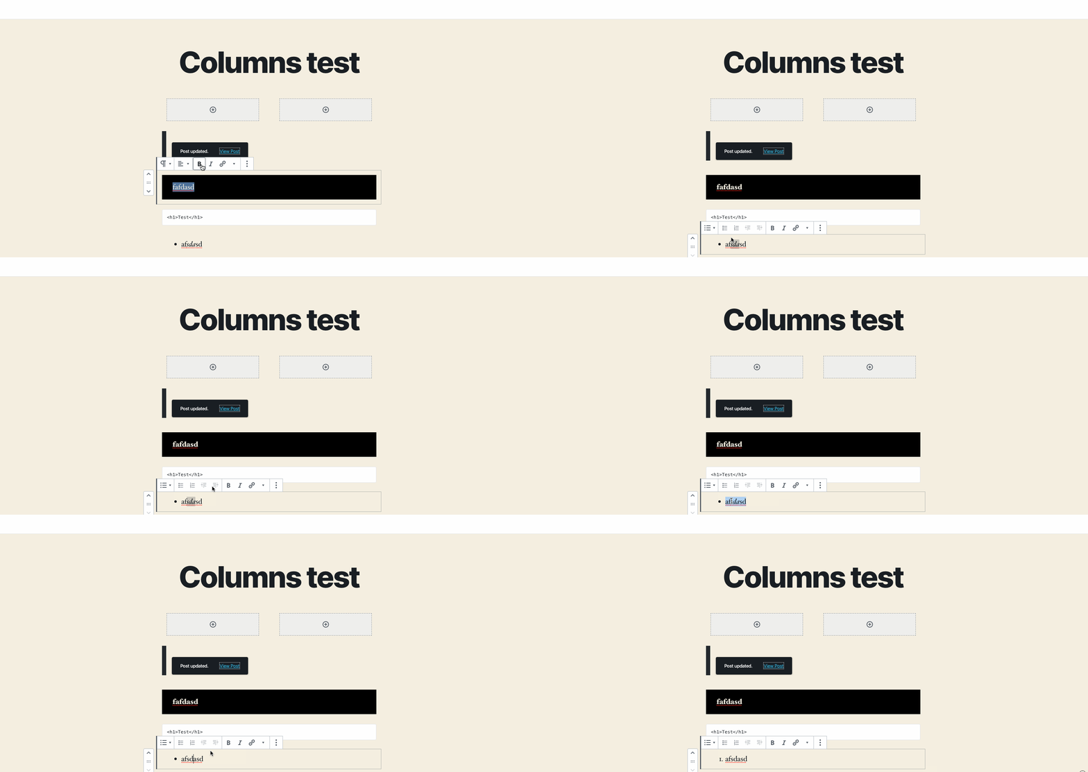
I noticed that this change created regression for toolbar buttons: When they are toggled they no longer change their visual appearance. This is how it worked before 7.0: Filed in #18825. |


Closes #8559
While working on #18624 I notice that if I use Dropdown or DropdownMenu, the styling of the DropdownToggle is different. This PR tries to address that by:
The downside here is that the specific styles for the Toggle in DropdownMenu were specifically targetted to match the styling of
ToolbarButton(block toolbars) which means the size of the regular buttons and the dropdowns (hover) is not consistent now. My thinking at the moment is that we should fix this by removing the specific styles forToobarButtonand instead make sure anyIconButton(ToolbarButton or not) insideToolbarcomponent should be adapted (hover styles with a smaller size).I decided to leave the toolbar hover style fix for a separate PR but if you think the breakage in the current PR is severe enough, I'm happy to do everything in the same PR. I preferred not including here to keep the size of the PR smallish.
I also added a temporary story to the Dropdown component where we show both a DropdownMenu and a Dropdown in the same canvas to be able to compare them.