-
Notifications
You must be signed in to change notification settings - Fork 4.2k
New issue
Have a question about this project? Sign up for a free GitHub account to open an issue and contact its maintainers and the community.
By clicking “Sign up for GitHub”, you agree to our terms of service and privacy statement. We’ll occasionally send you account related emails.
Already on GitHub? Sign in to your account
Restore the block hover and focus styles in Unified Toolbar mode. #11737
Restore the block hover and focus styles in Unified Toolbar mode. #11737
Conversation
|
Could you add some screenshots to this pull request to make it clearer what the before/after of these changes should look like? |
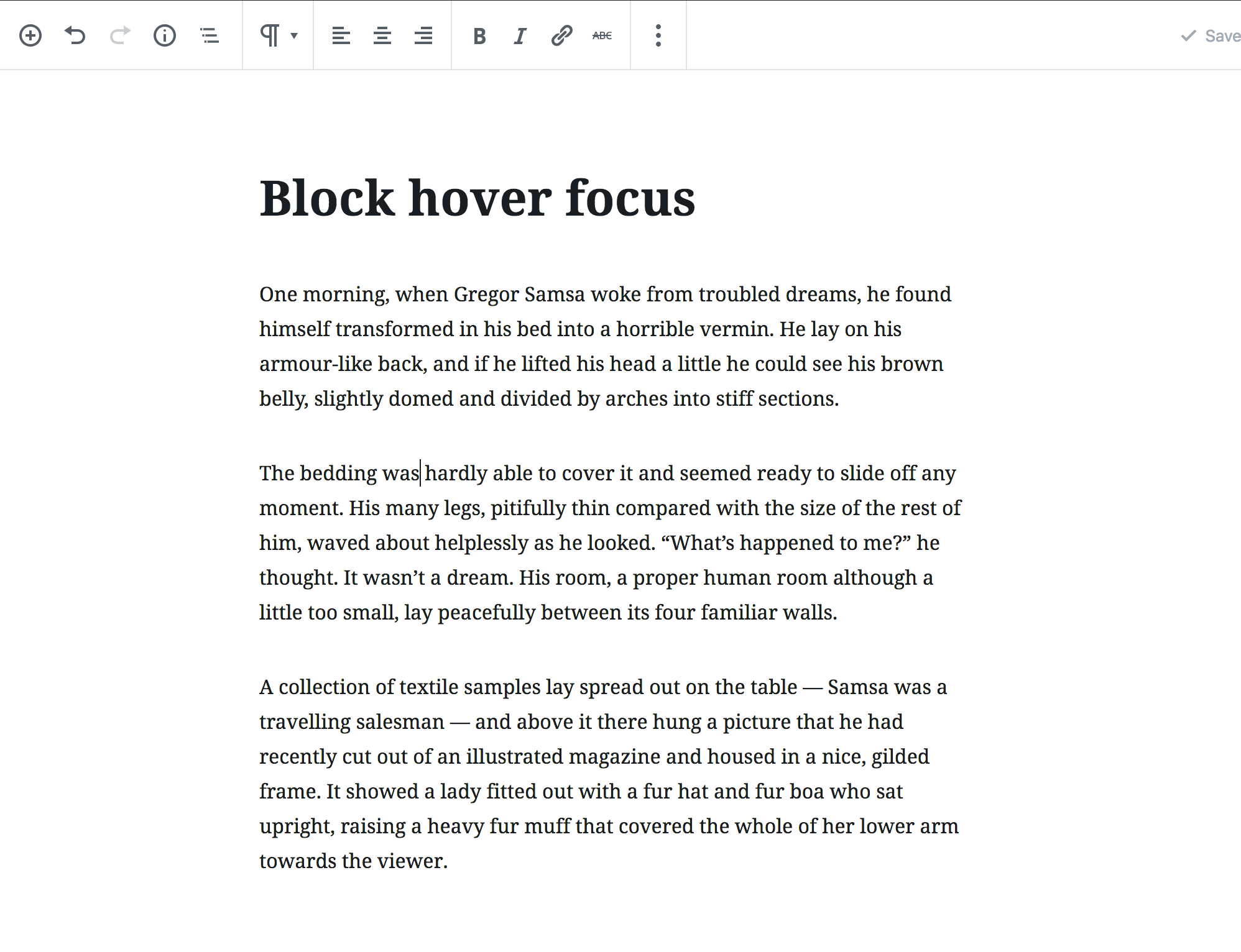
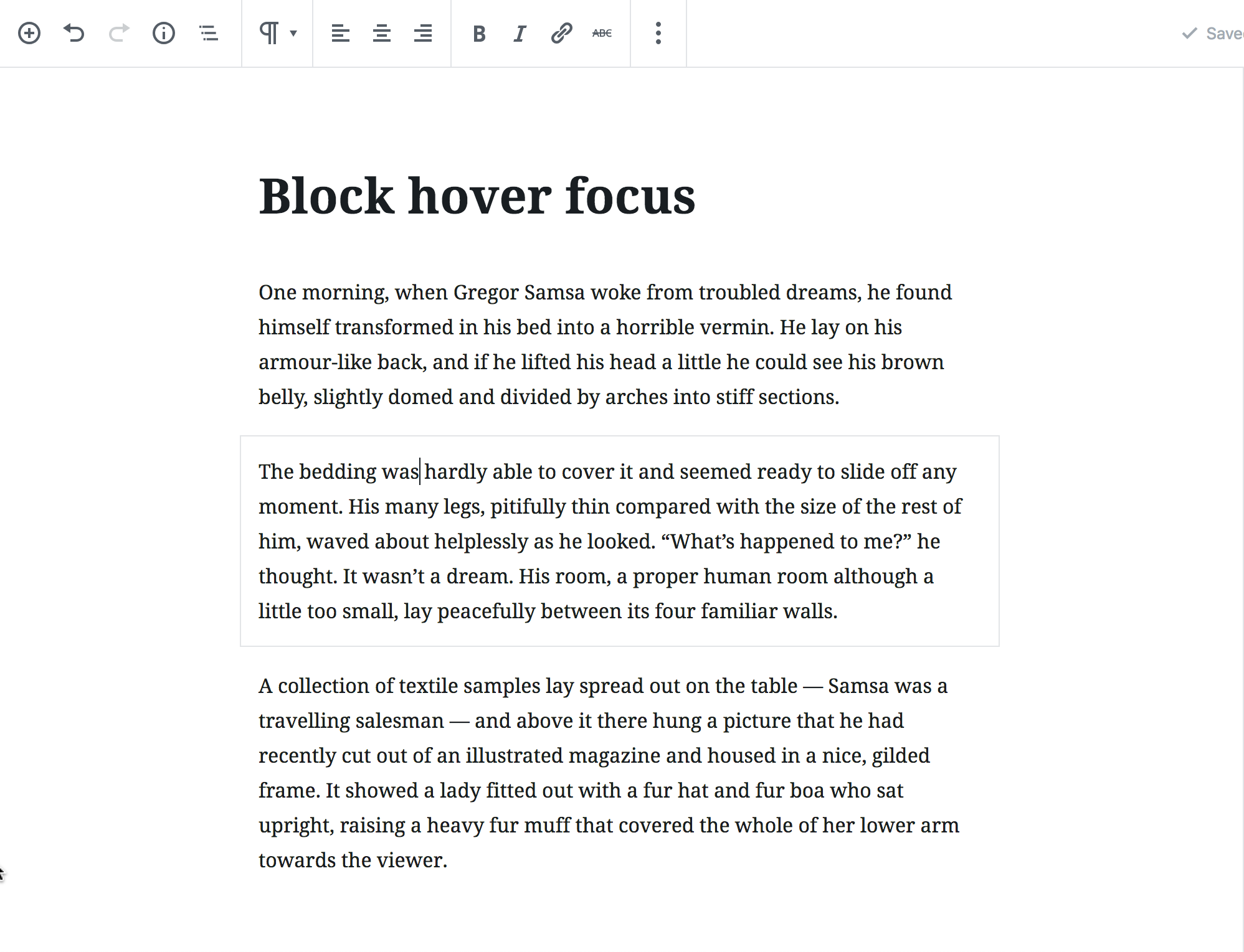
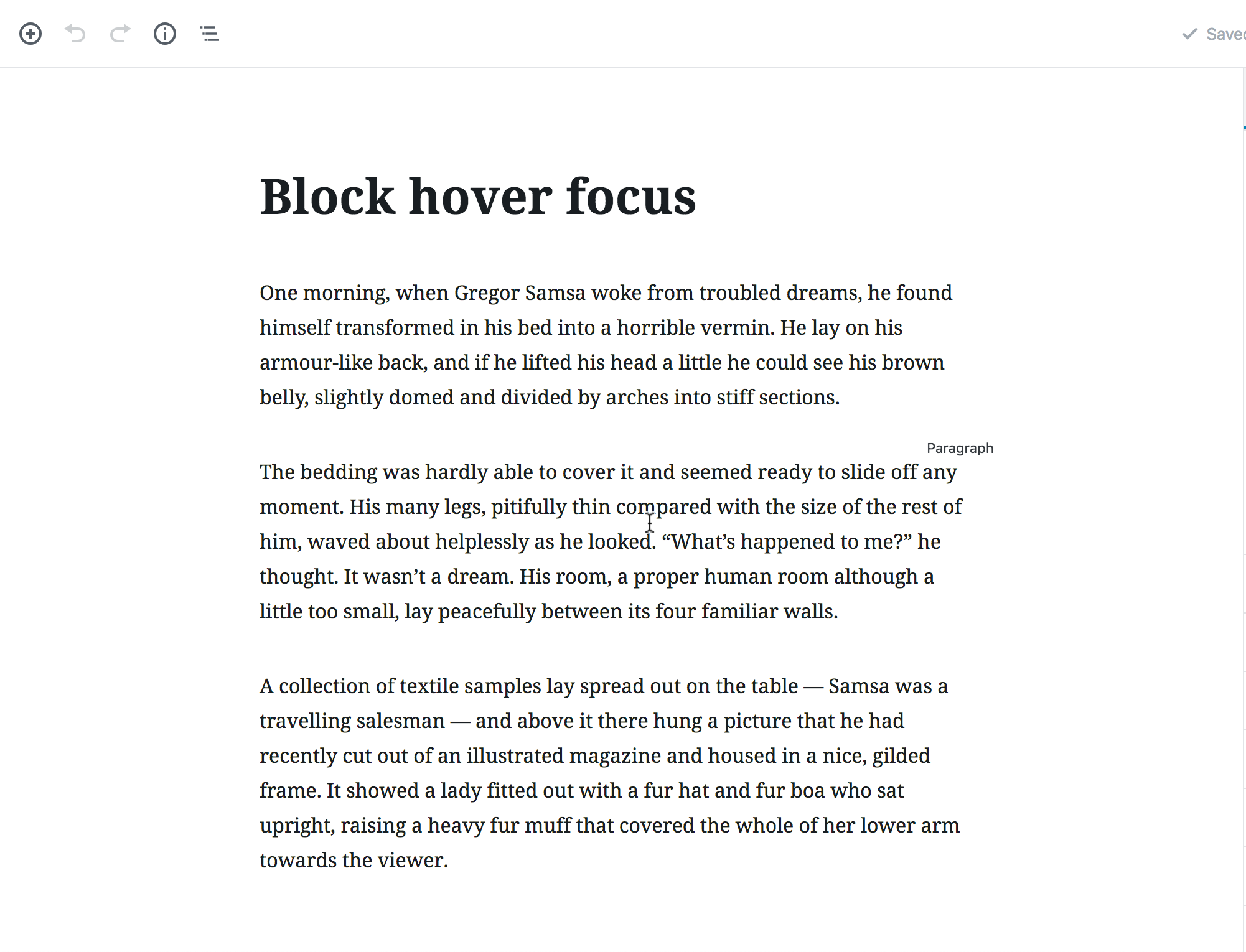
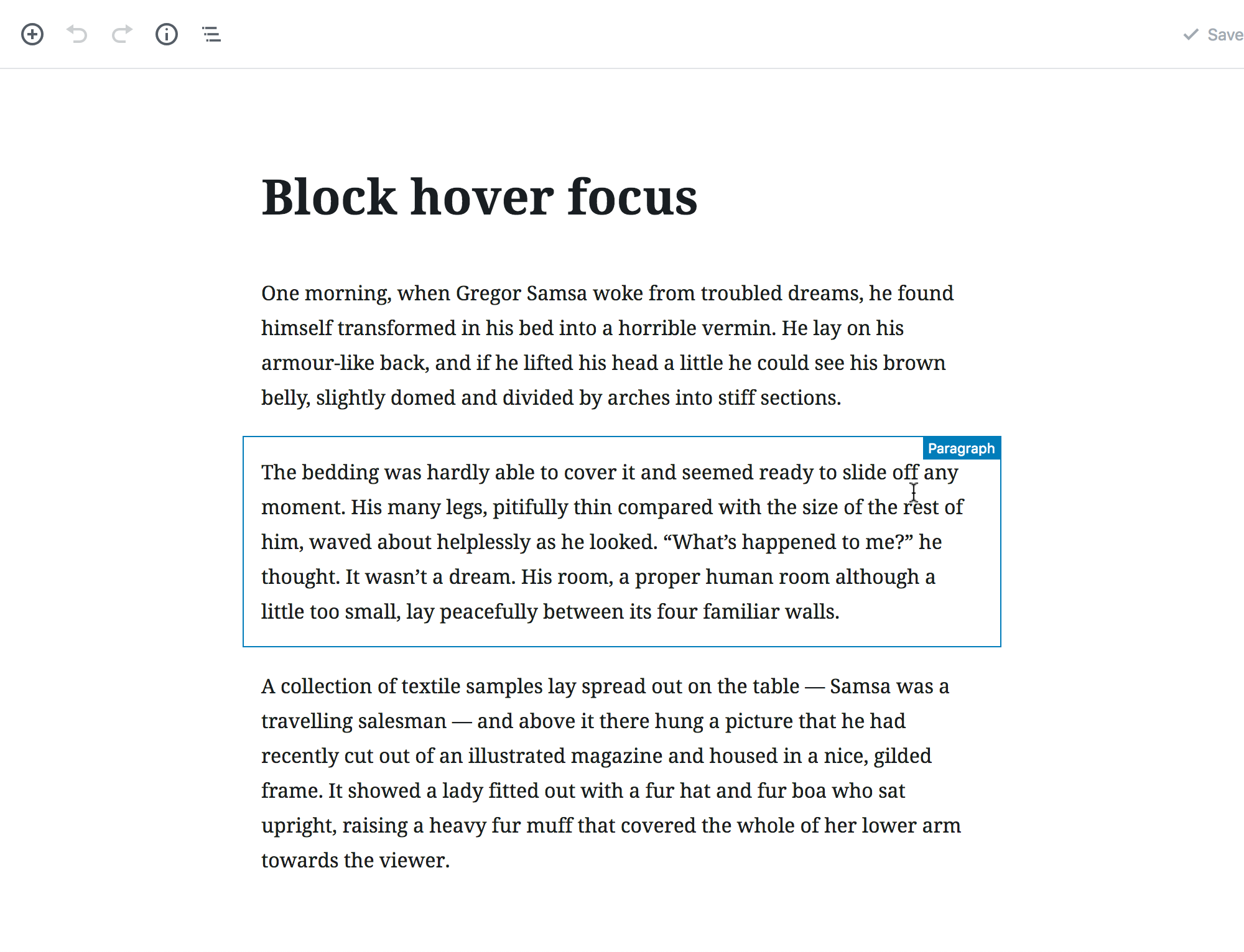
It just restores the default styles used in the default mode. Anyways, here's the screenshots: focus before (caret is in the second block): focus after: hover before: hover after: 2 considerations:
|
There was a problem hiding this comment.
Choose a reason for hiding this comment
The reason will be displayed to describe this comment to others. Learn more.
On hover there's a more visible blue border. I wonder why the hover style is more prominent than the focus style.
This is intentional because the really intense hover style on focus is a bit distracting.
I am for this change because it makes things consistent, and something like spotlight mode should be what does away with/controls these hover/focus states, not the toolbar positioning.
I also see the benefit in some kind of higher-contrast option that enables more intense focus colours, but I think that should be separate.
cc'ing some others for their feedback because while I like this, I don't think I have final design say 😉
|
Agree to wait a bit for final feedback.
I'd like to remind everyone that for non-text contrast (user interface components) the contrast requirement is at least 3:1. |
e0151da to
ae49092
Compare
|
Pushed a change with the suggestion in #10559. I think the selected outline contrast could be increased slightly. |
There was a problem hiding this comment.
Choose a reason for hiding this comment
The reason will be displayed to describe this comment to others. Learn more.
Design wise approving.
|
This looks good in my testing. With the final design approval we are good to go in merging this. Woohoo Thanks all! Fixes #10559 |
|
Let's also continue the conversation around hover states across the two modes separately. This improves the selection state which seemed the most important. We could also look at increasing the contrast of the selected state too. |
|
Thanks. @mtias on the related issue, some new contributors at WordCamp Milano asked you some feedback. It would be nice from you to reply to encourage participation of new contributors, as this is one of the main goals of an open source project. Thank you. |
|
Also, seems the latest commit didn't update a few snapshots? The build failed /Cc @mtias @antpb . |
|
@afercia I missed that ping, thanks. |
|
@karmatosed nice |


Description
The Unified Toolbar mode should not remove outlines. This was discussed and agreed by the accessibility team and it's our recommendation as a team.
For example, I may find Unified Toolbar mode useful for my workflow but, as a user with vision impairments, still want a clear indication of hover and focus on the blocks. Instead, I can't use Unified Toolbar because it removes focus indication.
Quoting from the related issue #10559
This PR is an effort to propose a positive action. It partially reverts #9394. An option for a lighter UI when writing is already available with "Spotlight Mode" and as a team we feel that's the proper place for UI modifications that are clearly extraneous to a "Unified Toolbar" option.
Fixes #10559