-
Notifications
You must be signed in to change notification settings - Fork 26
New issue
Have a question about this project? Sign up for a free GitHub account to open an issue and contact its maintainers and the community.
By clicking “Sign up for GitHub”, you agree to our terms of service and privacy statement. We’ll occasionally send you account related emails.
Already on GitHub? Sign in to your account
Data Visualizations for Yearn #89
Comments
|
Great project. Lfg. |
|
Update for the first week! The Aim for This WeekWe spent most of our time preparing the new server and finishing off some housekeeping work in the data repo. Another focus for this week was to try out the whole process of publishing an article/tweet, tracking some user metrics, and doing follow-ups and RTs if necessary. What We Actually Did
Plans for Next WeekIt seems we would need some more lead time before we can actually start on the efficient frontier. |
|
Update for the second week! The Aim for This WeekOur primary focus for this week was to try out a simple tweet and prepare the data pipelines for it. The mismatches will be handled soon after we launch the initial version of the frontend and the weekly tweets. I would like to share some details about it here for the record:
What We Actually Did
Plans for Next WeekWe are set with the initial contents for the tweet - sharing the vaults that have the highest APY - and the channels to share it, which are the YFI Interns twitter account and the data-science workgroup in discord. We will go over the data for a few more days and post it on Tuesday the 27th. We are also planning to spin up a development server for the frontend next week. The Yearn Vaults' Stablecoins Report and the draft for the efficient frontier will be hosted on the server. The efficient frontier visualization will be honed to deliver the right narrative, it seems like the current pipeline can show us only the distinction between the USD backed and the ETH backed pools. |
|
Update for the third week! The Aim for This WeekOur main focus for this week was twofold: to create the initial draft for the efficient frontier visualization and to finally finish the migration of the previous FastAPI to yDaemon. The first item has been done, but the second item still needs confirmation from the consumers of this information, mainly the vault management team. We also began to post tweets and schedule RTs using the YFI Interns twitter account. Although increasing the traction of our media channels was not the primary goal of this project, we thought it would be beneficial to increase our media frequency to get more feedback for our visualizations. What We Actually Did
Plans for Next WeekWe plan to change up the UI designs for the frontend to better match the looks of our visualizations, and hopefully also to blend into our brand image. The app will be hosted from the yearn-data-analytics repo using the Turborepo system, which is the monorepo build system used by the Yearn Web Lib. We also plan to continue the tweets about some basic information on our products like the APYs of vaults. One thing to note is that some members of the team, kofee and huggingbot, will also be splitting their time to work on creating dashboards in yearn.vision for veYFI. This could temporarily decrease their contribution to this project, but we will make sure that we deliver the project on time. |
|
Update for the fourth week! The Aim for This WeekWe finally completed the migration and deployed the app at: This initial version of the app will serve two visualizations, a retouch of the overview of V2 vaults made by jameskbh, and the efficient frontier. But the current visualizations are using outdated data points, which will be updated next week. What We Actually Did
Plans for Next WeekAlthough there still remain some details that need to be handled, the big milestone for the first month has been completed. Thus we now plan to move on to the next milestone which is to implement the customer clustering analysis. We will create a separate budget request for this next round to continue the renumeration for the members. Thanks to the retweet from the main account, the YFI Interns account is regaining back its traction. We will continue on making simple tweets about our vaults and strategies, and gradually move on to sharing simple visualizations like the overview of V2 vaults. These tweets will have a link to the data visualization website and to our main yearn finance app to encourage traffic. Marco Worms will help us out with the overall design and branding of the website, they have already created examples for the assets and taglines. We plan to work together on driving up the quality and giving some more character to the frontend. |

Scope
Data visualizations have become a powerful tool to convey one's message on social media, especially in the DeFi space during this bearish market full of fear, uncertainty, and doubt.
The above tweets are presented as an objective depiction of the market phenomenon and thus appear trustworthy, while being able to naturally ignite a value proposition from the community:
Yearn has a very powerful data infrastructure to create these narratives, visualizations that portray our main strengths and empower our branding. We already have a huge list of projects that are dedicated to create and persist our data. Just to name a few:
However when we searched for Yearn Finance on twitter we could not find a single narrative that was data-driven.
We want to fix this.
Plan
The previous budget request for the data team already contains the initiatives and the ongoing projects as a whole team, thus we would like to focus on the plans for this specific project here.
We plan to solve the above problem in two ways, creating the visualizations ourselves, and promoting the narratives created from the others. For the latter we believe that it is necessary to make a server that can embed and update visualizations created from different data platforms, such as Dune Analytics and Footprint Analytics.
We plan to update all visualizations in a weekly basis using the latest data. The changes in the interpretations will be noted also in a weekly basis through the social media.
We expect this project to span a total of three months. However, we would like to note that we make this request to be supporting the project for the first month only, for better flexibility and assessment of the project. Nevertheless, we outline the full 3-month roadmap in the following.
First Month (Requested Month)
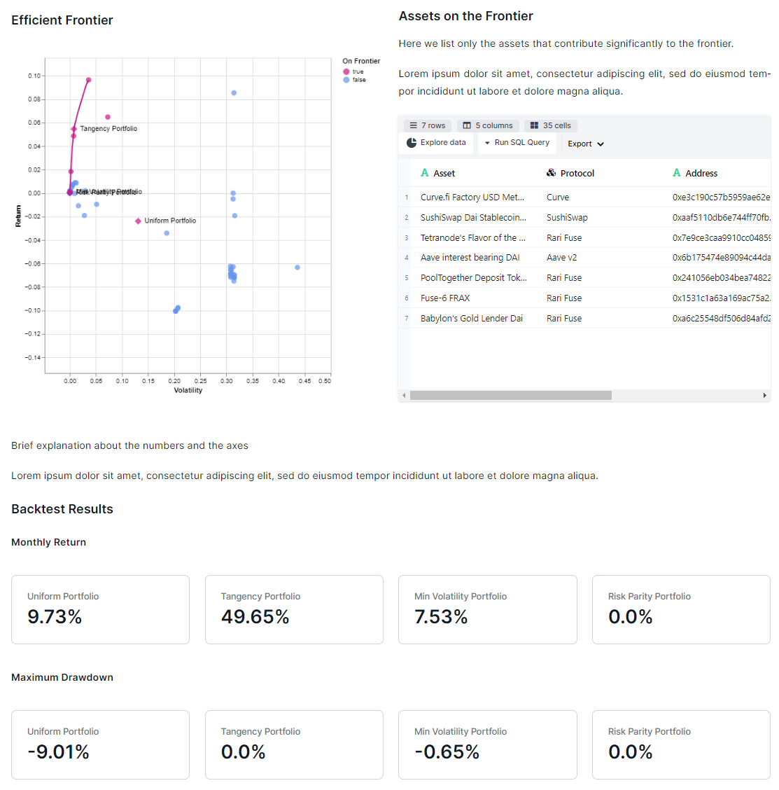
Sample image for the efficient frontier

Second Month
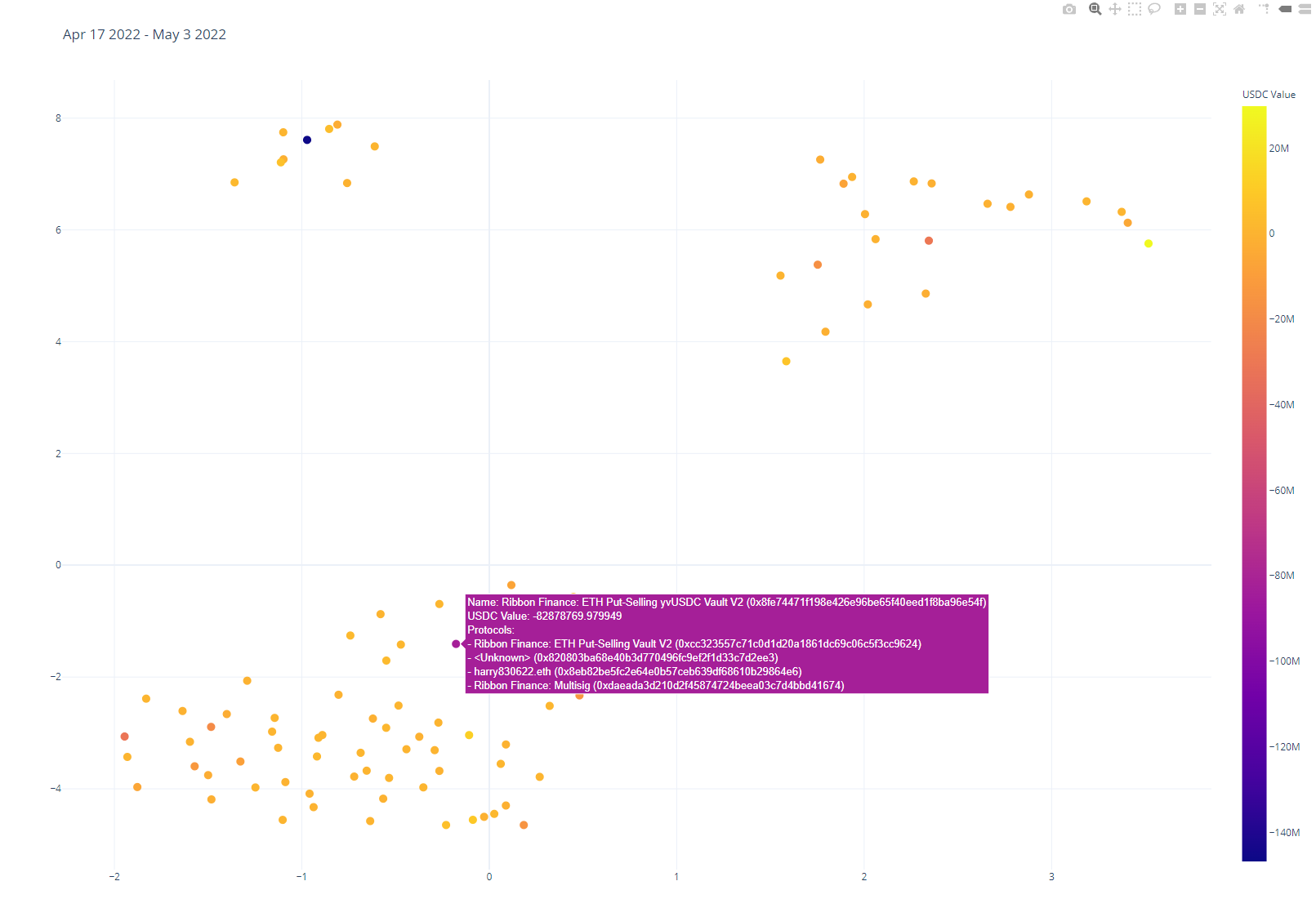
Sample image for the customer clustering

Third Month
Deadline
2022-09-30
People
List of team members and the responsibilities:
The members will continue to support the other initiatives mentioned in the previous budget request for the data team as well.
Money
$15,000 for a single month. After a month another request will be presented to support the next milestones of the project.
The budget will be streamed to the members noted above.
Amount
15000 DAI, or YFI of equivalent value
Wallet address
streamed to the contributors
Reporting
The text was updated successfully, but these errors were encountered: