generated from statOmics/Rmd-website
-
Notifications
You must be signed in to change notification settings - Fork 3
/
Copy pathelegansDE.Rmd
278 lines (186 loc) · 9.76 KB
/
elegansDE.Rmd
1
2
3
4
5
6
7
8
9
10
11
12
13
14
15
16
17
18
19
20
21
22
23
24
25
26
27
28
29
30
31
32
33
34
35
36
37
38
39
40
41
42
43
44
45
46
47
48
49
50
51
52
53
54
55
56
57
58
59
60
61
62
63
64
65
66
67
68
69
70
71
72
73
74
75
76
77
78
79
80
81
82
83
84
85
86
87
88
89
90
91
92
93
94
95
96
97
98
99
100
101
102
103
104
105
106
107
108
109
110
111
112
113
114
115
116
117
118
119
120
121
122
123
124
125
126
127
128
129
130
131
132
133
134
135
136
137
138
139
140
141
142
143
144
145
146
147
148
149
150
151
152
153
154
155
156
157
158
159
160
161
162
163
164
165
166
167
168
169
170
171
172
173
174
175
176
177
178
179
180
181
182
183
184
185
186
187
188
189
190
191
192
193
194
195
196
197
198
199
200
201
202
203
204
205
206
207
208
209
210
211
212
213
214
215
216
217
218
219
220
221
222
223
224
225
226
227
228
229
230
231
232
233
234
235
236
237
238
239
240
241
242
243
244
245
246
247
248
249
250
251
252
253
254
255
256
257
258
259
260
261
262
263
264
265
266
267
268
269
270
271
272
273
274
275
276
277
---
title: "Elegans: DE analysis"
author: "Lieven Clement"
date: "statOmics, Ghent University (https://statomics.github.io)"
output:
html_document:
code_download: true
theme: flatly
toc: true
toc_float: true
highlight: tango
number_sections: true
linkcolor: blue
urlcolor: blue
citecolor: blue
---
```{r, echo=FALSE}
suppressPackageStartupMessages({
library(tidyverse)
library(R.utils)
})
```
# Background
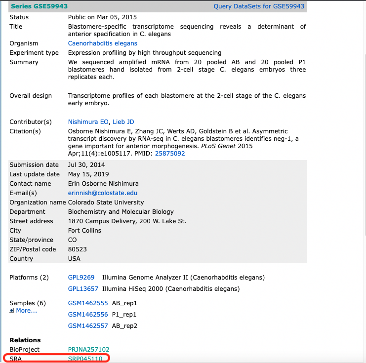
After fertilization but prior to the onset of zygotic transcription, the C. elegans zygote cleaves asymmetrically to create the anterior AB and posterior P1 blastomeres, each of which goes on to generate distinct cell lineages. To understand how patterns of RNA inheritance and abundance arise after this first asymmetric cell division, we pooled hand-dissected AB and P1 blastomeres and performed RNA-seq (Study [GSE59943](https://www.ncbi.nlm.nih.gov/geo/query/acc.cgi?acc=GSE59943)).
## Read alignment and Count table
We downloaded the SRA files, converted them to fastQ files and aligned them using the Hisat2 mapper through the QuasR and RHisat2 package in the script [elegansAlignmentCountTable](./elegansAlignmentCountTable.html) on the SGA course website.
Next, we import the count table derived from the full fastQ files for the elegans experiment. The count table can be found on the elegansFastq branch of the course website.
Note, that you can also work with the count table that you generated using the small fastQ files that contained 2% of the reads of the full fastQ files.
```{r}
geneCounts <- read.csv("https://raw.githubusercontent.com/statOmics/SGA/elegansFastq/elegansCountTableFull.csv",row.names = 1)
head(geneCounts)
```
Note, that
- The first column is the size of the gene.
- The remaining columns are the count for each fastq files.
- The column names of the count columns are the names of the SRA files, which can be used to link them to the experiment.
## Meta Data
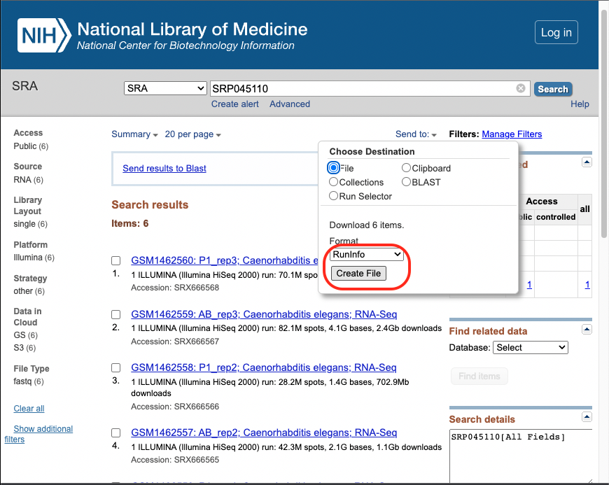
The information which connects the sample information from GEO with the SRA run id is downloaded from [SRA](https://www.ncbi.nlm.nih.gov/sra?term=SRP045110) using the Send to: File button.

Download SRA info to link sample info to info sequencing:
1. Go to corresponding [SRA](https://www.ncbi.nlm.nih.gov/sra?term=SRP045110) page and save the information via the "Send to: File button".
2. Select RunInfo!

Note, that this file is already included on the elegansFastq branch of the course github site.
```{r}
sraInfo <- read.csv("https://raw.githubusercontent.com/statOmics/SGA/elegansFastq/SraRunInfo.csv")
```
### Read background experiment
Via the GEOquery package we can access the meta data from experiments that are deposited to GEO.
```{r}
suppressPackageStartupMessages({
library( "GEOquery" )
})
gse <- getGEO("GSE59943")
length(gse)
```
There are two objects because there were runs with two different machines.
Combine the data from both files and add sample name column in order to be able to link the info to that from SRA names in the count table.
```{r}
pdata <- rbind(pData(gse[[1]]),pData(gse[[2]]))
pdata$SampleName <- rownames(pdata)
```
### Combine experiment metadata with metadata on the SRA sequencing files
The SampleName column that we made in the pdata object can be used to combine the metadata from SRA files to that of GEO experiment data.
```{r}
sraInfo$SampleName
pdata$SampleName
```
The order is different, but we can use merge to combine them correctly.
```{r}
pdata <- merge(pdata,sraInfo,by="SampleName")
```
The run is also the name of the SRA file so we will be able to link alignment file name to the experiment via the SRA file info.
# Differential analysis
## Preprocessing
### Setup count object edgeR
- First column of geneCounts is the size of the gene, so we will not use it to setup the count object for edgeR.
```{r}
suppressPackageStartupMessages({
library(edgeR)
})
dge <- DGEList(geneCounts[,-1])
```
```{r}
cbind(pdata$Run,colnames(dge))
```
```{r}
pdata$Run==colnames(dge)
```
- The order of the samples in the metadata and count table is the same
- We replace the name of the SRA file with the title of the experiment, which is more informative
```{r}
colnames(dge) <- pdata$title
```
- The pdata contains many variables with long names. We extract rename the relevant data and convert it into a factor.
```{r}
pdata <- pdata %>%
dplyr::rename(cellType = `cell type:ch1`,
rep = `replicate:ch1`,
model = Model) %>%
mutate(
cellType = as.factor(cellType),
rep = as.factor(rep),
model = as.factor(model)
)
```
### Filtering
We typically filter out lowly abundant genes.
Note, that the filtering is independent from the downstream analysis.
The main rationale is to keeps genes that have at least min.count reads in a worthwhile number samples. The latter is derived from the design matrix.
Indeed, genes with many zeros do not contain a lot of information and the DE analysis is typically underpowered for these genes.
```{r}
design <- model.matrix(~cellType, pdata)
keep <- filterByExpr(dge, design)
dge <- dge[keep, ,keep.lib.sizes=FALSE]
```
The option keep.lib.sizes=FALSE causes the library sizes to be recomputed after the filtering. This is generally recommended, although the effect on the downstream analysis is usually small.
### Normalisation to correct for differences in effective library size
The normalisation factors/offsets have to be calculated upon filtering.
```{r}
dge <- calcNormFactors(dge)
```
## Data exploration
One way to reduce dimensionality is the use of multidimensional scaling (MDS). For MDS, we first have to calculate all pairwise distances between our objects (samples in this case), and then create a (typically) two-dimensional representation where these pre-calculated distances are represented as accurately as possible. This means that depending on how the pairwise sample distances are defined, the two-dimensional plot can be very different, and it is important to choose a distance that is suitable for the type of data at hand.
edgeR contains a function plotMDS, which operates on a DGEList object and generates a two-dimensional MDS representation of the samples. The default distance between two samples can be interpreted as the "typical" log fold change between the two samples, for the genes that are most different between them (by default, the top 500 genes, but this can be modified). We generate an MDS plot from the DGEList object dge, coloring by the treatment and using different plot symbols for different cell lines.
```{r}
plotMDS(dge, top = 500, col=as.double(pdata$cellType))
```
The cell types of the same repeat seem to line up.
## Modeling
### Estimation of the dispersion
We first estimate the overdispersion.
```{r}
dge <- estimateDisp(dge, design)
plotBCV(dge)
```
### Fitting and inference
Finally, we fit the generalized linear model and perform the test. In the glmLRT function, we indicate which coefficient (which column in the design matrix) that we would like to test for. It is possible to test more general contrasts as well, and the user guide contains many examples on how to do this. The topTags function extracts the top-ranked genes. You can indicate the adjusted p-value cutoff, and/or the number of genes to keep.
Here we keep all genes in the toptable: `n = nrow(dge)`
```{r}
fit <- glmFit(dge, design)
lrt <- glmLRT(fit, coef = "cellTypeP1")
ttAll <-topTags(lrt, n = nrow(dge)) # all genes
```
Note, that the workflow with glmFit and glmLRT is no longer the default workflow of edgeR. We will discuss this when we focus on the technical aspects of differential analysis of RNASeq data.
## Plots
### P-values
We first assess the p-values.
```{r}
qplot(ttAll$table$PValue,geom = "histogram", binwidth=.05,center=0.025) + xlab("pvalue")
```
### Volcano and MA plot
Next we make a volcano plot and an MA plot.
```{r}
library(ggplot2)
volcano<- ggplot(
ttAll$table,
aes(x=logFC,y=-log10(PValue),
color=FDR<0.05)) +
geom_point() + scale_color_manual(values=c("black","red"))
volcano
```
```{r}
plotSmear(lrt, de.tags = row.names(ttAll$table |> filter(FDR < 0.05)))
```
### Heatmap
Another way of representing the results of a differential expression analysis is to construct a heatmap of the top differentially expressed genes. Here, we would expect the contrasted sample groups to cluster separately. A heatmap is a "color coded expression matrix", where the rows and columns are clustered using hierarchical clustering. Typically, it should not be applied to counts, but works better with transformed values. Here we show how it can be applied to log CPM values.
```{r}
sigNames <- row.names(ttAll$table |> filter(FDR < 0.05))
heatmap(cpm(dge)[sigNames, ])
```
## List of significant genes
```{r}
ttAll$table |> filter(FDR < 0.05)
```
## What did we forgot to account for in the data analysis?
Assess the MDS plot and the first figure in the paper that published the data (Osborne et all, 2013, [DOI: 10.1371/journal.pgen.1005117](https://doi.org/10.1371/journal.pgen.1005117)).
```{r fig.cap='Differential transcript abundance in AB and P1 blastomeres following the first embryonic division. (Source: Osborne et all, 2013, DOI: 10.1371/journal.pgen.1005117)'}
knitr::include_graphics("https://europepmc.org/articles/PMC4395330/bin/pgen.1005117.g001.jpg")
```
Which source of variability is not included in the analysis and how could we account for this? Try to adjust the script accordingly.
# Session Info
With respect to reproducibility, it is highly recommended to include a session info in your script so that readers of your output can see your particular setup of R.
```{r}
sessionInfo()
```