-
Notifications
You must be signed in to change notification settings - Fork 148
Examples with code
The basic idea for all of these plots is that you should be able to do ppl.{plot_command}(ax, x, y) instead of plt.{plot_command}(x, y). I haven't figured yet how to completely inherit Axes and such from matplotlib, because it is a huge, very complicated piece of code. But hopefully that functionality will be in future releases :)
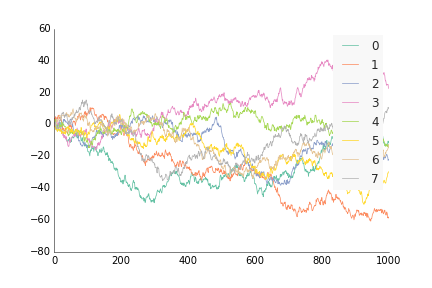
For data where the x and y are ordered, like by time or distance, use ppl.plot, similar to how you'd use plt.plot or ax.plot from matplotlib. Except instead of plt.plot(x, y) or ax.plot(x, y), do ppl.plot(ax, x, y).
import prettyplotlib as ppl
import numpy as np

# prettyplotlib imports
import matplotlib.pyplot as plt
import matplotlib as mpl
from prettyplotlib import brewer2mpl

# Set the random seed for consistency
np.random.seed(12)

fig, ax = plt.subplots(1)

# Show the whole color range
for i in range(8):
    y = np.random.normal(size=1000).cumsum()
    x = np.arange(1000)

    # For now, you need to specify both x and y :(
    # Still figuring out how to specify just one
    ppl.plot(ax, x, y, label=str(i), linewidth=0.75)

ppl.legend(ax)

fig.savefig('plot_prettyplotlib_default.png')If you want to move the legend to somewhere else, use the arguments you'd normally use for legend(), e.g. loc='lower right', ncol=4:
ppl.legend(ax, loc='lower left', ncol=4)The full code is here:
import prettyplotlib as ppl
import numpy as np

# prettyplotlib imports
import matplotlib.pyplot as plt
import matplotlib as mpl
from prettyplotlib import brewer2mpl

# Set the random seed for consistency
np.random.seed(12)

fig, ax = plt.subplots(1)

# Show the whole color range
for i in range(8):
    y = np.random.normal(size=1000).cumsum()
    x = np.arange(1000)

    # For now, you need to specify both x and y :(
    # Still figuring out how to specify just one
    ppl.plot(ax, x, y, label=str(i))

ppl.legend(ax, loc='lower left', ncol=4)

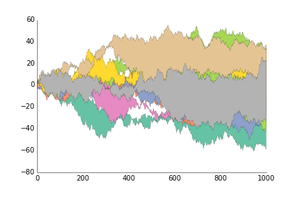
fig.savefig('plot_prettyplotlib_legend_lower_left.png')This is for when you want to show the area between two lines, like you have timeseries of two stocks and want to show their difference.
import prettyplotlib as ppl

# prettyplotlib imports
import matplotlib.pyplot as plt
import matplotlib as mpl
from prettyplotlib import brewer2mpl

# Set the random seed for consistency
np.random.seed(12)

fig, ax = plt.subplots(1)

# Show the whole color range
for i in range(8):
    y1 = np.random.normal(size=1000).cumsum()
    y2 = np.random.normal(size=1000).cumsum()
    x = np.arange(1000)

    ppl.fill_between(x, y1, y2, label=str(i))

ppl.legend()

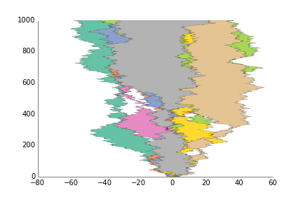
fig.savefig('fill_between_prettyplotlib_default.png')This is for when you want to show the area between two lines, like you have timeseries of two stocks and want to show their difference.
import prettyplotlib as ppl

# prettyplotlib imports
import matplotlib.pyplot as plt
import matplotlib as mpl
from prettyplotlib import brewer2mpl

# Set the random seed for consistency
np.random.seed(12)

fig, ax = plt.subplots(1)

# Show the whole color range
for i in range(8):
    y1 = np.random.normal(size=1000).cumsum()
    y2 = np.random.normal(size=1000).cumsum()
    x = np.arange(1000)

    ppl.fill_betweenx(x, y1, y2, label=str(i))

ax = ppl.legend()

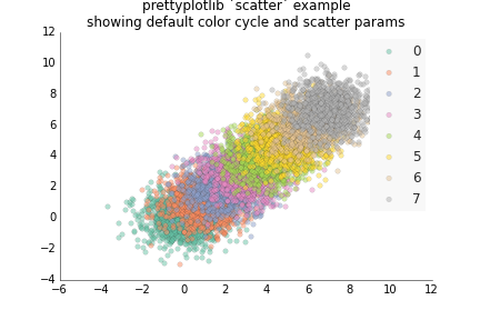
fig.savefig('fill_between_prettyplotlib_default.png')This is for less structured data than plot, like if you have two samples X and Y, and gene expression for each one, and you want to see how the expression of the same gene is for the two samples. :)
import prettyplotlib as ppl
import numpy as np

# This is "import matplotlib.pyplot as plt" from the prettyplotlib library
import matplotlib.pyplot as plt

# This is "import matplotlib as mpl" from the prettyplotlib library
import matplotlib as mpl

# Set the random seed for consistency
np.random.seed(12)

fig, ax = plt.subplots(1)

# Show the whole color range
for i in range(8):
    x = np.random.normal(loc=i, size=1000)
    y = np.random.normal(loc=i, size=1000)
    ppl.scatter(ax, x, y, label=str(i))

ppl.legend(ax)

ax.set_title('prettyplotlib `scatter` example\nshowing default color cycle and scatter params')
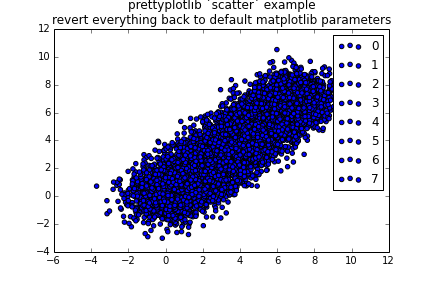
fig.savefig('scatter_prettyplotlib_default.png')If you really want to change all the parameters I worked so hard on, you can:
import prettyplotlib as ppl
import numpy as np
import matplotlib.pyplot as plt
import matplotlib as mpl
from prettyplotlib import brewer2mpl

# Set the random seed for consistency
np.random.seed(12)

fig, ax = plt.subplots(1)

#mpl.rcParams['axis.color_cycle'] = ['blue']

# Show the whole color range
for i in range(8):
    x = np.random.normal(loc=i, size=1000)
    y = np.random.normal(loc=i, size=1000)
    ax.scatter(x, y, label=str(i), facecolor='blue', edgecolor='black', linewidth=1)

# Get back the top and right axes lines ("spines")
spines_to_remove = ['top', 'right']
for spine in spines_to_remove:
    ax.spines[spine].set_visible(True)

# Get back the ticks. The position of the numbers is informative enough of
# the position of the value.
ax.xaxis.set_ticks_position('both')
ax.yaxis.set_ticks_position('both')

# For all the spines, make their line thicker and return them to be black
all_spines = ['top', 'left', 'bottom', 'right']
for spine in all_spines:
    ax.spines[spine].set_linewidth(1.0)
    ax.spines[spine].set_color('black')

# Change the labels back to black
ax.xaxis.label.set_color('black')
ax.yaxis.label.set_color('black')

# Change the axis title also back to black
ax.title.set_color('black')

# Remove the line around the legend box, and instead fill it with a light grey
# Also only use one point for the scatterplot legend because the user will
# get the idea after just one, they don't need three.
ax.legend()

ax.set_title('prettyplotlib `scatter` example\nshowing default color cycle and scatter params')
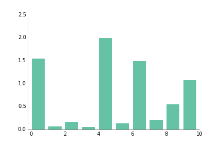
fig.savefig('scatter_prettyplotlib_back_to_matplotlib_default.png')This plot is great for categorical data, unrelated quantities such as number of cats, oranges, and computers per household.
import prettyplotlib as ppl
import numpy as np
import matplotlib.pyplot as plt

fig, ax = plt.subplots(1)

np.random.seed(14)

ppl.bar(ax, np.arange(10), np.abs(np.random.randn(10)))
fig.savefig('bar_prettyplotlib_default.png')If you supply the command grid="y", where the "y" indicates I want the grid coming out of the y-axis at certain y=... values, aka perpendicular to the y-axis, you will get a white grid drawn over your data. It's almost like adding ticks, but since it's "erasing", it increases the data-ink ratio.
import prettyplotlib as ppl
import numpy as np
import matplotlib.pyplot as plt

fig, ax = plt.subplots(1)

np.random.seed(14)

# 'y' for make a grid based on where the major ticks are on the y-axis
ppl.bar(ax, np.arange(10), np.abs(np.random.randn(10)), grid='y')
fig.savefig('bar_prettyplotlib_grid.png')If you say annotate=True in the ppl.bar command, then the value of the number on top of the bar plot will be added.
import prettyplotlib as ppl
import matplotlib.pyplot as plt
import numpy as np
import string

fig, ax = plt.subplots(1)
np.random.seed(14)
n = 10
ppl.bar(ax, np.arange(n), np.abs(np.random.randn(n)), annotate=True, grid='y')
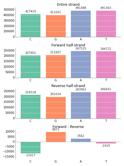
fig.savefig('bar_prettyplotlib_grid_annotated.png')If you happen to have negative values in your bar plot, the annotation on them will correctly appear underneath them. Also, the x-axis line will be moved up to the y=0 mark, instead of staying at the bottom.
import prettyplotlib as ppl
import matplotlib.pyplot as plt

fig, axes = plt.subplots(nrows=4, figsize=(6,8))

# This is the order we want to plot them, too
nucleotides = ['C', 'G', 'A', 'T']

colors = {nucleotide: ppl.colors.set2[i] for i, nucleotide in enumerate(nucleotides)}

entire_strand = {'C':427419, 'G':413241, 'A':491488, 'T':491363}
reverse_half = {'C': 219518, 'G':201634, 'A':243963, 'T':246641}
forward_half = {'C': 207901, 'G':211607, 'A':247525, 'T':244722}
skew = {nucleotide: forward_half[nucleotide] - reverse_half[nucleotide] for nucleotide in nucleotides}

strands = {'Entire strand':entire_strand,
            'Reverse half-strand':reverse_half,
            'Forward half-strand':forward_half,
            'Forward - Reverse':skew}

# The order that we want to plot the strand data in:
strand_names_ordered = ['Entire strand', 'Forward half-strand', 'Reverse half-strand', 'Forward - Reverse']

left = range(len(nucleotides))
for ax, strand_name in zip(axes, strand_names_ordered):
    strand_data = strands[strand_name]
    ppl.bar(ax, left=left,
            height=[strand_data[nucleotide] for nucleotide in nucleotides],
            annotate=True,
            xticklabels=nucleotides,
            grid='y',
            color=[colors[nucleotide] for nucleotide in nucleotides])
    ax.set_title(strand_name)

# Tell matplotlib to smartly lay out our figure
fig.tight_layout()If you don't like the way prettyplotlib formats the numbers on top of the bars, or you just want to label with something else, you can supply your own numbers or strings by giving an iterable (like a list of strings or numbers) to annotate:
import prettyplotlib as ppl
import matplotlib.pyplot as plt
import numpy as np
import string

fig, ax = plt.subplots(1)
np.random.seed(14)
n = 10
ppl.bar(ax, np.arange(n), np.abs(np.random.randn(n)),
        annotate=range(n,2*n), grid='y', xticklabels=string.uppercase[:n])
fig.savefig('bar_prettyplotlib_grid_annotated_user_labeled.png')If you supply xticklabels as an argument to plt.bar, this will label each bar with this xlabel.
import prettyplotlib as ppl
import matplotlib.pyplot as plt
import numpy as np
import string

fig, ax = plt.subplots(1)
np.random.seed(14)
n = 10
ppl.bar(ax, np.arange(n), np.abs(np.random.randn(n)), annotate=True, xticklabels=string.uppercase[:n], grid='y')
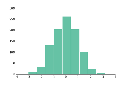
fig.savefig('bar_prettyplotlib_grid_annotated_labeled.png')If you have a large number of values and you're curious about the distribution of values within the data, hist is the function for you!
Right now, sideways histograms (with orientation=horizontal) aren't working in my matplotlib so they are untested.
import prettyplotlib as ppl
import matplotlib.pyplot as plt
import numpy as np

np.random.seed(12)

fig, ax = plt.subplots(1)

ppl.hist(ax, np.random.randn(1000))
fig.savefig('hist_prettyplotlib_default.png')Like with bar, you can add a white grid with grid="y", where the "y" indicates I want the grid coming out of the y-axis at certain y=... values, aka perpendicular to the y-axis.
import prettyplotlib as ppl
import matplotlib.pyplot as plt
import numpy as np

np.random.seed(12)

fig, ax = plt.subplots(1)

# 'y' for the 'y' axis. Could also add a grid over the 'x' axis.
ppl.hist(ax, np.random.randn(1000), grid='y')
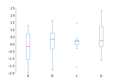
fig.savefig('hist_prettyplotlib_grid.png')If you have several things you'd like to compare distributions with, the boxplot can be very nice.
import prettyplotlib as ppl
import numpy as np
import matplotlib.pyplot as plt
np.random.seed(10)

data = np.random.randn(8, 4)
labels = ['A', 'B', 'C', 'D']

fig, ax = plt.subplots()
ppl.boxplot(ax, data, xticklabels=labels)
fig.savefig('boxplot_prettyplotlib_default.png')Because matplotlib took the color scheme from MATLAB, it inherited the ubiquitous and every-distorting rainbow color map:
How can you tell what values are positive and negative, at a glance? it's impossible without heavy scrutiny and switching back and forth between the figure and the colorbar. Indeed, there have been studies stating that "the rainbow colormap is universally inferior to all other colormaps"
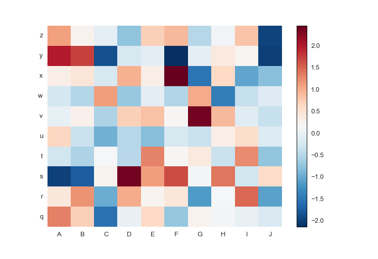
So prettyplotlib makes a beautiful default colormap. Notice that this syntax is different from all others, because you must supply fig as well to plot the colormap, the scale which shows what color corresponds to what value.
ppl.pcolormesh(fig, ax, np.random.randn(10,10))
import prettyplotlib as ppl
import matplotlib.pyplot as plt
import numpy as np

fig, ax = plt.subplots(1)

np.random.seed(10)

cmesh, cbar = ppl.pcolormesh(fig, ax, np.random.randn(10,10))
fig.savefig('pcolormesh_prettyplotlib_default.png')
Notice that, ppl.pcolormesh returns both the pcolormesh as well as the colorbar of it.
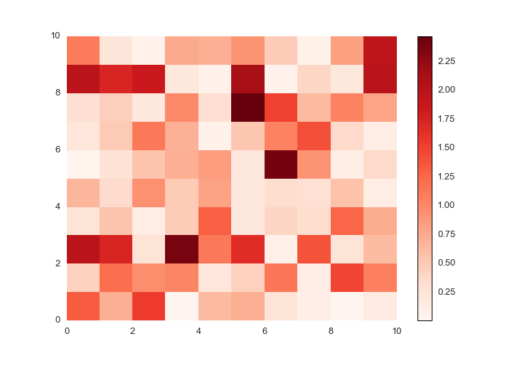
Notice that the above plot has both blue and red colors, and on the colorbar to the right you see there are both positive and negative values. If you have only positive or only negative values, prettyplotlib will auto-detect this and adjust the colormap accordingly.
For positive data, the colors default to red, with larger numbers darker and smaller numbers lighter.
import prettyplotlib as ppl
import matplotlib.pyplot as plt
import numpy as np

fig, ax = plt.subplots(1)

np.random.seed(10)

ppl.pcolormesh(fig, ax, np.abs(np.random.randn(10,10)))
fig.savefig('pcolormesh_prettyplotlib_positive.png')For negative data, the colormap defaults to blues, with more negative (smaller) values darker blue, and larger values (closer to zero) as lighter blue.
import prettyplotlib as ppl
import matplotlib.pyplot as plt
import numpy as np

fig, ax = plt.subplots(1)

np.random.seed(10)

ppl.pcolormesh(fig, ax, -np.abs(np.random.randn(10,10)))
fig.savefig('pcolormesh_prettyplotlib_negative.png')It can be a pain in the neck to figure out how to put row and column labels directly onto a pcolormesh heatmap. Thankfully, prettyplotlib will accept xticklabels and yticklabels arguments, like this:
import prettyplotlib as ppl
import matplotlib.pyplot as plt
import numpy as np
import string

fig, ax = plt.subplots(1)

np.random.seed(10)

ppl.pcolormesh(fig, ax, np.random.randn(10,10),
               xticklabels=string.uppercase[:10],
               yticklabels=string.lowercase[-10:])
fig.savefig('pcolormesh_prettyplotlib_labels.png')If you'd like to use your own colormaps, go ahead!
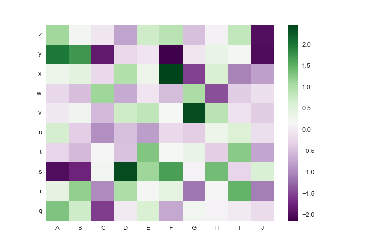
If your data has both positive and negative values, a diverging colormap is an excellent choice as it will highlight the differences between positive and negative, and the zero values. The diverging colormap PRGn or Purple and Green is pretty nice. I usually use this website to look up the colormaps: Every Colorbrewer Scale
Just import brewer2mpl from prettyplotlib and specify your colormap. The main lines to change are:
from prettyplotlib import brewer2mpl
...
green_purple = brewer2mpl.get_map('PRGn', 'diverging', 11).mpl_colormap
...
ppl.pcolormesh(...,
               cmap=green_purple)
Here is the full code:
import prettyplotlib as ppl
import matplotlib.pyplot as plt
from prettyplotlib import brewer2mpl
import numpy as np
import string

green_purple = brewer2mpl.get_map('PRGn', 'diverging', 11).mpl_colormap

fig, ax = plt.subplots(1)

np.random.seed(10)

ppl.pcolormesh(fig, ax, np.random.randn(10,10),
               xticklabels=string.uppercase[:10],
               yticklabels=string.lowercase[-10:],
               cmap=green_purple)
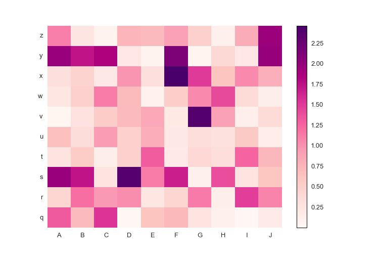
fig.savefig('pcolormesh_prettyplotlib_labels_other_cmap_diverging.png')Or, if you have positive-only or negative-only data, a sequential colormap like this Red-Purple one is great. The command is similar to the diverging colormaps:
from prettyplotlib import brewer2mpl
...
red_purple = brewer2mpl.get_map('RdPu', 'Sequential', 9).mpl_colormap
...
ppl.pcolormesh(...,
               cmap=red_purple)
Here is the full code.
import prettyplotlib as ppl
import matplotlib.pyplot as plt
from prettyplotlib import brewer2mpl
import numpy as np
import string

red_purple = brewer2mpl.get_map('RdPu', 'Sequential', 9).mpl_colormap

fig, ax = plt.subplots(1)

np.random.seed(10)

ppl.pcolormesh(fig, ax, np.abs(np.random.randn(10,10)),
               xticklabels=string.uppercase[:10],
               yticklabels=string.lowercase[-10:],
               cmap=red_purple)
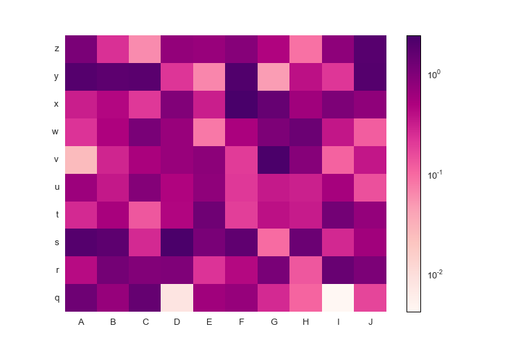
fig.savefig('pcolormesh_prettyplotlib_labels_other_cmap_sequential.png')Finally, if you'd like to supply some special commands for pcolormesh like log scaling, you can do that too!
import prettyplotlib as ppl
import matplotlib.pyplot as plt
from prettyplotlib import brewer2mpl
import numpy as np
import string
from matplotlib.colors import LogNorm

red_purple = brewer2mpl.get_map('RdPu', 'Sequential', 9).mpl_colormap

fig, ax = plt.subplots(1)

np.random.seed(10)

x = np.abs(np.random.randn(10,10))
ppl.pcolormesh(fig, ax, x,
               xticklabels=string.uppercase[:10],
               yticklabels=string.lowercase[-10:],
               cmap=red_purple,
               norm=LogNorm(vmin=x.min().min(), vmax=x.max().max()))
fig.savefig('pcolormesh_prettyplotlib_labels_lognorm.png')If you have a divergent colormap but you want the white zero value to be
something else, you can supply center_value as a keyword argument to
pcolormesh to recenter the data.
import prettyplotlib as ppl
import matplotlib.pyplot as plt
from prettyplotlib import brewer2mpl
import numpy as np
import string

green_purple = brewer2mpl.get_map('PRGn', 'diverging', 11).mpl_colormap

fig, ax = plt.subplots(1)

np.random.seed(10)

ppl.pcolormesh(fig, ax, np.random.randn(10,10),
               xticklabels=string.uppercase[:10],
               yticklabels=string.lowercase[-10:],
               cmap=green_purple, center_value=2)
fig.savefig('pcolormesh_prettyplotlib_labels_other_cmap_diverging_center_value.png')
And now the 'zero' value is 2! So it's white at 2. Looks like most of the data is below there..
