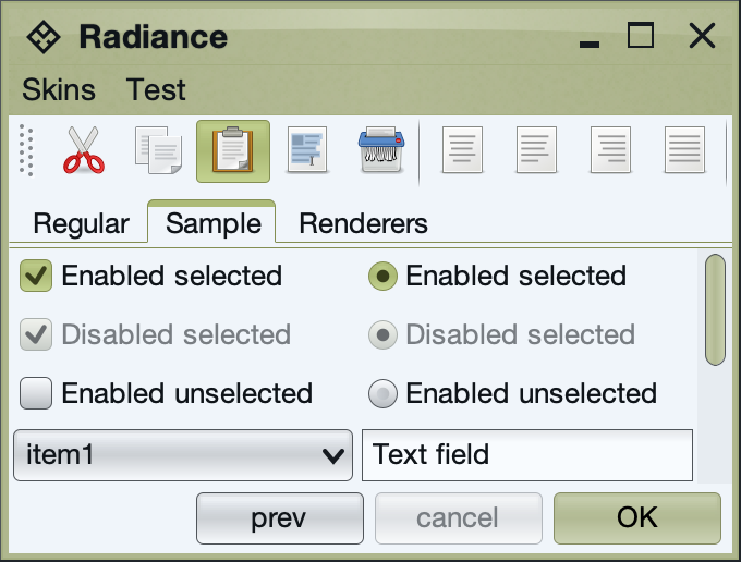
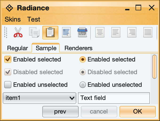
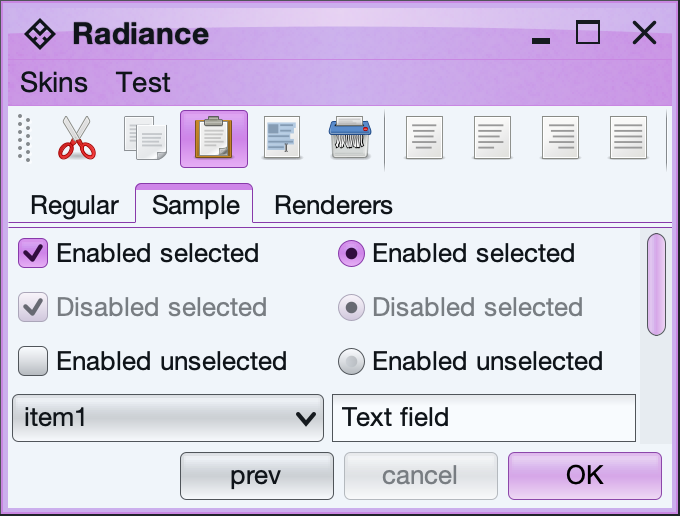
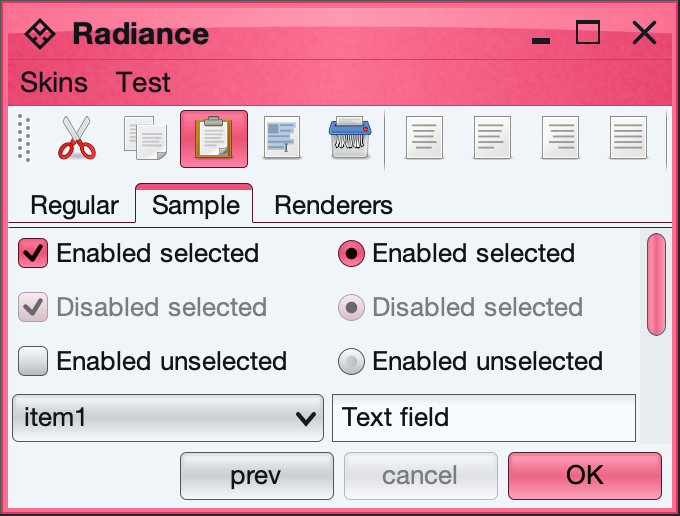
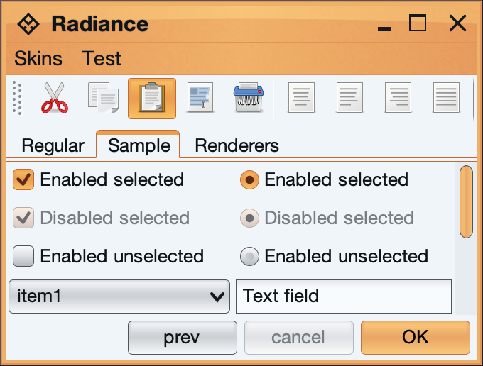
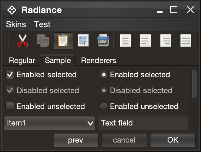
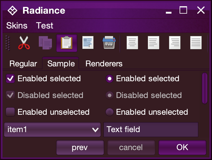
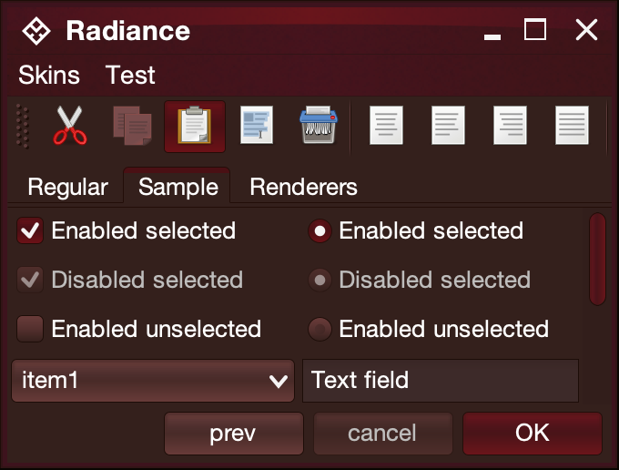
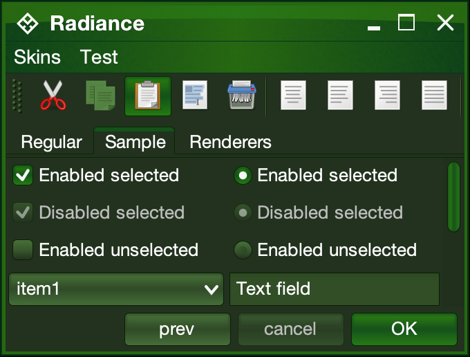
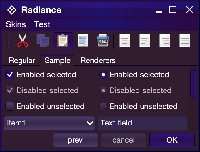
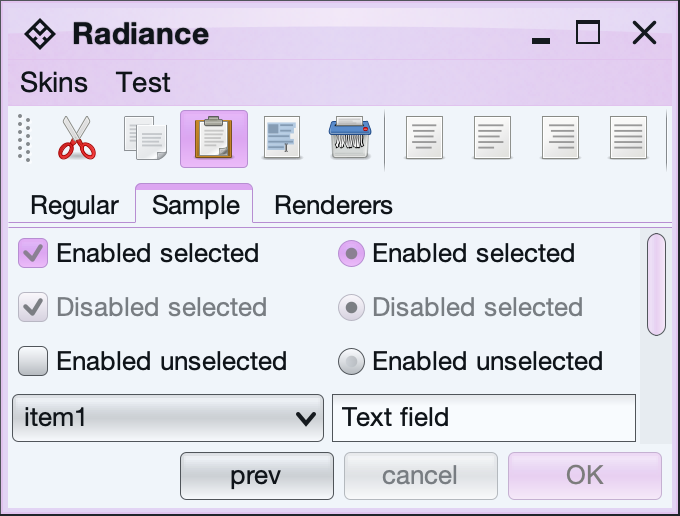
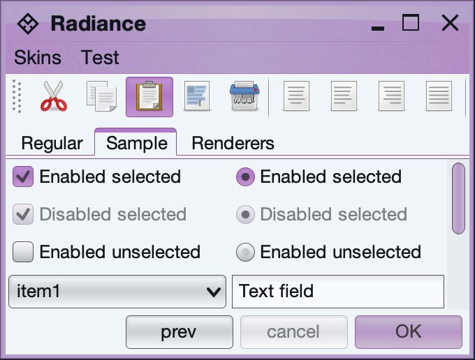
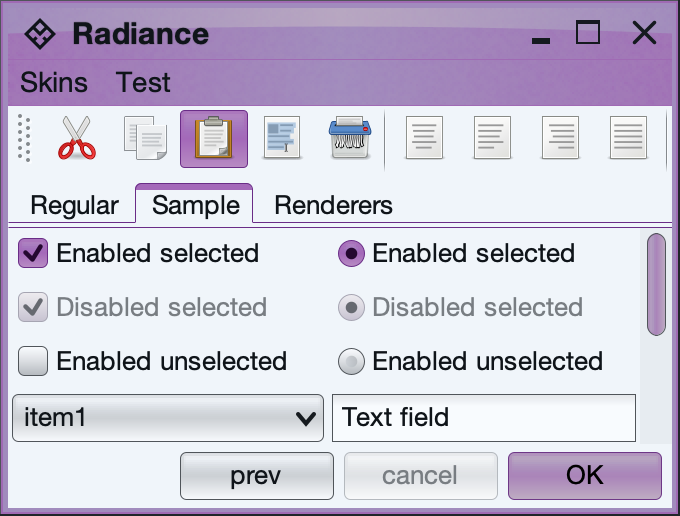
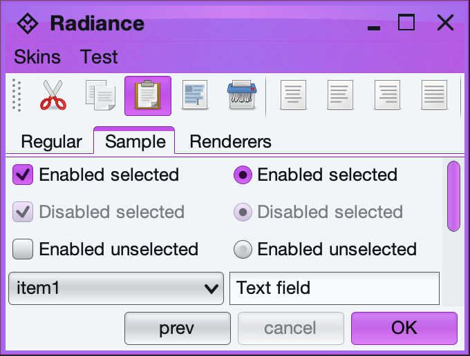
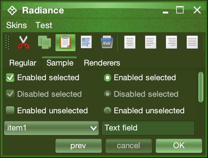
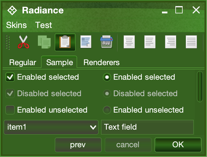
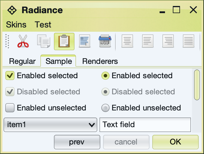
A color scheme is a set of information that allows painting a control in a specific visual state. In general, a color scheme defines a collection of colors that are used by the various Radiance painters to paint different control areas (such as background fill, border etc) under a specific visual state.
The RadianceColorScheme contains all the APIs officially supported by Radiance color schemes. The APIs can be roughly divided in three categories:
- Base colors. These are defined in the
SchemeBaseColors - Derived colors. These are defined in the
SchemeDerivedColors - Creating derived color schemes.
The SchemeBaseColors defines the following base colors:
- Ultra light
- Extra light
- Light
- Mid (medium)
- Dark
- Ultra dark
- Foreground
The first six colors are used to paint the background "layer" of a control, such as, for example, the background fill of a button. The foreground color is primarily used to paint the foreground "layer" of a control, such as, for example, the button text and optionally the themed button icon.
It is up to the fill painter to decide which specific colors to use for the background layer, and how to use them. For example, a completely flat (non-gradient) look can be achieved by the fill painter using a single color, or by a color scheme specifying identical color values for the entire ultra light / ultra dark spectrum.
The SchemeDerivedColors defines the following derived colors:
- Line
- Focus ring
- Mark
- Echo
- Background fill
- Text background fill
- Accented background fill
- Selection background
- Selection foreground
- Separator primary
- Separator secondary
The idea behind derived colors is to find the balance between consistent visuals across all surfaces painted by Radiance and allowing the app to customize specific colors to fit the particulars of its design language.
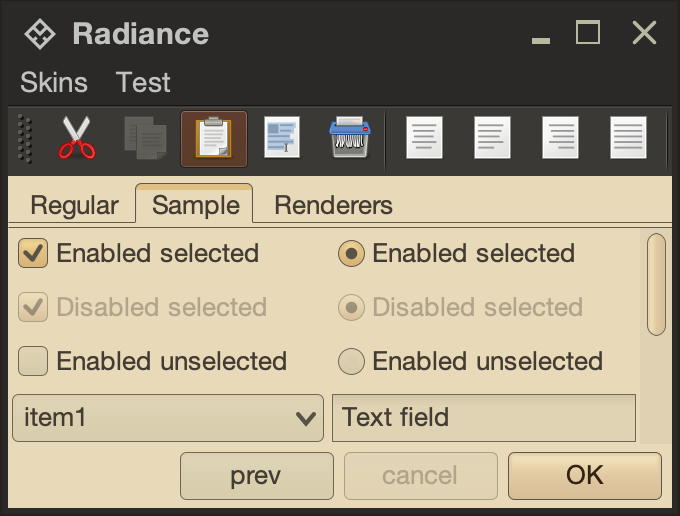
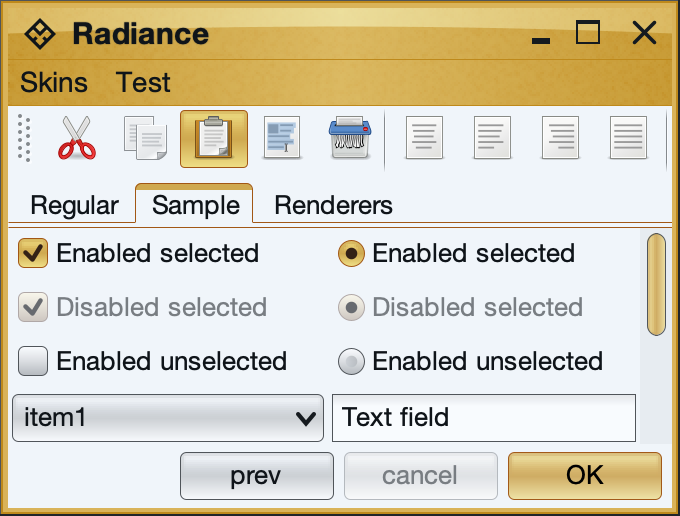
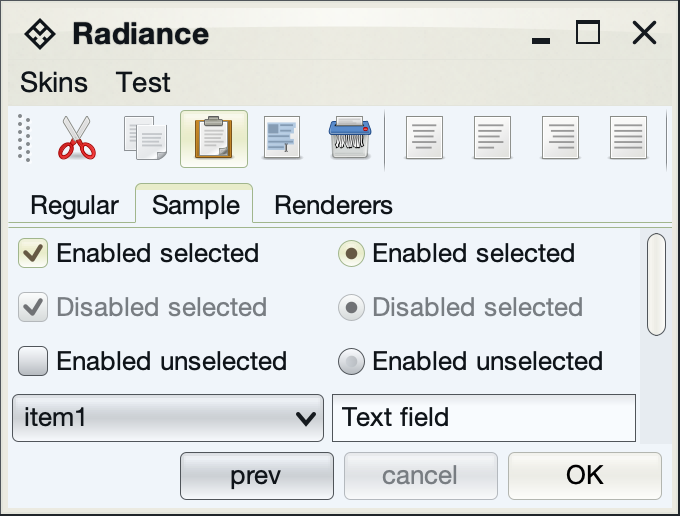
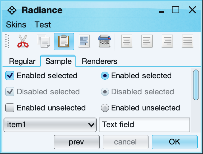
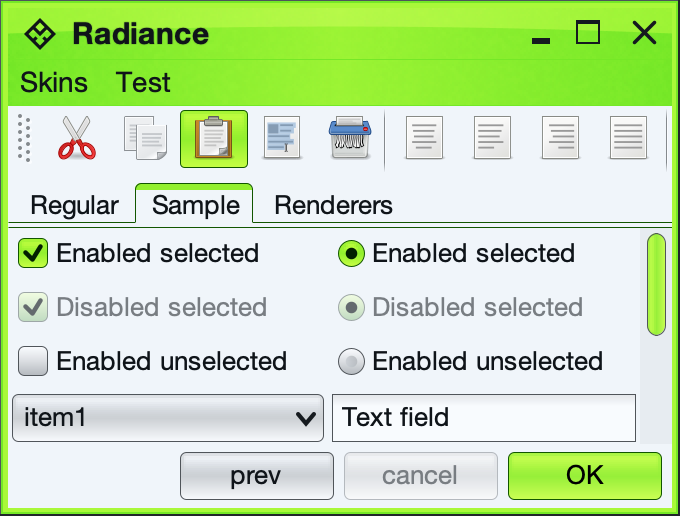
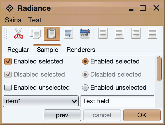
Let's take a look at the following UI under the core Dust Coffee skin:
To point out just a few places where Radiance is using derived colors:
- Mark color is used for the selected mark / dot of checkboxes and radio buttons, as well as the arrow of the combobox.
- Separator secondary color is used for the double content border of the tabbed pane
- Separator primary and secondary colors are used to paint the drag bump dots of the toolbar, as well as the separators in the toolbar
- Accented background fill is used to fill the scroll bar track
- Text background fill is used to fill the text field for better visual indication of editable content
Providing one or more of the derived colors in your color schemes file is the recommended approach to tweaking the overall visual language of your application while maintaining continuity across different UI surfaces.
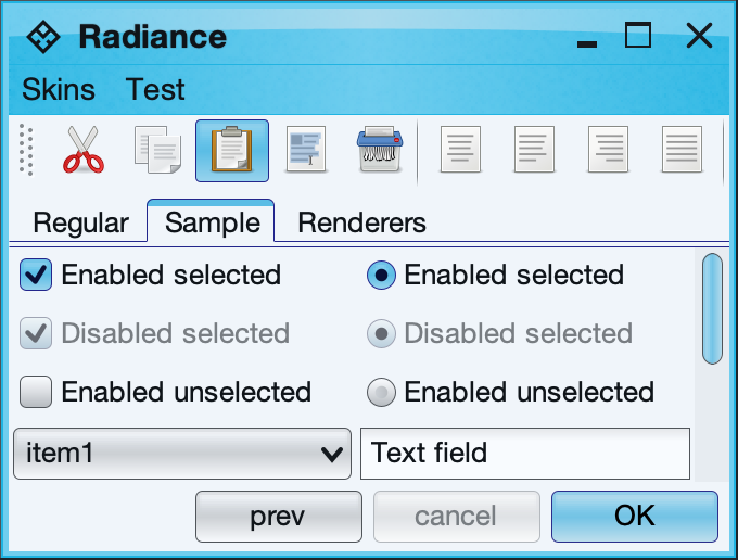
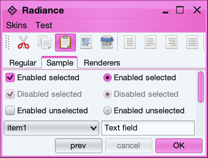
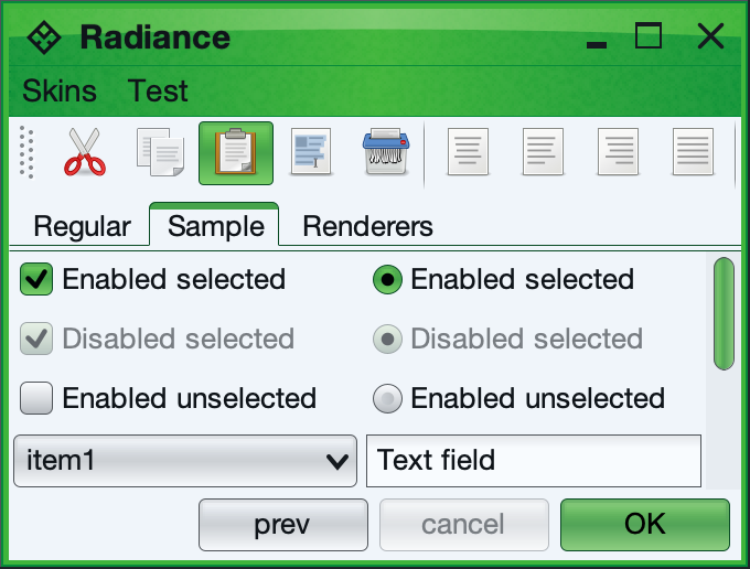
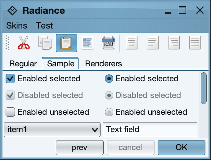
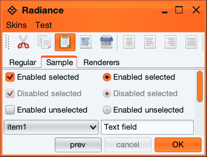
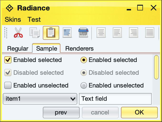
The Radiance core library provides the following sixteen light color schemes:
Aqua, Barby Pink
Bottle Green, Brown Creme, Light Aqua Lime Green, Olive Orange, Purple Raspberry, Sepia Steel Blue, Sunset Sun Glare, TerracottaThe Radiance core library provides the following five dark color schemes:
Ebony, Dark Violet
Charcoal, Jade Forest UltramarineThe RadianceColorScheme contains a number of APIs to create derived color schemes. Note that a color scheme is a delicate balance between the foreground color and the background colors, providing visually appealing selection of colors that are designed to work together on various painters. In some cases, creating a derived color scheme with one of these APIs (especially negated and inverted color schemes) will not result in visually pleasing appearance.
The following API allows shifting both the background and the foreground colors:
  /**
   * Creates a shift version of <code>this</code> scheme.
   *
   * @param backgroundShiftColor
   *     Shift color for background colors. Should have full opacity.
   * @param backgroundShiftFactor
   *     Value in 0.0...1.0 range. Larger values shift more towards the
   *     specified color.
   * @param foregroundShiftColor
   *     Shift color for foreground colors. Should have full opacity.
   * @param foregroundShiftFactor
   *     Value in 0.0...1.0 range. Larger values shift more towards the
   *     specified color.
   * @return Shift version of <code>this</code> scheme.
   */
  public RadianceColorScheme shift(Color backgroundShiftColor,
      double backgroundShiftFactor, Color foregroundShiftColor,
      double foregroundShiftFactor)
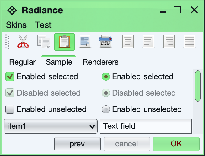
Here is the Purple color scheme shifted 80% towards light green in background colors and 70% towards dark red in foreground color (see the foreground color of the default button):
The following API allows shifting only the background colors:
  /**
   * Creates a shift version of <code>this</code> scheme.
   *
   * @param backgroundShiftColor
   *     Shift color for background colors. Should have full opacity.
   * @param backgroundShiftFactor
   *     Value in 0.0...1.0 range. Larger values shift more towards the
   *     specified color.
   * @return Shift version of <code>this</code> scheme that does not change
   *   the foreground color.
   */
  public RadianceColorScheme shiftBackground(Color backgroundShiftColor,
      double backgroundShiftFactor)
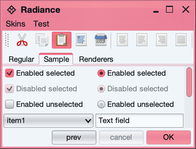
Here is the same Purple color scheme shifted 80% towards light red in background colors:
The following API allows tinting the colors (shifting towards white):
  /**
   * Creates a tinted (shifted towards white) version of <code>this</code>
   * color scheme.
   *
   * @param tintFactor
   *     Value in 0.0...1.0 range. Larger values shift more towards white
   *     color.
   * @return Tinted version of <code>this</code> scheme.
   */
  public RadianceColorScheme tint(double tintFactor)
The following API allows toning the colors (shifting towards gray):
  /**
   * Creates a toned (shifted towards gray) version of <code>this</code> color
   * scheme.
   *
   * @param toneFactor
   *     Value in 0.0...1.0 range. Larger values shift more towards gray
   *     color.
   * @return Toned version of <code>this</code> scheme.
   */
  public RadianceColorScheme tone(double toneFactor)
The following API allows shading the colors (shifting towards black):
  /**
   * Creates a shaded (shifted towards black) version of <code>this</code>
   * color scheme.
   *
   * @param shadeFactor
   *     Value in 0.0...1.0 range. Larger values shift more towards black
   *     color.
   * @return Shaded version of <code>this</code> scheme.
   */
  public RadianceColorScheme shade(double shadeFactor)
Here is the same Purple color scheme tinted 40%, toned 40% and shaded 40%:
The following API allows saturating or desaturating the colors:
  /**
   * Creates a saturated or desaturated version of <code>this</code> scheme.
   * The value and brightness stay the same.
   *
   * @param saturateFactor
   *     Value in -1.0...1.0 range. Positive values create more saturated
   *     colors. Negative values create more desaturated colors.
   * @return Saturated version of <code>this</code> scheme.
   */
  public RadianceColorScheme saturate(double saturateFactor)
Here is the same Purple color scheme saturated 40% and desaturated 40%:
The following API allows inverting the colors:
  /**
   * Creates an inverted version of <code>this</code> scheme.
   *
   * @return Inverted version of <code>this</code> scheme.
   */
  public RadianceColorScheme invert()
The following API allows negating the colors:
  /**
   * Creates a negated version of <code>this</code> scheme.
   *
   * @return Negated version of <code>this</code> scheme.
   */
  public RadianceColorScheme negate()
Here is the same Purple color scheme inverted and negated:
The following API allows shifting the hue of the colors:
  /**
   * Creates a hue-shifted (in HSB space) version of <code>this</code> color
   * scheme.
   *
   * @param hueShiftFactor
   *     Value in -1.0...1.0 range.
   * @return Hue-shifted version of <code>this</code> scheme.
   */
  public RadianceColorScheme hueShift(double hueShiftFactor)
Here is the same Purple color scheme hue-shifted 40%:
Additional color schemes can be found in the extras pack.
