Modifiers are a ubiquitous and versatile way to extend and augment composables. Modifiers are used to specify layout behavior, provide custom drawing, process user input, etc.
Aurora provides a number of modifiers for consistent user experience across different surfaces in your application.
The app in this screenshot is using Aurora's decoration areas to create visual grouping of certain functional areas. Under the Gemini skin, the title bar and the menu bar use dark grey background fill, the toolbar is using dark blue fill, and the footer is using a medium grey fill.
Here is the layout skeleton:
Column(modifier = Modifier.fillMaxSize()) {
  AuroraDecorationArea(decorationAreaType = DecorationAreaType.Toolbar) {
    DemoToolbar(
      alignmentCommands = alignmentCommands,
      styleCommands = styleCommands,
      resourceBundle = resourceBundle,
      iconDimension = DpSize(20.dp, 20.dp)
    )
  }
  Spacer(modifier = Modifier.weight(weight = 1.0f, fill = true))
  AuroraDecorationArea(decorationAreaType = DecorationAreaType.Footer) {
    DemoSkeletonFooter(onSkinChange = onSkinChange)
  }
}
AuroraDecorationArea is not a layout composable itself. Instead, it sets up the internal bits for Aurora to apply the right visuals to all the projected child composables. To get the right visuals for the background fill of the contents of AuroraDecorationArea, use Modifier.auroraBackground() on the top-level container that you add:
@Composable
fun DemoSkeletonFooter(
    modifier: Modifier = Modifier,
    onSkinChange: (AuroraSkinDefinition) -> Unit
) {
    Row(
        verticalAlignment = Alignment.CenterVertically,
        modifier = modifier
            .fillMaxWidth()
            .auroraBackground()
            .padding(horizontal = 8.dp, vertical = 6.dp)
    ) {
        Spacer(modifier.weight(weight = 1.0f, fill = true))
        AuroraSkinSwitcher(onSkinChange, PopupPlacementStrategy.Upward.HAlignStart)
    }
}In this screenshot, the ribbon application menu has three areas:
- Level 1 content - New, Open, Save, etc menus, displayed on the left
- Level 2 content - secondary content (E-mail, Wireless, etc) for the active level 1 item, displayed on the right
- Footer content - Options button, displayed at the bottom
For visual delineation, in this case, we display a slightly rounded border around the combined Level 1 + Level 2 content areas.
Here is the layout skeleton:
Row(
  modifier = Modifier.fillMaxWidth(1.0f)
    .height(height = panelHeightDp + 2.dp)
    .background(color = backgroundColorScheme.backgroundFillColor)
    .auroraBorder()
    .padding(all = 1.dp)
) {
  Level1Content(...)
  VerticalSeparatorProjection(...)
  Level2Content(...)
}
The order of the modifiers on the Row that contains the Level 1 and Level 2 content areas is important:
- Start with the height, accounting for extra 2 dp vertical space needed for border vertical paddings
- Next, the
backgroundmodifier to fill the whole row with a single color - Next, the
auroraBordermodifier to draw the slightly rounder border - Finally,
padding(all = 1.dp)modifier to prevent the content from overlapping with the border visuals
Use Modifier.auroraContextMenu() to display context menus. See context menu documentation for more information.
LabelProjection(
  contentModel = LabelContentModel(
    text = resourceBundle.getString("ContextMenu.show"),
    enabled = contentEnabled.value
  )
).project(
  modifier = Modifier.auroraContextMenu(
    enabled = contentEnabled.value,
    contentModel = CommandMenuContentModel(
      groups = listOf(
        CommandGroup(commands = commands1),
        CommandGroup(commands = commands2),
        CommandGroup(commands = commands3)
      )
    ),
    presentationModel = CommandPopupMenuPresentationModel(
      popupPlacementStrategy = PopupPlacementStrategy.Upward.HAlignStart,
      toDismissOnCommandActivation = false
    )
  )
)Use Modifier.auroraPopupMenuRowBackground() to configure background fill of individual popup menu rows, as well as the optional background fill of the popup menu icon gutter.
// Earlier in the flow of a custom popup menu handler
// the gutter width was computed and set on the popup
// content layout info

CommandButtonProjection(
    contentModel = command,
    presentationModel = menuButtonPresentationModel,
    overlays = overlays
).project(
    modifier = Modifier.fillMaxWidth()
        .auroraPopupMenuRowBackground(
            backgroundFillColorQuery = { _, scheme -> scheme.backgroundFillColor },
            iconGutterFillColorQuery = { it.accentedBackgroundFillColor },
            gutterWidth = popupContentLayoutInfo.gutterWidth),
    actionInteractionSource = remember { MutableInteractionSource() },
    popupInteractionSource = remember { MutableInteractionSource() }
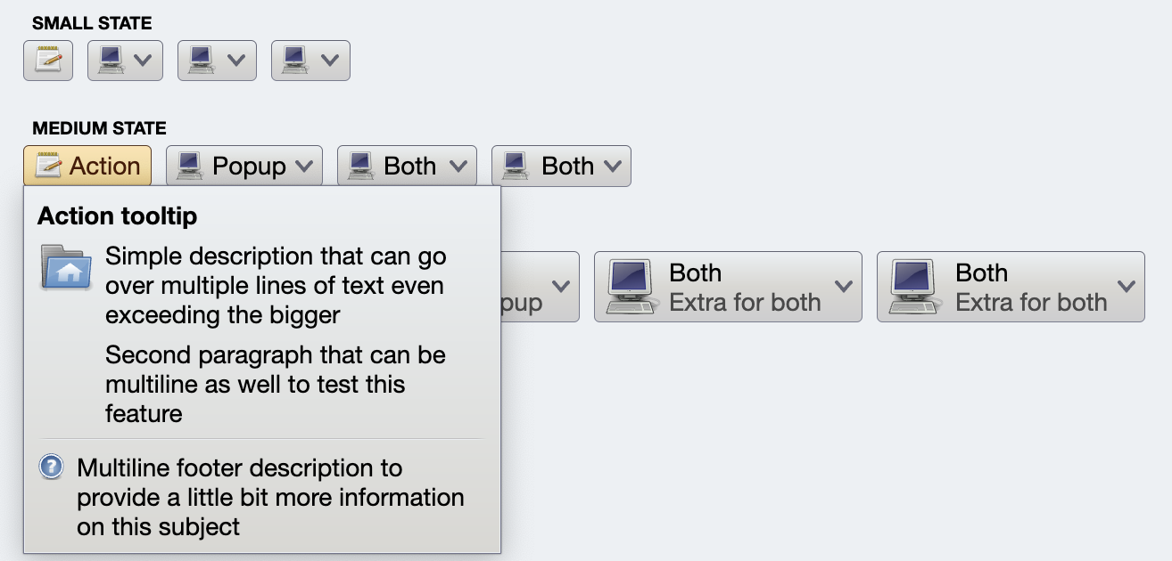
)Use Modifier.auroraRichTooltip() to display rich tooltip on hover:
Row(
  modifier = modifier
      .padding(presentationModel.contentPadding)
      .auroraRichTooltip(
          richTooltip = contentModel.richTooltip,
          presentationModel = presentationModel.richTooltipPresentationModel
      )
      ///
    ,
  verticalAlignment = Alignment.CenterVertically,
  horizontalArrangement = presentationModel.horizontalAlignment.arrangement
) {


