Follower is a Tooltipster plugin to make tooltips follow the cursor. MIT license.
Include the javascript plugin file in your page AFTER Tooltipster's file. Also include Follower's CSS file.
<html>
  <head>
    ...
    <link rel="stylesheet" type="text/css" href="tooltipster/dist/css/tooltipster.bundle.min.css" />
    <link rel="stylesheet" type="text/css" href="tooltipster-follower/css/tooltipster-follower.min.css" />
    ...
    <script type="text/javascript" src="tooltipster/dist/js/tooltipster.bundle.min.js"></script>
    <script type="text/javascript" src="tooltipster-follower/js/tooltipster-follower.min.js"></script>
  </head>
</html>
If you have no tooltips using
sideTipin your page, you may use Tooltipster's core files instead of the bundle ones.
Declare the follower plugin in the options of the tooltips you want to follow the cursor, instead of sideTip:
$('.tooltip').tooltipster({
    plugins: ['follower']
});
That's it! You should see your tooltip follow the mouse, at the bottom-right of the cursor.
Follower has the same default style and themes as Tooltipster's sideTip. They are all included in tooltipster-follower.min.css, so you don't need to include any other files.
To create your own style, create a sub-theme as explained in Tooltipster's documentation. The only difference is that you replace .tooltipster-sidetip by .tooltipster-follower in your rules.
minWidth The minimum width of the tooltip. Default: 0
maxWidth The maximum width of the tooltip. Default: null
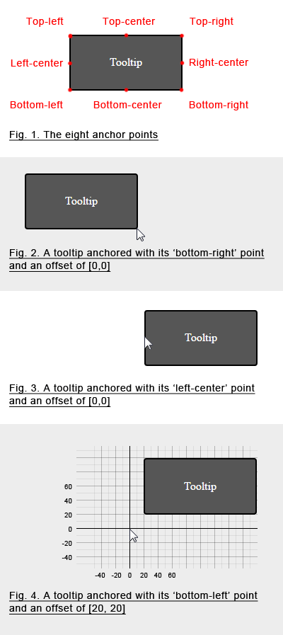
offset The position of the anchor in the coordinate system, in the form [x,y] (see the illustration below). Default: [15,-15]
anchor The anchor is the point of the tooltip which ties it to the coordinate system (see the illustration below). There are eight possible values: top-left, top-center, top-right, left-center, left-right, bottom-left, bottom-center, bottom-right. Default: top-left
All of Tooltipster's options, methods and events remain available. Only sideTip's features will be unavailable on tooltips that use Follower instead (read this note).
$('.tooltip').tooltipster({
	anchor: 'bottom-left',
    minWidth: 200,
    maxWidth: 300,
    offset: [20, 20],
    plugins: ['follower'],
    theme: 'tooltipster-noir'
});follow events are fired when the position of the tooltip is set. It has event, helper and position properties, as well as an edit property which is a function that you may use to edit the coordinates of the tooltip.
position events are fired when Tooltipster asks Follower to re-evaluate the position of the tooltip, just like sideTip. Although we kept sideTip's original name for this event, it can be misleading as it is not fired every time the tooltip actually moves (use the follow events for that). The event has event, helper and position properties, and an edit property which is a function you can use to edit the proposed size of the tooltip.
