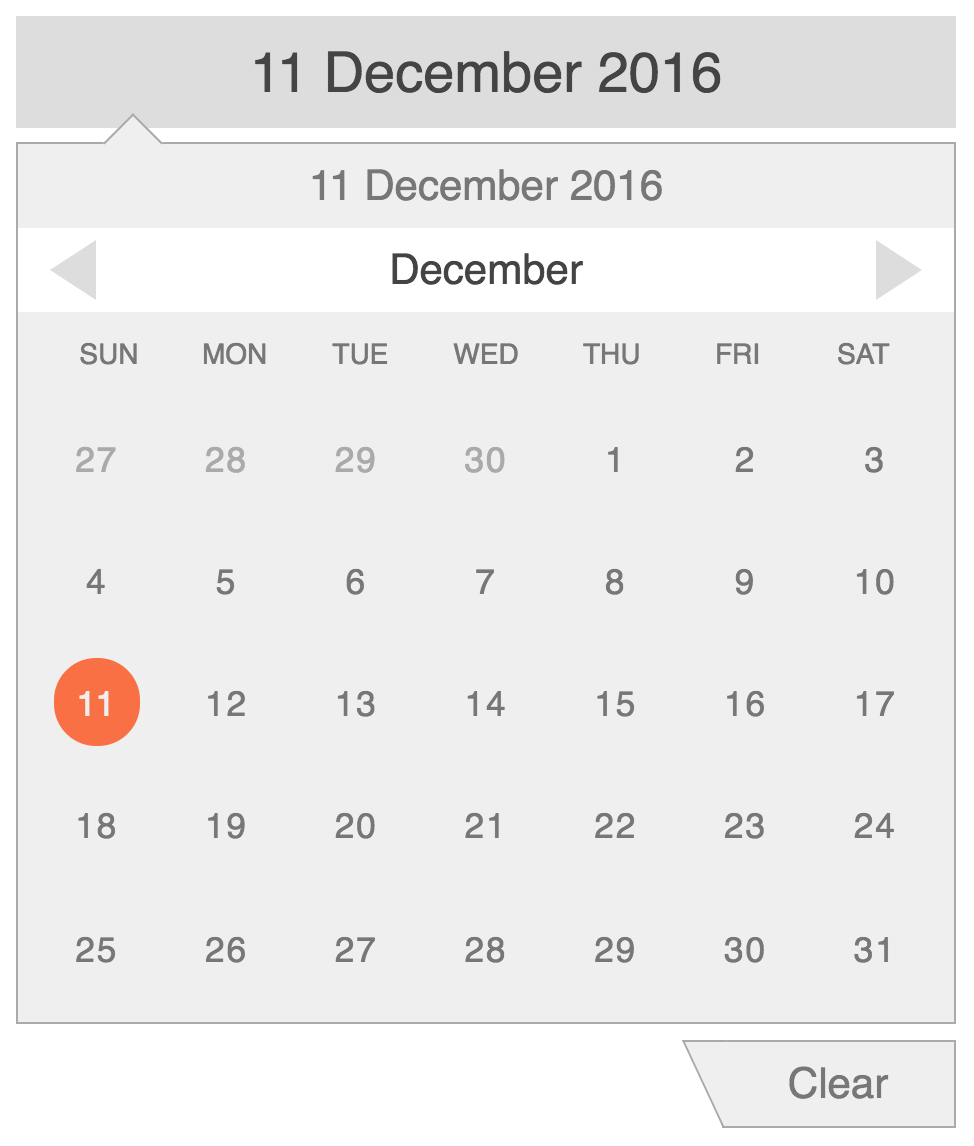
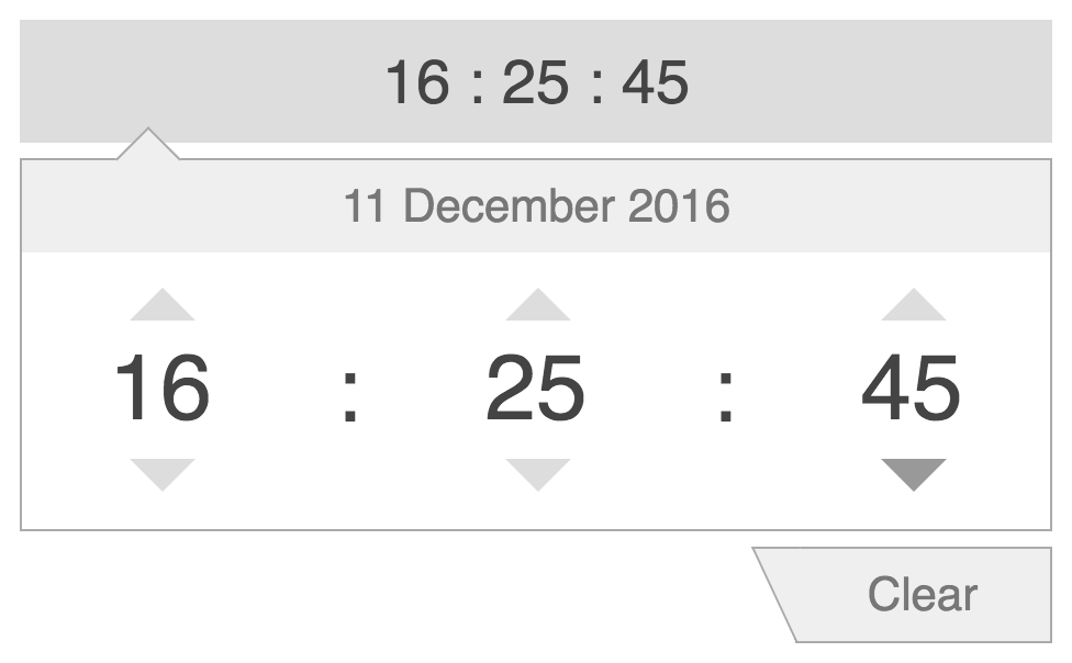
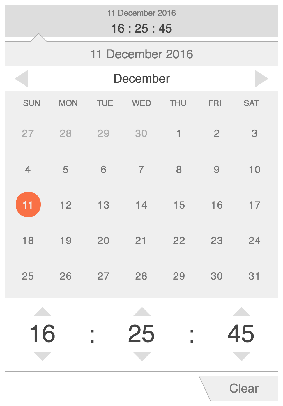
This directive is designed to provide easy and intuitive input of moment.js datetime objects.
Desgined to be as simple as possible in order to afford intuitive interactions.
Converted into an angular directive for your convenience :)
Click here for a live demo.
- Install 'angular-datetime-inputs' with bower
bower install angular-datetime-inputs
or with npm
npm install angular-datetime-inputs
- Add 'g1b.datetime-inputs' module to your app config
angular.module('myApp', [
  'g1b.datetime-inputs',
  ......
])- Use any of the directives in a view
For date input only:
<date-input date="date" on-change="print(date)" placeholder="Select date"></date-input>For time input only:
<time-input time="time" on-change="print(time)" placeholder="Select time"></time-input>For both date and time input:
<datetime-input datetime="datetime" on-change="print(datetime)" placeholder="Select datetime"></datetime-input>| Property | Usage | Default | Required |
|---|---|---|---|
| date | moment.js datetime object or a datetime string | none | no |
| time | moment.js datetime object or a datetime string | none | no |
| datetime | moment.js datetime object or a datetime string | none | no |
| format | moment.js compatible date/time format used for parsing initial datetime objects | none | no |
| date-format | moment.js compatible date format used for display in date and datetime input directives | 'DD MMMM YYYY' | no |
| time-format | moment.js compatible time format used for display in time and datetime input directives | 'HH : mm : ss' | no |
| min-date | moment.js datetime object min datetime | none | no |
| max-date | moment.js datetime object max datetime | none | no |
| hour-step | step size for hour input | 1 | no |
| minute-step | step size for minute input | 1 | no |
| second-step | step size for second input | 1 | no |
| on-change | Handler function that is fired on change of datetime object | none | no |
| on-close | Handler function that is fired on close of the edit popover | none | no |
| placeholder | Placeholder is shown when input object is undefined | none | no |
| allow-clear | Allow users to clear selected datetime value | false | no |
| clear-text | Clear text shown in the button used to clear date object | Clear | no |
| close-text | Close text shown in the button used to close edit popover | Close | no |
| css-class | custom css class name for datetime presentation | none | no |
If you are looking for a range input of datetime objects, check out angular-datetime-range


