This is an simple lab that builds a minimal dashboard showing data in a Table Format.
This labs assumes you are familiar with the Demo Environment
The Demo environment is hosted in a DMZ and ca be accessed with the following credentials:
user: guest
password: guest
The guest user is able to modify the dashboards and run Explore queries however it can't save any of the configuration changes.
This dashboard is a 1:1 copy of the faults that are present inside ACI. The main advantages compared to looking at the faults in the ACI UI are:
- the ability to aggregating Faults from Multiple Fabrics in a single table
- allowing advanced sorting and filtering
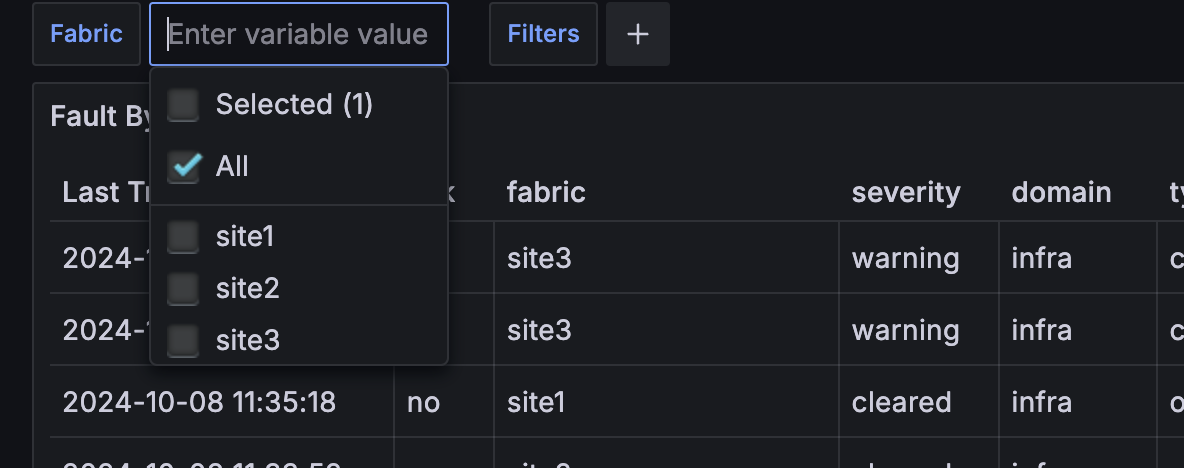
By using the Fabric drop down menu you can select different Fabrics (or All) and you can use the Colum headers to filter/sort the data:
This is a good dashboard to understand how Grafana dashboards are built, so let's re-built the Fault By Last Transition table.
Note: In this example we are focusing on Grafana Dashboard, someone configured the aci-exporter and Prometheus to populate the aci_faults with data. If you wanna learn on how to configure the aci-exporter and Prometheus to work together you can check out the development guide.
Warning: Since this is an environment open to the internet I have not allowed used to save any config changes so DO NOT close or reload the browser or you will loose your work !
- Select
Dashboards-->Tests-->Dashboard Test 1--> Move your move over the empty dashboard --> presseon the keyboard. This should open up the editing mode. - Ensure that you have:
Prometheusselected as Data Source- Selected the
Buildermode this is a good way to learn but we will also look a the code afterwards.
- From the Metric Drop Down menu select
aci_faultsand clickRun Querythis will display a Graph, in the legend you can see that for each metric we have infos about the Fabric, cause, description etc... the Metric value itself (the 1.7Bil) is the Unix Time Stamp of the last transition time the fault.
 However this is not a very good visualization for this type of data, we can see interesting data in the legend but a time series is really not the right visualization as we are interested in a list of faults aka a table!
To switch to a Table view we need two steps:
- Select the
Table Formatfor our query: Go toOptions-->Format--> SelectTable
<img src=images/lab1/Visualization.png width="500">
- With just these two simple changes the data should look much better already however:
- The
Timeandcreatedcolumn are not the last transition time for the Fault but when the fault was first received inPrometheusand for our use case this is useless. - The table contains a few "useless" column that would be nice to hide
- The
Value(last column) that represent the last transition time for ourFaultis a long number, not a date
- The
To solve all these issue we need to manipulate our data, in this example we are going to use there 3 Grafana transformations:
Organize fields by name: This will allows us to rename, re-order and hide the table columns:Convert field type: This will allow us to convert theValuefrom a Unix Time Stamp to an actual human readable dataSort by: To sort our Events by Last Transition time i.e.Value- click on the
Transform Datatab and selectAdd Transformation
Select Transform Data --> Add Transformation --> Organize fields by name
 Here you can
- Change the ordering of the fields, by drag them by the vertical dots on the left
- Hide them, by clicking on the
eyesymbol - Rename them by adding text in the empty box on the right of the field name
You are free to sort things as you please but I would recommend to at least:
- Hide:
- Time
- aci
- created
- instance
- job
- Rename:
ValuestoLast Transition- Place
Last Transitionas first item in the table
Select Add another transformation --> Convert field type
- Field:
Last Transition - Type:
Time
If you have placed the Last Transition as the first colum you should now see dates but you probably also notice that are not quite right as they show 1970.
This is due to the fact that the epoch is expected in milliseconds since 1970 but what we are getting is just seconds, we will fix this after for now ignore this.
Select Add another transformation --> Sort By
- Field:
Last Transition - Reverse: Enabled
Depending on how you have Organize the fields our table should look something like this:
All we have to do is multiple the Last Transition (aka the Value of our Metric) by 1000
- Click on
Query-->+ Operations - In the
Searchtab entermultiplyand selectMultiply by scalar
- Set the
Value: to 1000 - Click
Run Queries
Now the time should be reflected correctly.
The query Builder is a great tool to learn but as you star building more complex queries it will become too cumbersome to use and some advanced capabilities are also not available so is a good idea to also learn the PromQL syntax. Try to click on Code and you should see that the same expression can be written as:
aci_faults * 1000
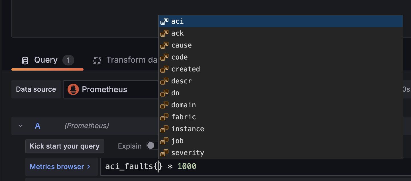
We will do this steps in the Code mode to learn a bit more. PromQL support filtering your queriers by the labels, this is super easy, just open a { after the metric name and you should see a dropdown menu with all our labels!

If you want for example to show Faults only from site1 you can type the following query aci_faults{fabric="site1"} * 1000 and now only faults from site1 should appear. If you want to filter by using Regular Expressions (RegEx) you can replace = with =~ we will use this syntax in the next task
Variables in Grafana allow you to create dynamic and interactive dashboards by enabling you to define placeholders that can be replaced with different values at runtime.
If you are still on the dashboard editing pane let's modify our query to look like this:
aci_faults{fabric=~"$fabric"} * 1000
The fabric=~"$fabric" part simply tells Grafana to use the variable $fabric in this filter and the =~ also allow us to treat this filtering expression as a RegEx so that we can select 1 or more fabrics at the same time.
Click apply, this will result in an empty dashboard, this is expected since the variable $fabric does not exists yet!
To create the $fabric variables to select our sites follow these steps:
- Click on the gear icon (settings in the top right) and select "Variables."
- Click "New variable"
- Select variable type:
Query - Name:
fabric - Display Name:
Fabric - Show on dashboard:
Labels and Values - Data source:
Prometheus - Query
- Query type:
Labels Values - Label:
fabricWarning select thefabriclabel DO NOT select$fabric
- Query type:
- Selection options: Enabled
Multi-ValuesandInclude All option
- Select variable type:
- Click
Apply - Click
Close - If the Dashboard is still empty click the refresh button on the Top Right (the two spinning arrows)
Now your dashboard will have a new drop down menu where you can dynamically select the fabric to display!
This concludes Lab1, feel free to play around more with this dashboard if you want or you can proceed to Lab2


