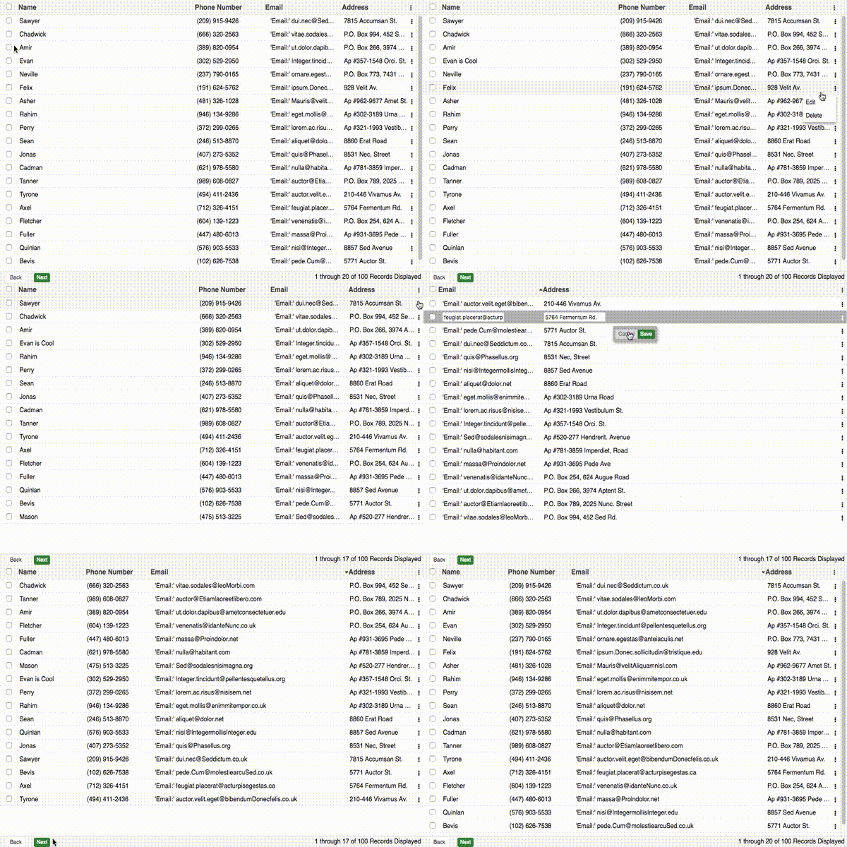


A Grid and Tree Component written in React using the Redux Pattern with plenty of open source examples, and an interesting backstory.

- Flat List or Tree Structure ➖ 🌲
- Local and/or Remote Data Source
- Local and/or Remote Pagination
- Extensive Column Definitions 💪
- Draggable Column Width/Resizing
- Draggable Column Ordering
- Sortable Columns
- Grid Action Menus
- Bulk Action Toolbar
- Selection Model (Single, MultiSelect, Checkbox)
- Event Handling for all kinds of DOM Events (List Below)
- Extendable and Modular Style Built with JavaScript

- Loading Mask
- Built-in Error Handling Module
- Handles Huge amount of Records (1000000+) ⭐
$ npm install react-redux-grid --save
If you would like to build and run the demo in your browser:
$ git clone https://github.com/bencripps/react-redux-grid.git
$ cd react-redux-grid
$ npm install
$ npm run start
Open your browser to: http://localhost:3000
Examples Github
import React from "react";
import { render } from "react-dom";
import { Grid } from "react-redux-grid";

render(
    <Grid data={data} stateKey={stateKey} />,
    document.getElementById("grid-mount")
);
| Prop |
Type |
Description |
| stateful |
bool |
the grid will store column configuration in browser local storage (based off of stateKey, so the key must be unique across all grids in a single application) |
| height |
oneOfType([number, string, bool]) |
the height of the grid container, if false, then no height will be set |
| stateKey |
string |
unique id for grid, more information available |
| showTreeRootNode |
bool |
used with tree-grid, to determine if root node should be displayed |
| classNames |
array |
a list of strings to be applied to the grid container as classes |
| events |
object |
grid event object, more information below |
| reducerKeys |
object |
object describing custom named reducers, more information below |
| pageSize |
int |
number of records to shown on a single grid page |
| emptyDataMessage |
any |
can be a string or a react component, which will be displayed if no grid data is available |
| dragAndDrop |
bool |
whether drag and drop of rows should be enabled |
| gridType |
oneOf(['grid', 'tree']) |
whether the grid will be a flat list or a tree view |
| data |
arrayOf(object) |
local data for grid to display, more information available |
| dataSource |
func |
function which returns data to display, more information available |
| filterFields |
object |
optional object describing additional values to filter grid data |
export const columns = [
    {
        name: "Name",
        dataIndex: "name",
        editor: '<input type="text" required />',
        width: "10%",
        className: "additional-class",
        renderer: ({ column, value, row }) => <span> Name: {value} </span>,
        hidden: false,
        placeholder: "Name",
        validator: ({ value, values }) => value.length > 0,
        change: ({ values }) => ({
            otherColDataIndex: "newValue",
        }),
        editable: ({ value, values }) => {
            if (value === "ShouldDisabled") {
                return true;
            }
            return false;
        },
        hideable: false,
        resizable: false,
        moveable: false,
        HANDLE_CLICK: () => {
            console.log("Header Click");
        },
        createKeyFrom: true,
    },
];
| Prop |
Type |
Description |
| name |
string |
title of column to be displayed |
| dataIndex |
oneOfType([string, array]) |
the key accessor for the column value (required parameter). more information available |
| editor |
jsx |
when an editor is used, this element will be rendered in place of the edited cell, more information available |
| width |
int |
width of column (if none is provided, a default width will be applied) |
| className |
array |
additional class names to apply to header of this column |
| renderer |
func |
a function which returns the cell contents for this column, more information available |
| hidden |
bool |
whether the column is hidden or visible |
| hideable |
bool |
whether the column can be hidden |
| moveable |
bool |
whether this column can be moved |
| placeholder |
string |
the placeholder that will be used for the editor input |
| validator |
func |
a func that should return a boolean, to determine if the newly input value is valid |
| change |
func |
a func that should return an object where keys are the dataIndex of affected columns, and the values will be the new values associated with that dataIndex. |
| editable |
oneOfType([func, bool]) |
whether the field should be disabled while in edit mode. |
| createKeyFrom |
bool |
see full documentation on createKeyFrom |
| sortFn |
func |
when a local sort action occurs, you can provide a method that will be passed to sort |
export const plugins = {
    EDITOR: {
        type: "inline",
        enabled: true,
        focusOnEdit: true,
    },
};
| Prop |
Type |
Description |
| type |
oneOf(['inline', 'grid']) |
two editors are available by default. in grid mode, all fields are editable. in inline mode, only a single line is editable at a time |
| enabled |
bool |
if true, the grid will have an editor available |
| focusOnEdit |
bool |
focus the first editable input when an edit event occurs (defaults to true) |
export const plugins = {
    COLUMN_MANAGER: {
        resizable: false
        defaultColumnWidth: `${100 / columns.length}%`,
        minColumnWidth: 10,
        moveable: true,
        headerActionItemBuilder: () => {},
        sortable: {
            enabled: true,
            method: 'local',
            sortingSource: 'http://url/to/sortingSource'
        }
    }
}
| Prop |
Type |
Description |
| resizable |
bool |
will set all columns to resizable. This parameter will not override columns that have declared they are not resizable from the columns array |
| defaultColumnWidth |
int |
if no column width is provided, columns will be divided equally. this can be overwritten by providing a new string template |
| minColumnWidth |
int |
the minimum width a column can be dragged to |
| moveable |
bool |
whether the columns can be reordered by drag |
| headerActionItemBuilder |
func |
build a custom jsx component to be used as the header action items |
| sortable |
object |
an object that describes whether columns can be sorted |
| sortable.enabled |
bool |
an object that describes whether columns can be sorted |
| sortable.method |
oneOf(['local', 'remote']) |
whether sorting will execute locally, or remotely |
| sortable.sortingSource |
string |
where sorting data will be retrieved (a required parameter for remote sorting) |
Pagination
export const plugins = {
    PAGER: {
        enabled: true,
        pagingType: "remote",
        toolbarRenderer: (
            pageIndex,
            pageSize,
            total,
            currentRecords,
            recordType
        ) => {
            return `${pageIndex * pageSize} through ${
                pageIndex * pageSize + currentRecords
            } of ${total} ${recordType} Displayed`;
        },
        pagerComponent: false,
    },
};
| Prop |
Type |
Description |
| enabled |
bool |
whether a pager will be used, defaults to true |
| pagingType |
oneOf(['local', 'remote']) |
defaults to local |
| toolbarRenderer |
func |
a function which which returns the description of the current pager state, ex: 'Viewing Records 10 of 100' |
| pagerComponent |
jsx |
if you'd like to pass your own pager in, you can supply a jsx element which will replace the pager entirely |
export const plugins = {
    GRID_ACTIONS: {
        iconCls: "action-icon",
        onMenuShow: ({ columns, rowData }) => {
            console.log("This event fires before menushow");

            if (rowData.isDisabled) {
                return ["menu-item-key"]; // this field will now be disabled
            }
        },
        menu: [
            {
                text: "Menu Item",
                key: "menu-item-key",
                EVENT_HANDLER: () => {
                    alert("Im a menu Item Action");
                },
            },
        ],
    },
};
| Prop |
Type |
Description |
| iconCls |
string |
class to be used for the action icon |
| menu |
arrayOf(object) |
menuItems, with text, key, EVENT_HANDLER properties. each object must contain a unique key relative to it's parent array. These keys will be used as the JSX element key. |
| onMenuShow |
func |
a method that fires upon menu action click. @return an array of keys to disable menu items that correspond with these keys. |
export const plugins = {
    SELECTION_MODEL: {
        mode: "single",
        enabled: true,
        editEvent: "singleclick",
        allowDeselect: true,
        activeCls: "active-class",
        selectionEvent: "singleclick",
    },
};
| Prop |
Type |
Description |
| mode |
oneOf(['single', 'multi', 'checkbox-single', 'checkbox-multi']) |
determines whether a single value, or multiple values can be selected |
| editEvent |
oneOf(['singleclick', 'doubleclick', 'none']) |
what type of mouse event will trigger the editor |
| enabled |
bool |
whether the selection model class is initialized |
| allowDeselect |
bool |
whether a value can be deselected |
| activeCls |
string |
the class applied to active rows upon selection |
| selectionEvent |
oneOf(['singleclick', 'doubleclick']) |
the browser event which triggers the selection event |
export const plugins = {
    ERROR_HANDLER: {
        defaultErrorMessage: "AN ERROR OCURRED",
        enabled: true,
    },
};
| Prop |
Type |
Description |
| defaultErrorMessage |
string |
the default error message to display when no error information is available |
| enabled |
bool |
whether the error handler should be initialized |
export const plugins = {
    LOADER: {
        enabled: true,
    },
};
| Prop |
Type |
Description |
| enabled |
bool |
whether the loading mask should be initialized |
export const plugins = {
    BULK_ACTIONS: {
        enabled: true,
        actions: [
            {
                text: "Bulk Action Button",
                EVENT_HANDLER: () => {
                    console.log("Doing a bulk action");
                },
            },
        ],
    },
};
| Prop |
Type |
Description |
| enabled |
bool |
whether the bulk action toolbar should be used |
| actions |
arrayOf(object) |
the actions (including button text, and event handler) that will be displayed in the bar |
export const plugins = {
    ROW: {
        enabled: true,
        renderer: ({ rowProps, cells, row }) => {
            return <tr {...rowProps}>{cells}</tr>;
        },
    },
};
| Prop |
Type |
Description |
| enabled |
bool |
whether the bulk action toolbar should be used |
| renderer |
func |
function which returns the row contents for this row |
All grid events are passed in as a single object.
export const events = {
    HANDLE_CELL_CLICK: () => {},
    HANDLE_CELL_DOUBLE_CLICK: () => {},
    HANDLE_BEFORE_ROW_CLICK: () => {},
    HANDLE_ROW_CLICK: () => {},
    HANDLE_ROW_DOUBLE_CLICK: () => {},
    HANDLE_BEFORE_SELECTION: () => {},
    HANDLE_AFTER_SELECTION: () => {},
    HANDLE_BEFORE_INLINE_EDITOR_SAVE: () => {},
    HANDLE_AFTER_INLINE_EDITOR_SAVE: () => {},
    HANDLE_BEFORE_BULKACTION_SHOW: () => {},
    HANDLE_AFTER_BULKACTION_SHOW: () => {},
    HANDLE_BEFORE_SORT: () => {},
    HANLE_BEFORE_EDIT: () => {},
    HANDLE_AFTER_SELECT_ALL: () => {},
    HANDLE_AFTER_DESELECT_ALL: () => {},
    HANDLE_AFTER_ROW_DROP: () => {},
    HANDLE_BEFORE_TREE_CHILD_CREATE: () => {},
    HANDLE_EDITOR_FOCUS: () => {},
    HANDLE_EDITOR_BLUR: () => {},
};
Each function is passed two arguments, the first is a context object which will contain metadata about the event, and the second argument is the browser event if applicable.
HANDLE_CELL_CLICK = ({ row, rowId, rowIndex }, e) => {};All core components and plugins have corresponding .styl files that can be extended or overwritten. Class names have also been modularized and are available to modify or extend within src/constants/gridConstants.js
To update CLASS_NAMES or the CSS_PREFIX dynamically, you can use the applyGridConfig function. More information is available here.
export const CSS_PREFIX = "react-grid";

export const CLASS_NAMES = {
    ACTIVE_CLASS: "active",
    DRAG_HANDLE: "drag-handle",
    SORT_HANDLE: "sort-handle",
    SECONDARY_CLASS: "secondary",
    CONTAINER: "container",
    TABLE: "table",
    HEADER: "header",
    ROW: "row",
    CELL: "cell",
    PAGERTOOLBAR: "pager-toolbar",
    EMPTY_ROW: "empty-row",
    LOADING_BAR: "loading-bar",
    DRAGGABLE_COLUMN: "draggable-column",
    COLUMN: "column",
    SORT_HANDLE_VISIBLE: "sort-handle-visible",
    BUTTONS: {
        PAGER: "page-buttons",
    },
    SELECTION_MODEL: {
        CHECKBOX: "checkbox",
        CHECKBOX_CONTAINER: "checkbox-container",
    },
    ERROR_HANDLER: {
        CONTAINER: "error-container",
        MESSAGE: "error-message",
    },
    EDITOR: {
        INLINE: {
            CONTAINER: "inline-editor",
            SHOWN: "shown",
            HIDDEN: "hidden",
            SAVE_BUTTON: "save-button",
            CANCEL_BUTTON: "cancel-button",
            BUTTON_CONTAINER: "button-container",
        },
    },
    GRID_ACTIONS: {
        CONTAINER: "action-container",
        SELECTED_CLASS: "action-menu-selected",
        MENU: {
            CONTAINER: "action-menu-container",
            ITEM: "action-menu-item",
        },
    },
    BULK_ACTIONS: {
        CONTAINER: "bulkaction-container",
        DESCRIPTION: "bulkaction-description",
        SHOWN: "shown",
        HIDDEN: "hidden",
    },
};


