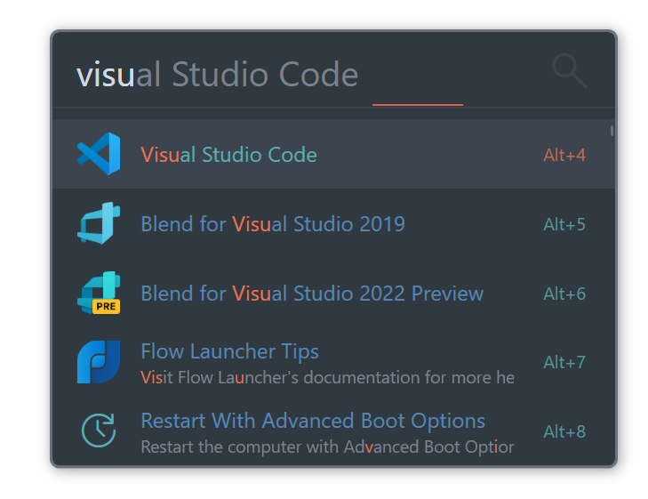
If you make a theme for the first time, refer to the existing theme. Copy the sublime.xaml (This is one of the basic theme files.) in the theme folder of Flow and make it a new file. Or you can download it here.
Place the theme you created in the Theme folder inside the UserData directory, for roaming this is located at %APPDATA%\FlowLauncher\Themes\ (AppData Roaming path) and for portable it is by default %localappdata%\FlowLauncher\app-<VersionOfYourFlowLauncher>\UserData\Themes\ (AppData Local path). Flow will read from the UserData directory for custom themes and its own app directory for default themes. Make sure you do not place in the location outside UserData because it will be erased along with the default theme files after an update.
The theme file allows you to set the following parts. Each style has a key, and there are items that can be modified. If theme has a key not described in this document, we recommend you not to modify it separately.
(There is a possibility of changing/deleting this part depending on the version.)
In this item, you can set the color, border size, border color, and corner radius of the basic window.
<Style x:Key="WindowBorderStyle" BasedOn="{StaticResource BaseWindowBorderStyle}" TargetType="{x:Type Border}">
        <Setter Property="BorderThickness" Value="2" />
        <Setter Property="BorderBrush" Value="#6c7279" />
        <Setter Property="CornerRadius" Value="5" />
        <Setter Property="Background" Value="#303840" />
 </Style>
Window border thickness is recommended from 1 or 2. Recommended corner radius is 0, 5 or less.
This is the style of the basic search window. You can set the font size, color of cursor, font color, input window height. If the font size is reduced, the height of the window is also reduced, so the height must be specified.
<Style x:Key="QueryBoxStyle" BasedOn="{StaticResource BaseQueryBoxStyle}" TargetType="{x:Type TextBox}">
        <Setter Property="FontSize" Value="24" />
        <Setter Property="Background" Value="#303840" />  <!-- Set it to the same color as the window. -->
        <Setter Property="Foreground" Value="#d2d8e5" /> <!-- Font Color -->
        <Setter Property="CaretBrush" Value="#FFAA47" /> <!-- Cursor Color -->
        <Setter Property="FontSize" Value="26" />
        <Setter Property="Height" Value="42" /> <!-- Default is 42. -->
</Style>This is the style of the recommended search word that appears after the search word. The font size & Height should be the same as the QueryBoxStyle, and a more translucent color is recommended.
<Style x:Key="QuerySuggestionBoxStyle" BasedOn="{StaticResource BaseQuerySuggestionBoxStyle}" TargetType="{x:Type TextBox}">
        <Setter Property="Background" Value="#303840" />
        <Setter Property="Foreground" Value="#798189" /> <!-- Font Color -->
        <Setter Property="FontSize" Value="26" /> <!-- Same as QueryBox -->
        <Setter Property="Height" Value="42" /> <!-- Same as QueryBox -->
</Style>It is possible to set the color of the loading bar that is sometimes displayed.
<Style x:Key="PendingLineStyle" BasedOn="{StaticResource BasePendingLineStyle}" TargetType="{x:Type Line}">
        <Setter Property="Stroke" Value="#FFAA47" /> <!-- Bar Color -->
</Style>This is the style of the magnifying glass icon displayed on the right side of the search window. Color & Size can be changed or hidden. (The picture change will be updated later.)
<Style x:Key="SearchIconStyle" TargetType="{x:Type Path}" BasedOn="{StaticResource BaseSearchIconStyle}">
        <Setter Property="Fill" Value="#3c454e" /> <!-- Color -->
        <Setter Property="Width" Value="32" /> <!-- Size. Default is 32. -->
        <Setter Property="Height" Value="32" /> <!-- Size -->
</Style>
If you want to hide it, you can add the following code.
<Setter Property="Visibility" Value="Collapsed" />This is the title part of the search result. The font size and color can be adjusted.
<Style x:Key="ItemTitleStyle"  BasedOn="{StaticResource BaseItemTitleStyle}" TargetType="{x:Type TextBlock}">
	<Setter Property="Foreground" Value="#5989b2" />
	<Setter Property="FontSize" Value="13" /> <!-- Default is 16 -->
</Style>You can specify a color that changes when the item is focused. The font size should be the same as ItemTitleStyle.
<Style x:Key="ItemTitleSelectedStyle" BasedOn="{StaticResource BaseItemTitleSelectedStyle}"  TargetType="{x:Type TextBlock}" >
        <Setter Property="Foreground" Value="#5bafb0" />
</Style>This is the filepath part of the search result. The font size and color can be adjusted.
<Style x:Key="ItemSubTitleStyle" BasedOn="{StaticResource BaseItemSubTitleStyle}" TargetType="{x:Type TextBlock}" >
        <Setter Property="Foreground" Value="#7b858f" />
        <Setter Property="FontSize" Value="13" /> <!-- Default is 13 -->
</Style>You can specify a color that changes when the item is focused. The font size should be the same as ItemSubTitleStyle.
<Style x:Key="ItemSubTitleSelectedStyle" BasedOn="{StaticResource BaseItemSubTitleSelectedStyle}" TargetType="{x:Type TextBlock}" >
        <Setter Property="Cursor" Value="Arrow" />
        <Setter Property="Foreground" Value="#cc8ec8" />
</Style>Specifies the color and size of the Hotkey font.
<Style x:Key="ItemHotkeyStyle" TargetType="{x:Type TextBlock}">
        <Setter Property="FontSize" Value="13" />
        <Setter Property="Foreground" Value="#5bafb0" />
</Style>You can specify a color that changes when the item is focused. The font size should be the same as ItemHotkeyStyle.
<Style x:Key="ItemHotkeySelectedStyle" TargetType="{x:Type TextBlock}">
        <Setter Property="FontSize" Value="13" />
        <Setter Property="Foreground" Value="#ea7354" />
</Style>This is the background color emphasized when the item is selected.
<SolidColorBrush x:Key="ItemSelectedBackgroundColor">#3c454e</SolidColorBrush>It emphasizes the part where the search word matches the result. Color and Font Weight can be set.
<Style x:Key="HighlightStyle">
        <Setter Property="Inline.Foreground" Value="#ea7354" />
        <Setter Property="Inline.FontWeight" Value="Bold" />
</Style>Specifies the color and size of the scroll bar.
<Style x:Key="ThumbStyle" BasedOn="{StaticResource BaseThumbStyle}" TargetType="{x:Type Thumb}">
        <Setter Property="SnapsToDevicePixels" Value="True"/>
        <Setter Property="OverridesDefaultStyle" Value="true"/>
        <Setter Property="IsTabStop" Value="false"/>
        <Setter Property="Width" Value="2"/> <!-- Size of Thumb -->
        <Setter Property="Focusable" Value="false"/>
        <Setter Property="Template">
            <Setter.Value>
                <ControlTemplate TargetType="{x:Type Thumb}">
                    <Border CornerRadius="2" DockPanel.Dock="Right" Background="#6c7279" BorderBrush="Transparent" BorderThickness="0" /> <!-- Background is Color of Thumb -->
                </ControlTemplate>
            </Setter.Value>
        </Setter>
</Style>Set the size, height, color, and margin of the horizontal line. If you don't think you need it, you can get rid of it.
<Style x:Key="SeparatorStyle" BasedOn="{StaticResource BaseSeparatorStyle}" TargetType="{x:Type Rectangle}">
        <Setter Property="Fill" Value="#3c454e"/>
        <Setter Property="Height" Value="1"/>
        <Setter Property="Margin" Value="0 0 0 8"/> <!--  It is left, up, right, and down in order. -->
</Style>
If you want to hide it, you can add the following code.
<Setter Property="Visibility" Value="Collapsed" />Specifies the color of the glyph icon.
<Style x:Key="ItemGlyph"  BasedOn="{StaticResource BaseGlyphStyle}" TargetType="{x:Type TextBlock}">
        <Setter Property="Foreground" Value="#5bafb0" />
</Style>Once you have crafted your perfect theme, why not share it with the community:
